HKP 2022 Annual Stamp Album & Pack
Designing a duo of exquisite books of Hong Kong stamp collection for Hongkong Post
Book Concept and Design

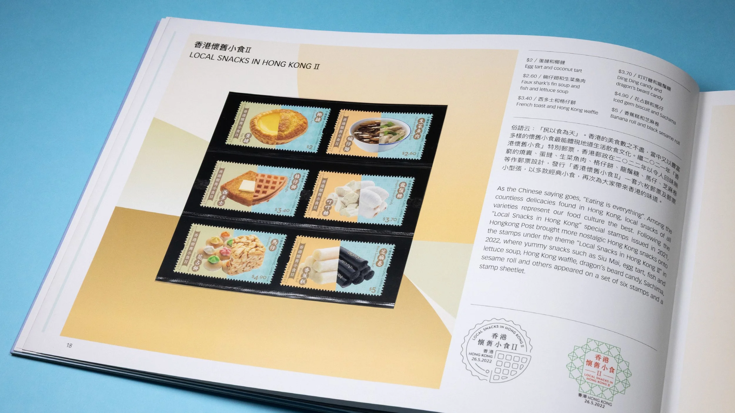
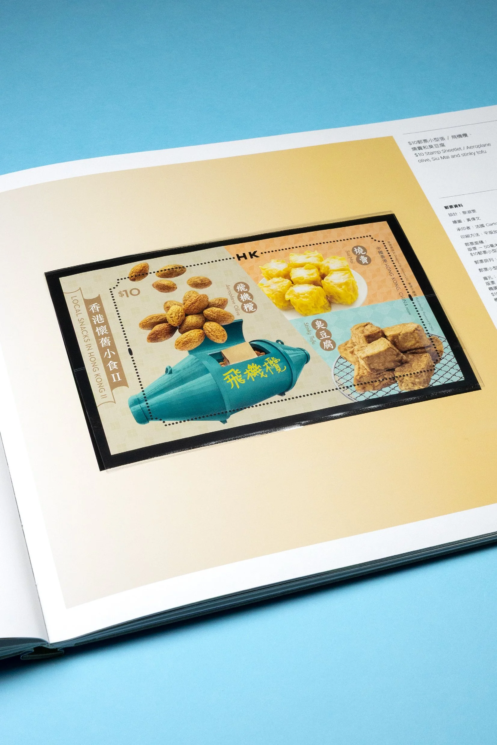
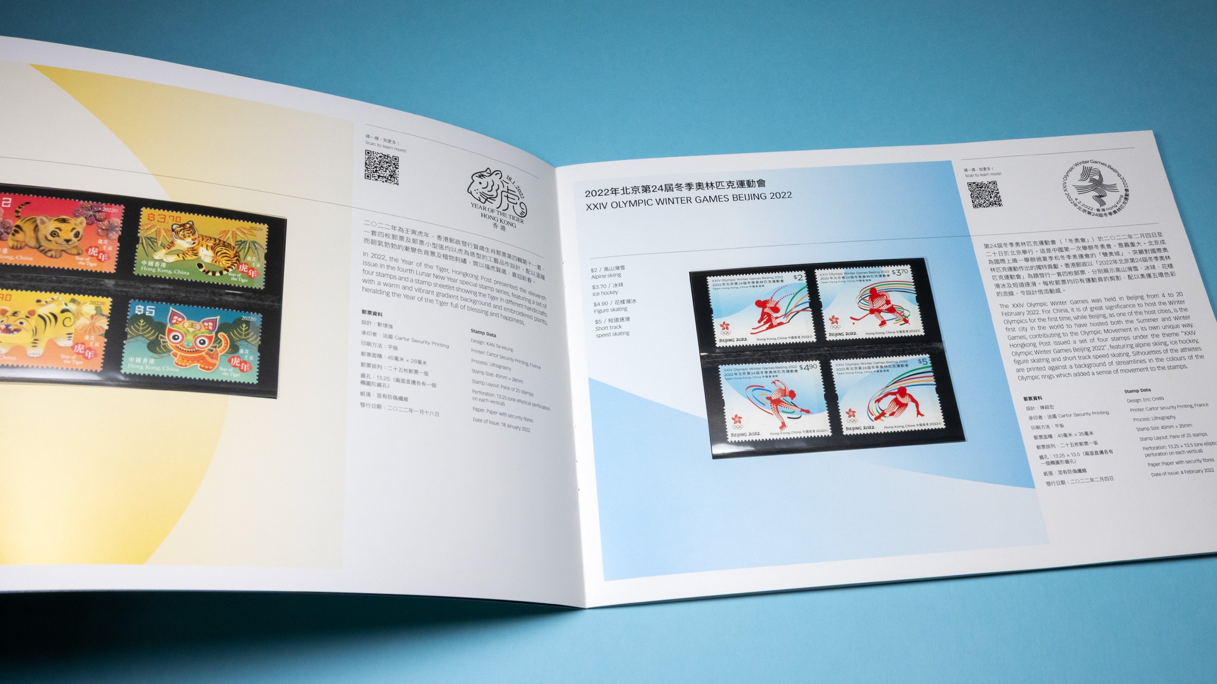
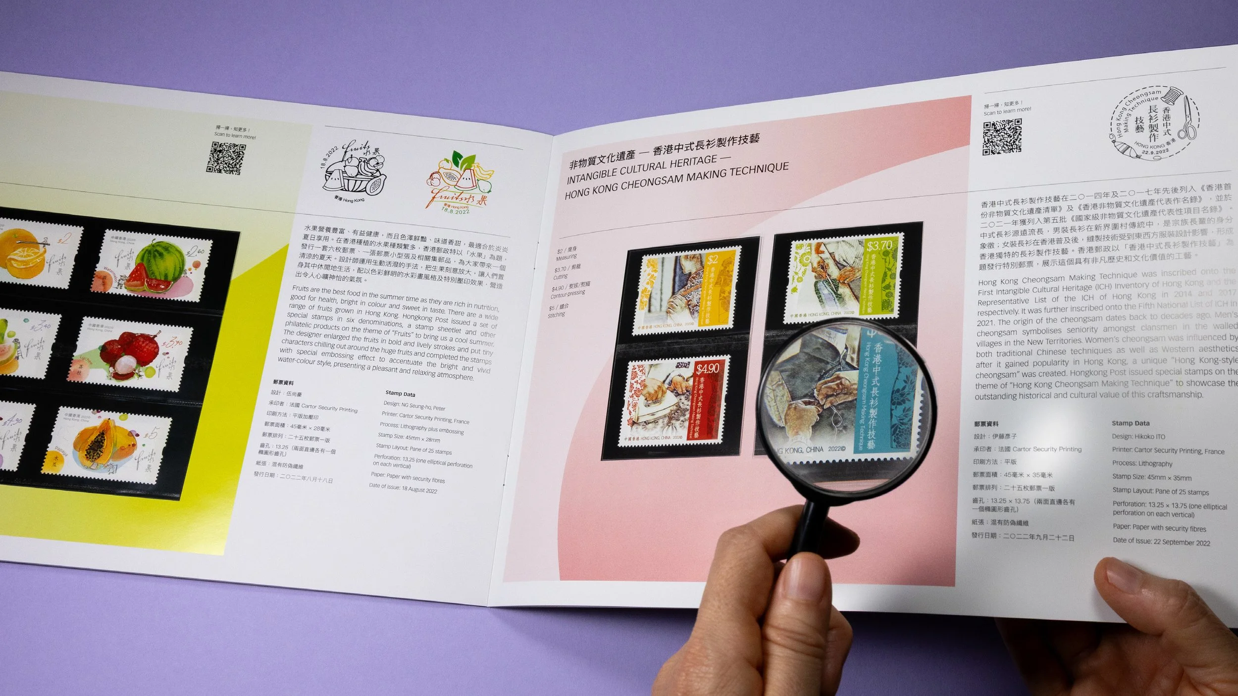
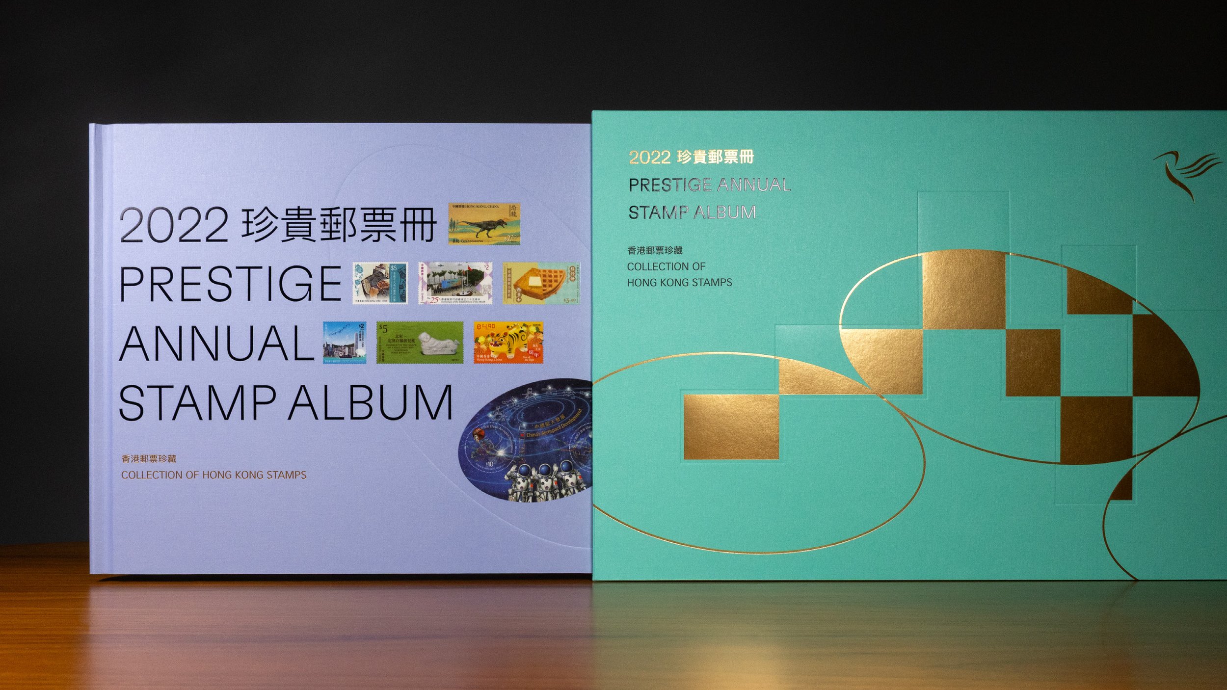
Every year Hongkong Post will publish a duo of collectable annual philately books for stamp collectors, especially philatelists. These two beautifully made books, the stamp album and the stamp pack, contain a complete set of thematic stamp series issued in Hong Kong throughout the year.

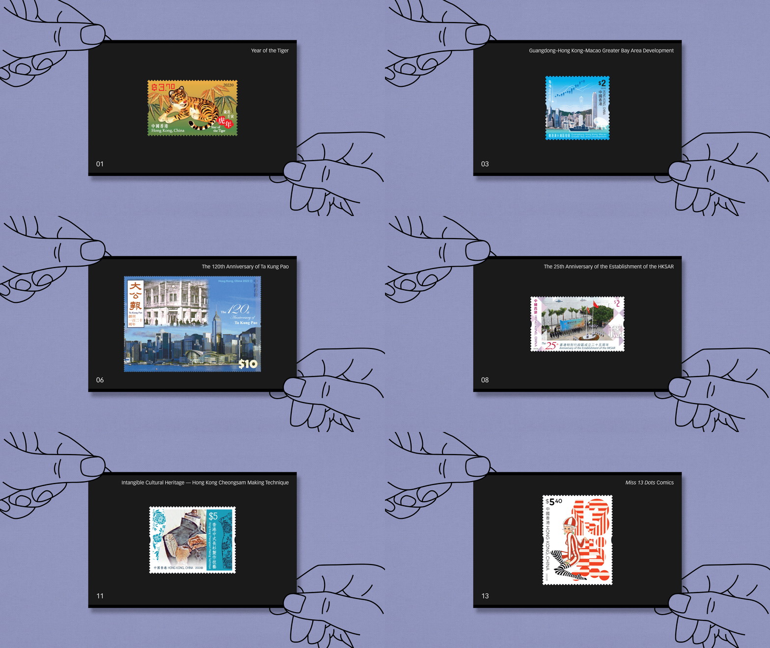
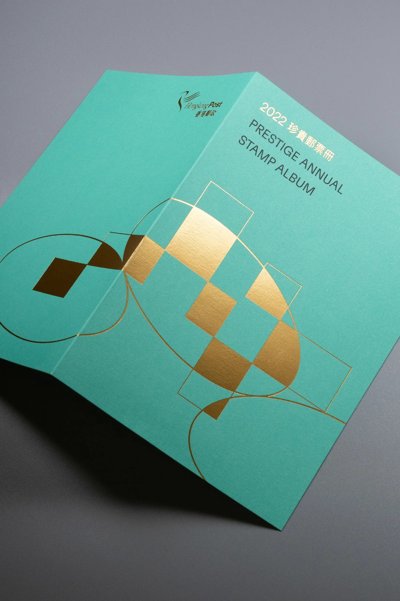
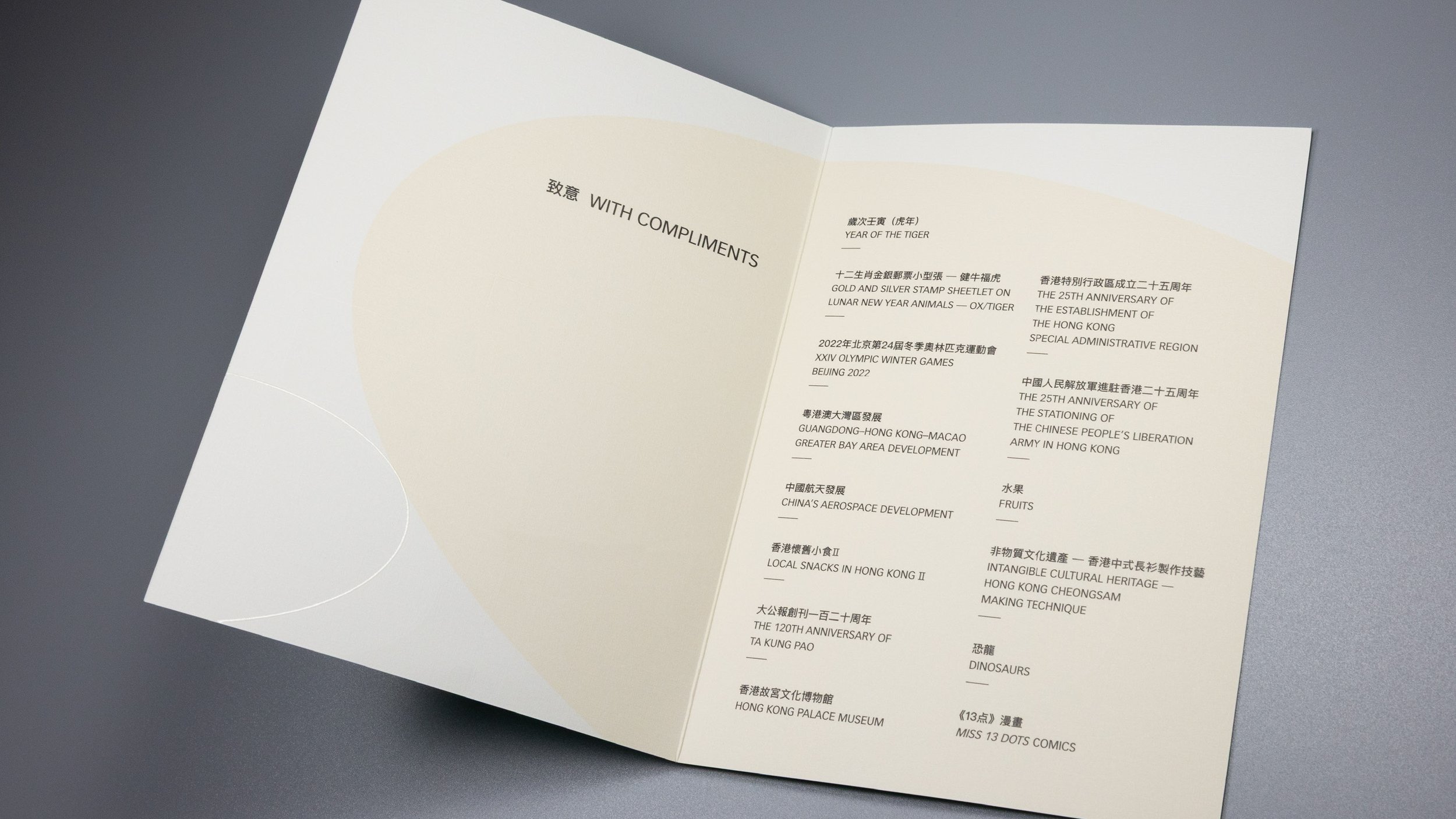
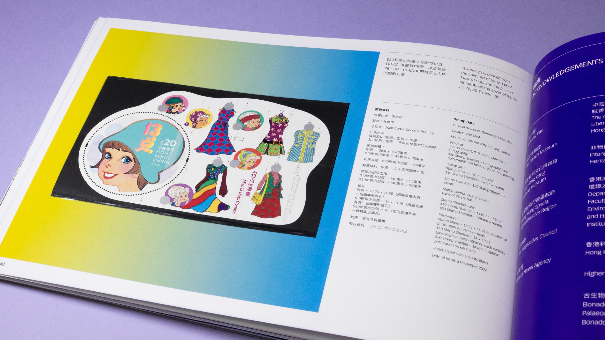
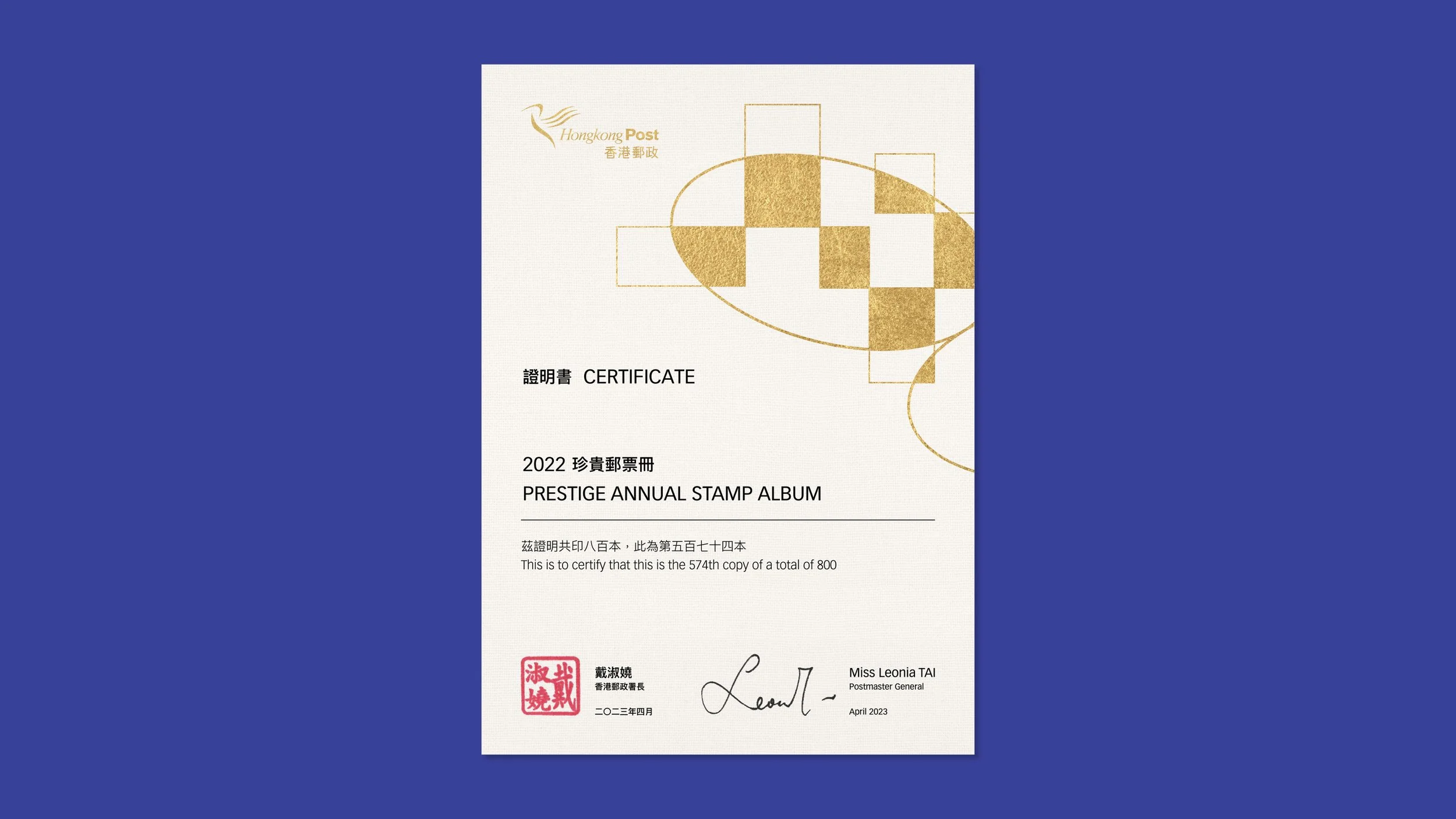
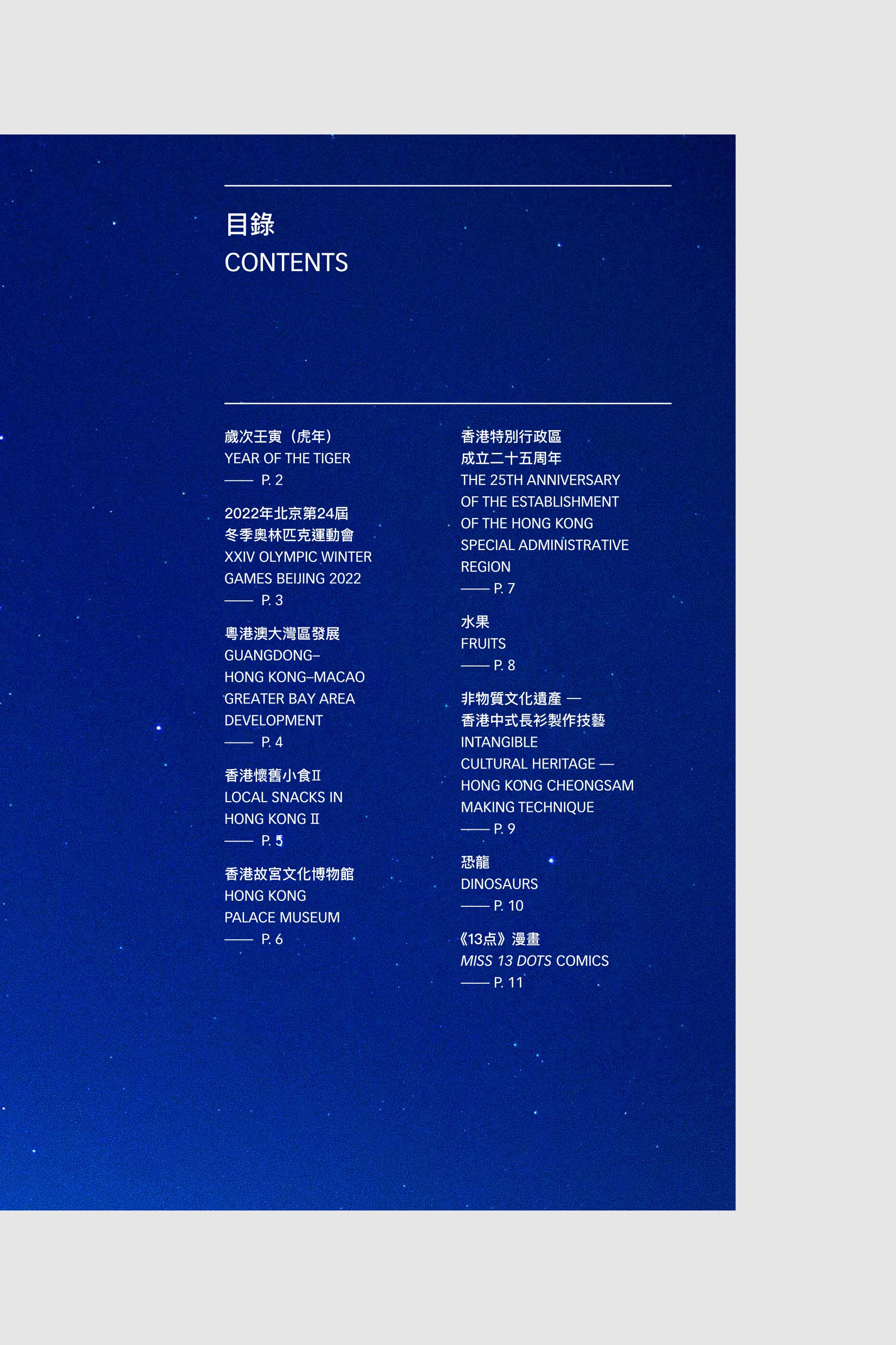
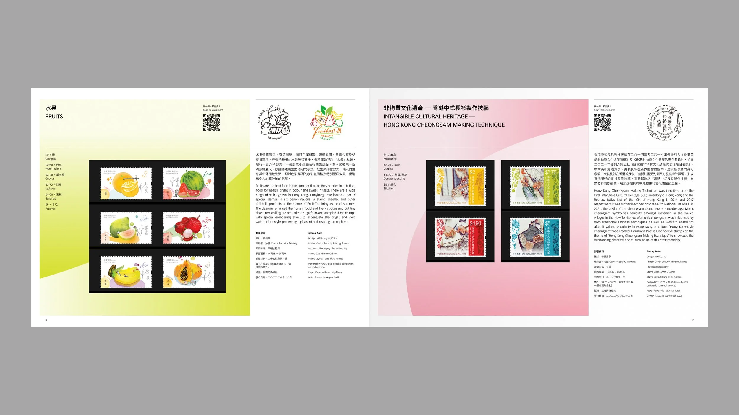
While the stamp album includes stamp sheetlets and souvenir sheets, as well as certificates for a few special edition stamps which have special printing treatments or rare materials used, the stamp pack is a more concise yet essential version. In addition, there is a deluxe edition of the album, limited to only 800 gift boxes, which feature the Postmaster General’s signature on a custom designed certificate that is similar to an elegant bookplate.
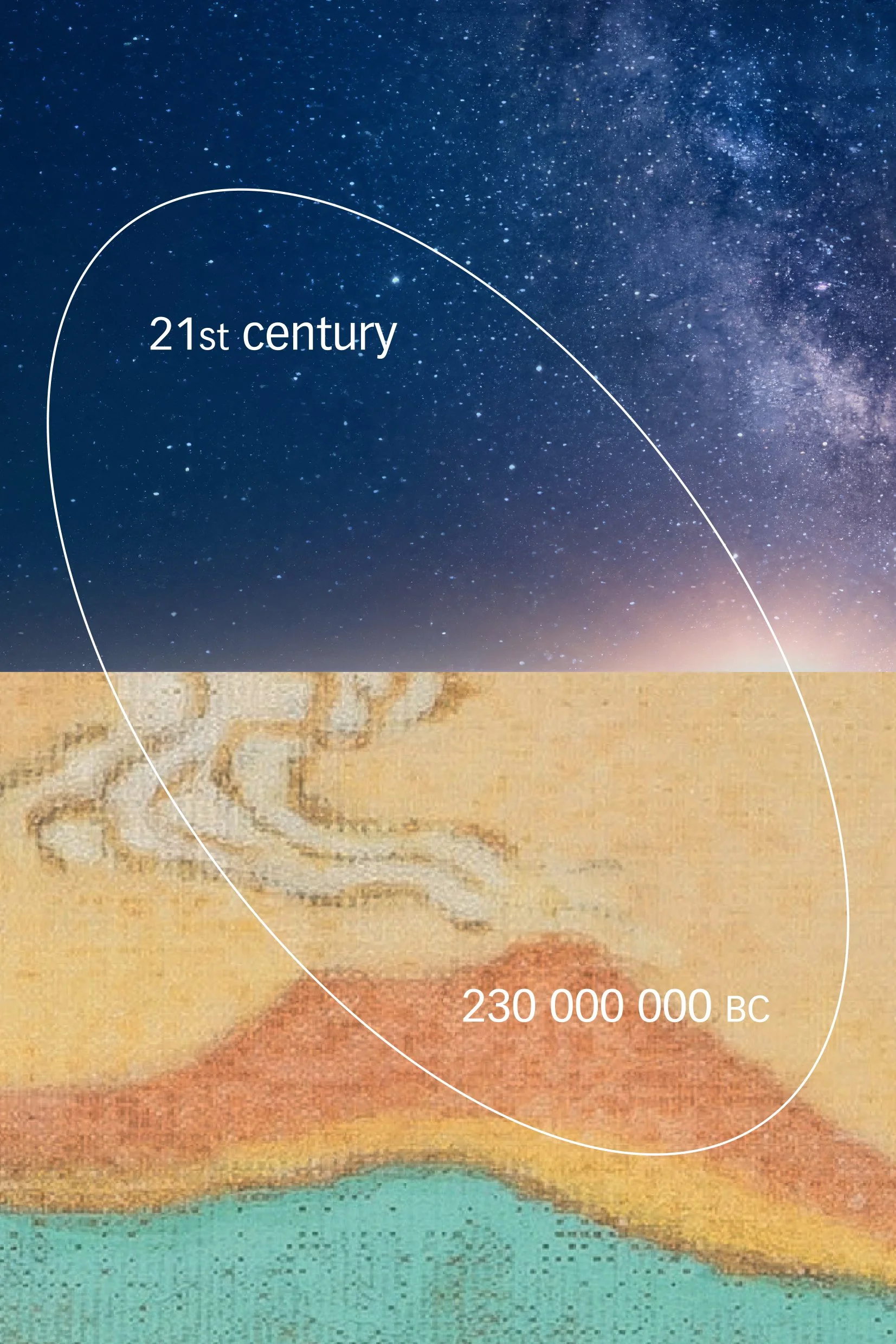
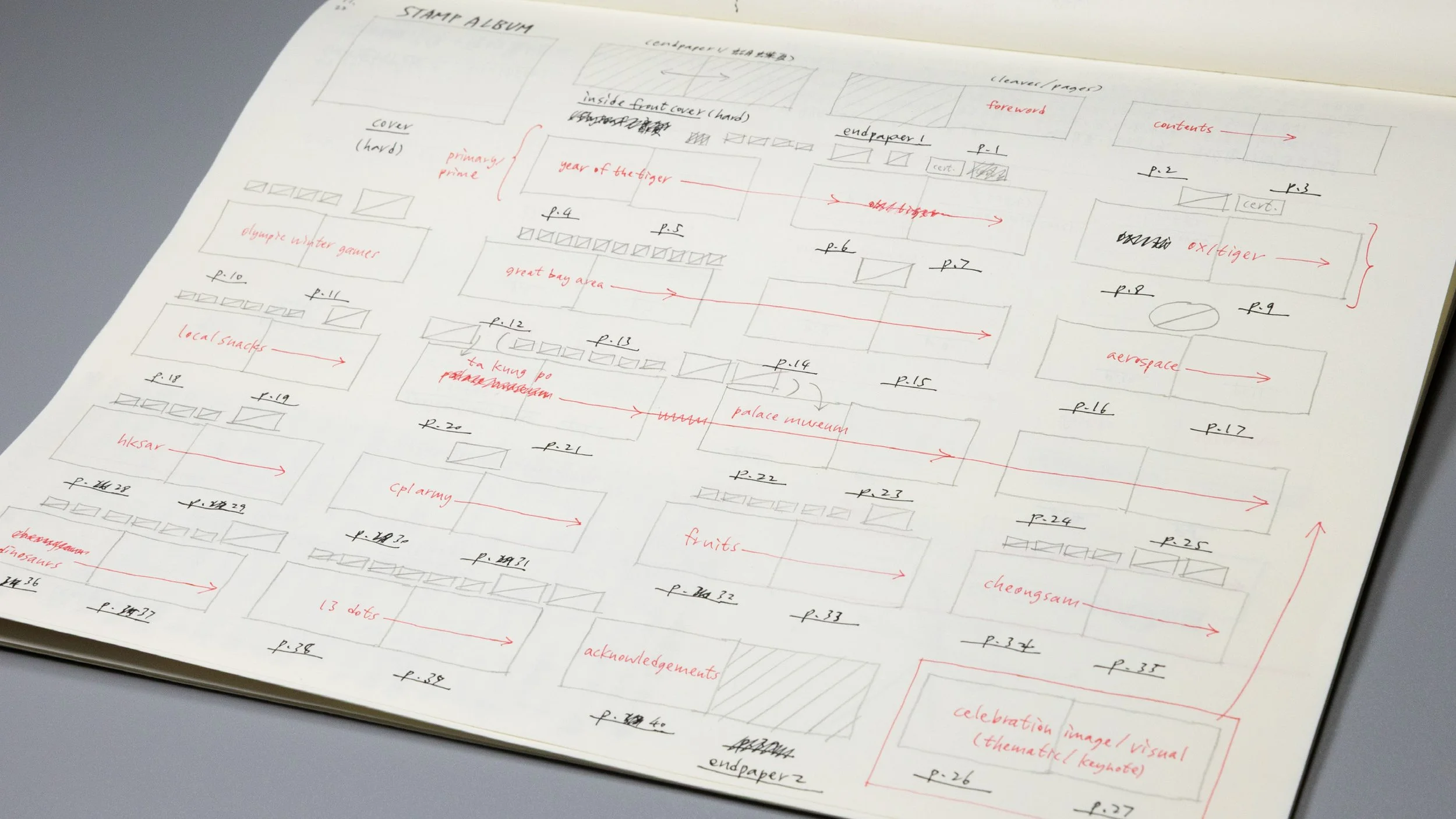
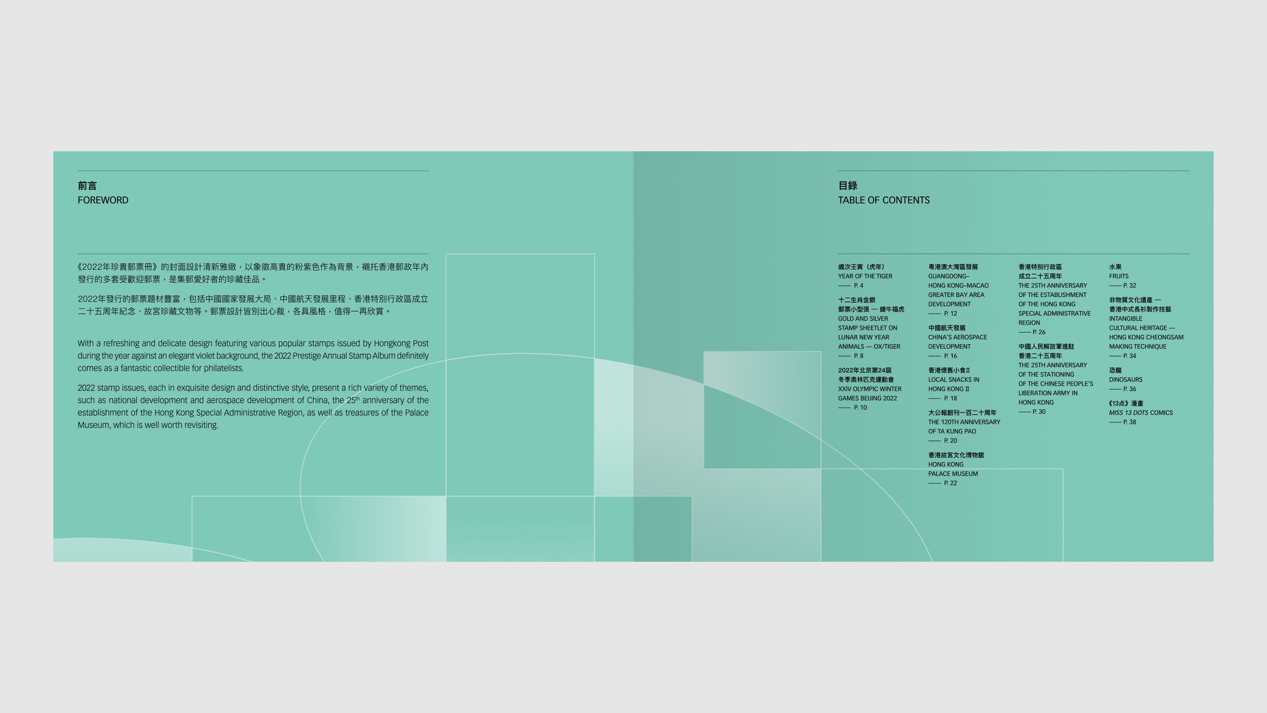
In the fall of 2022 we received a project invitation from HKP to design the stamp collection books, 13 thematic stamp series would be featured this year. The challenge was not merely to place all the stamp series nicely into a book but also to come up with a unifying concept that highly captures the common thread among those themes.

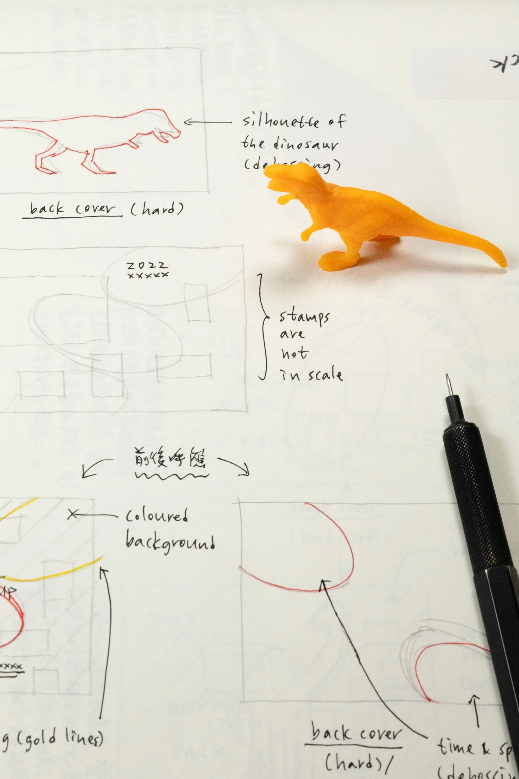
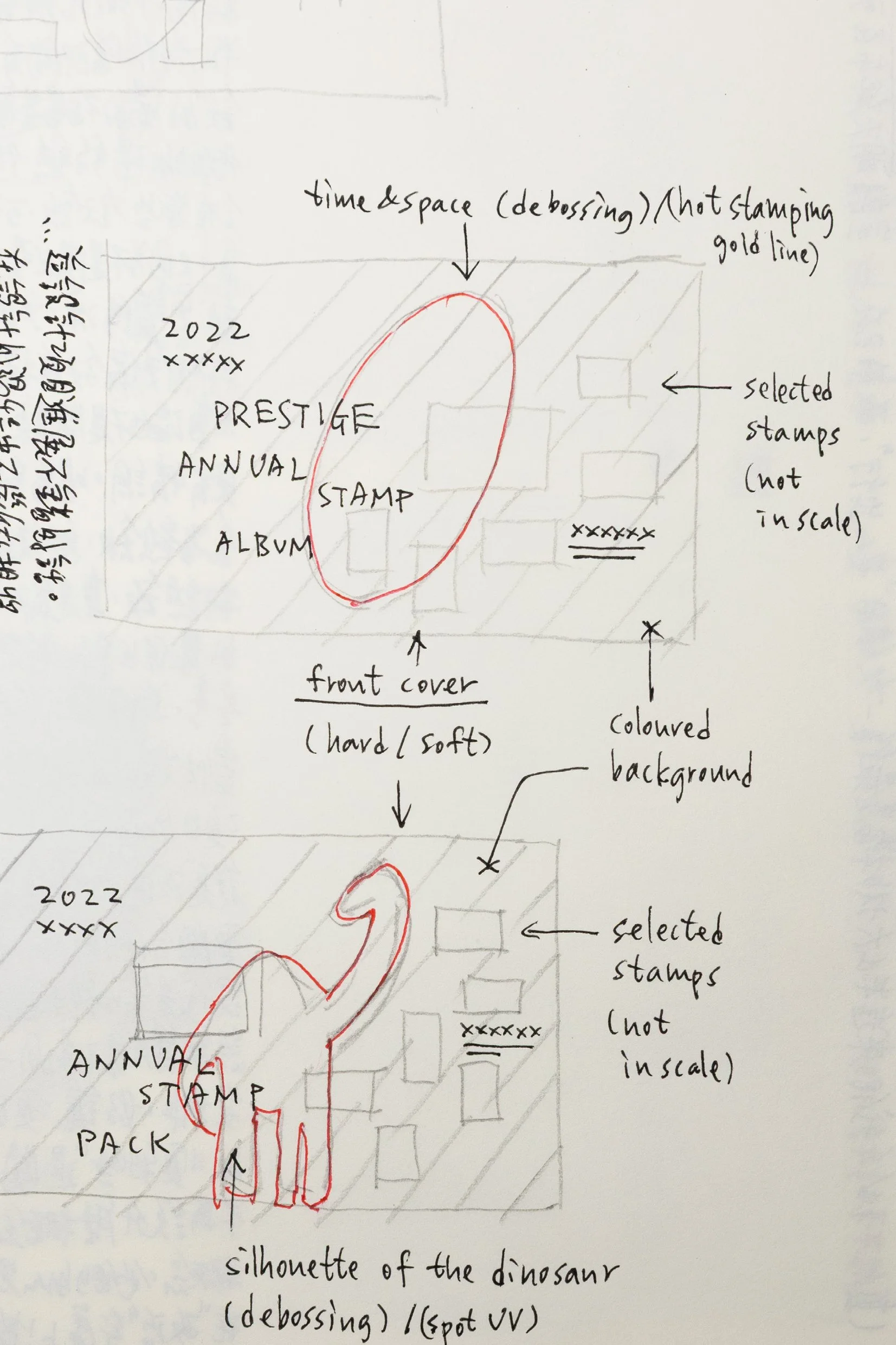
To review and study all the stamp series within the year carefully was a first step, but a rather critical one. There were 13 stamp themes telling us their own unique stories, and the most inspiring thing we found afterwards was an unseen timeline underneath. Space-time travelling was a very interesting core concept among the series even though it sounds a bit clichéd or overused.

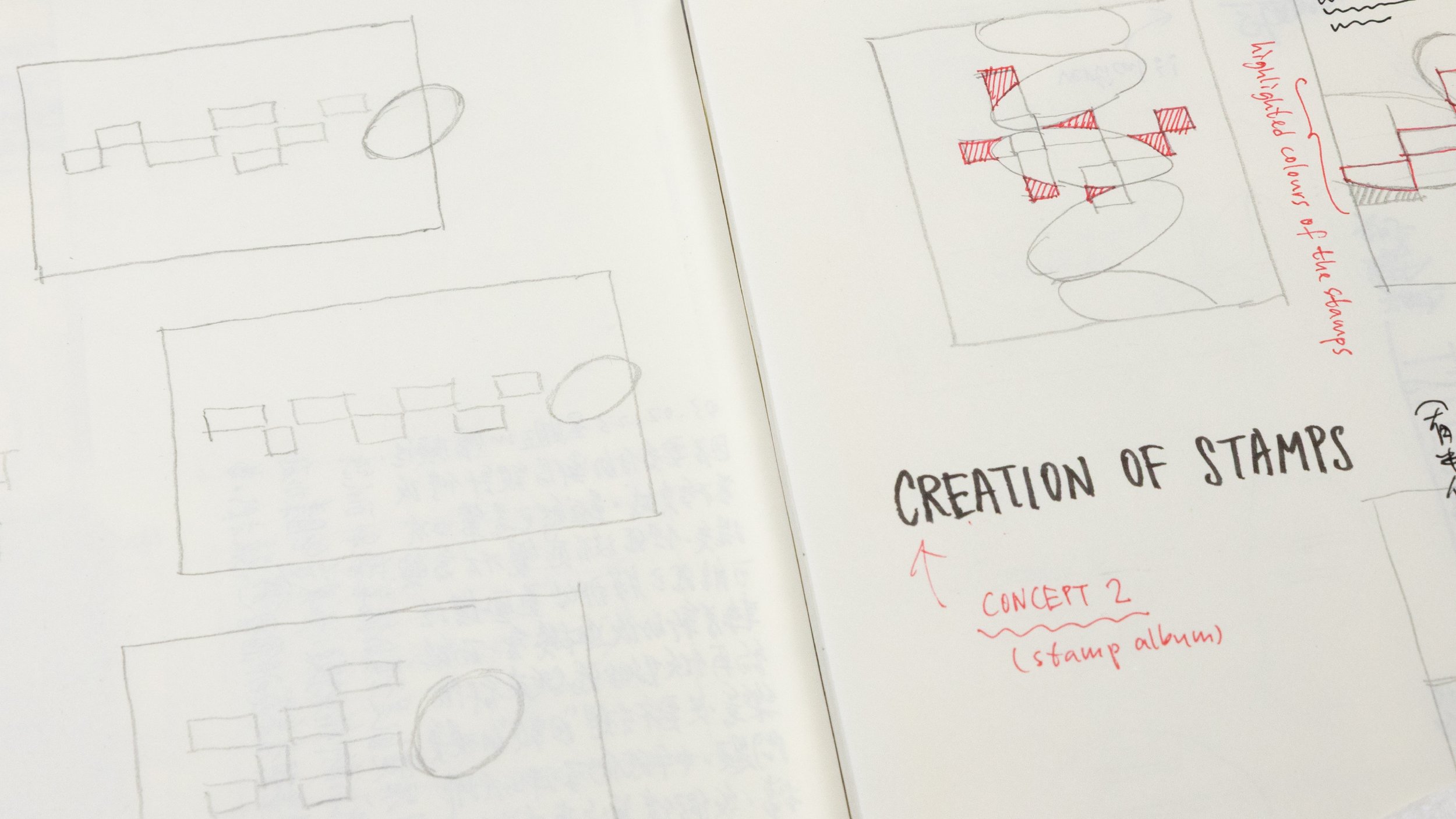
/ A preliminary idea of the cover designs
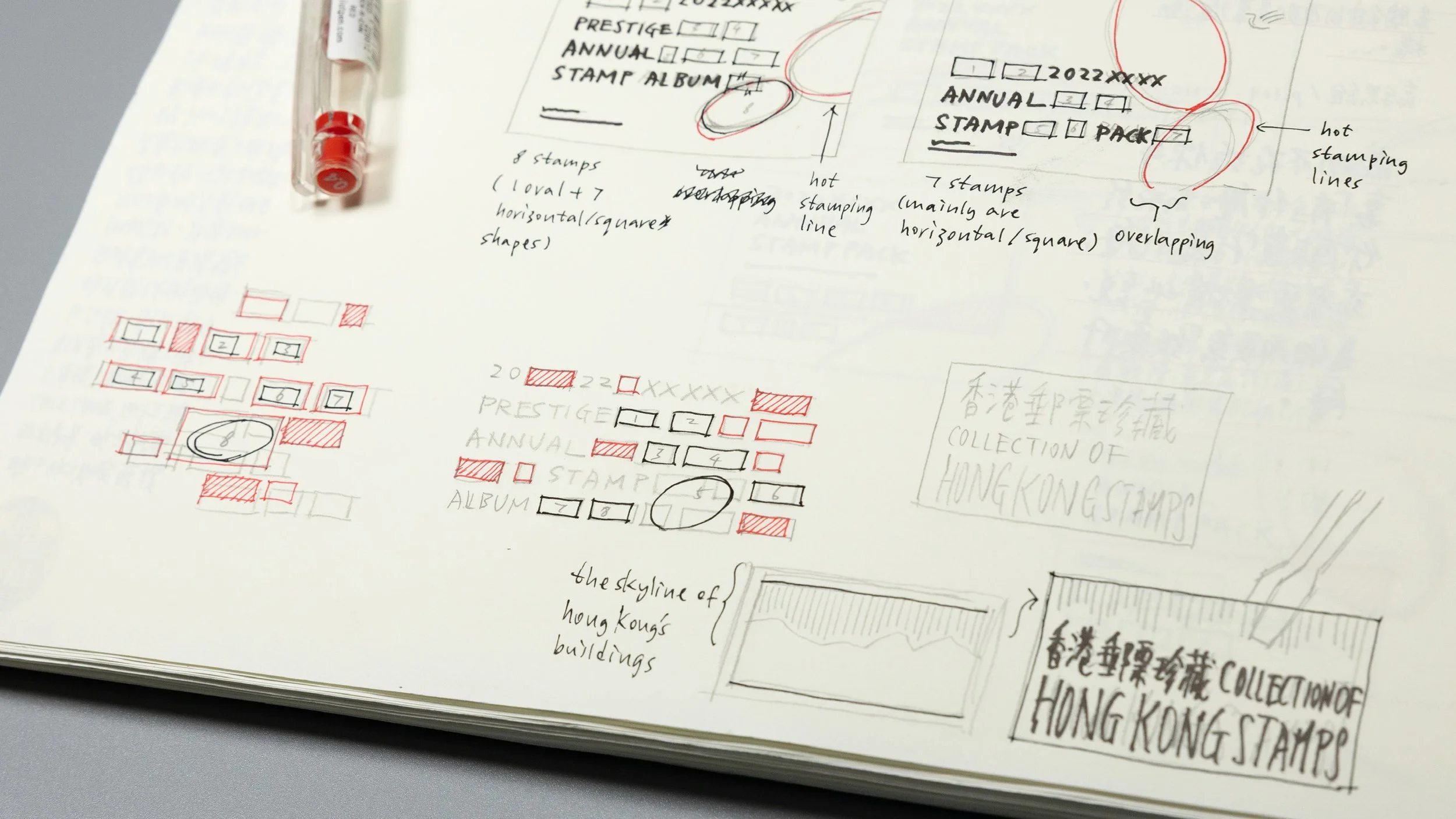
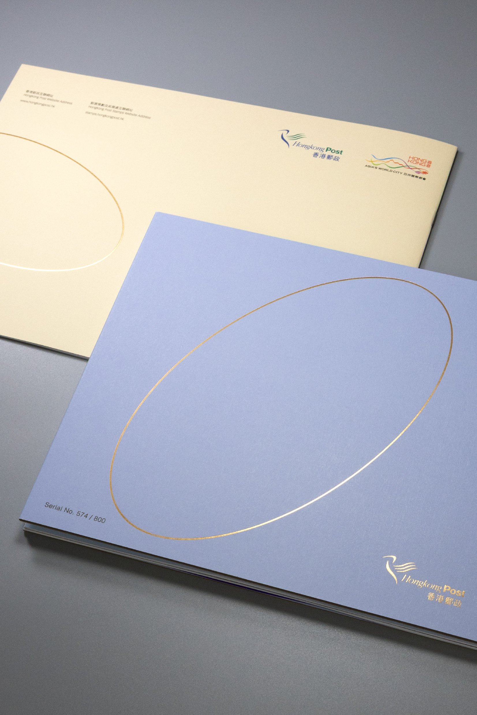
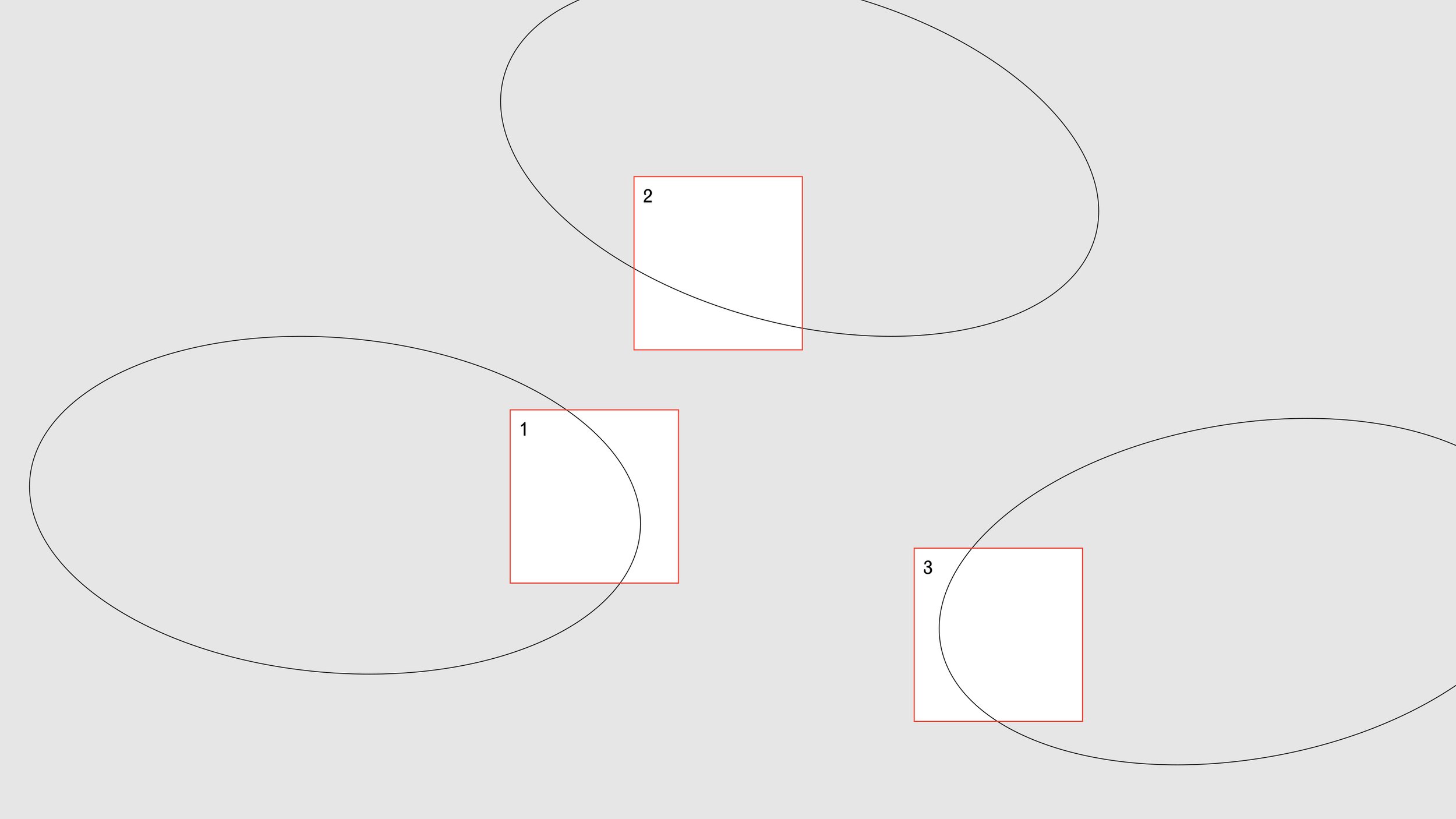
On the one hand, a concept is full of creative possibilities, but on the other hand it can be so hard to interpret when it tends to an abstract direction. We began with a simple geometric form — an ellipse, which is often utilized by many astrophysicists to visually describe and explain their newly proposed or advanced hypotheses, particularly on the space-time continuum topics. Using such a simple graphic form to express the most elusive idea was already a big leap within the creative development.
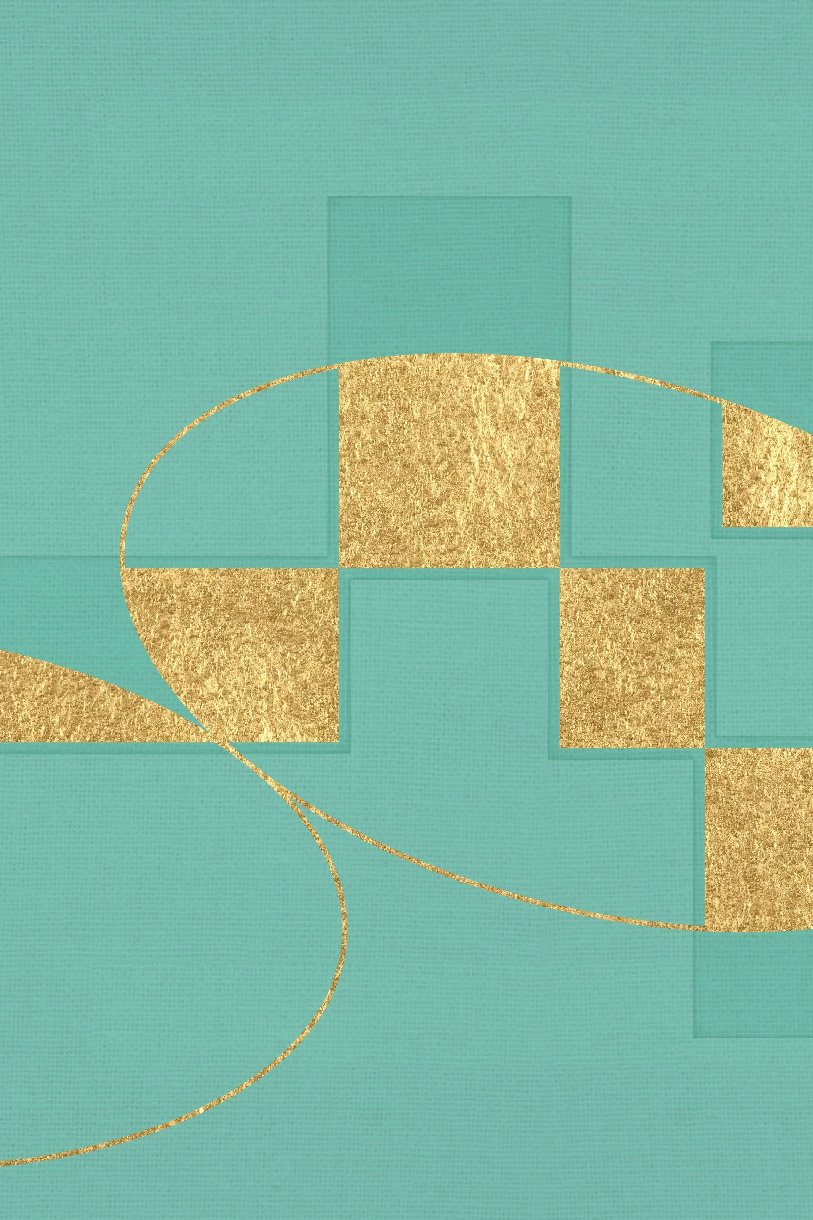
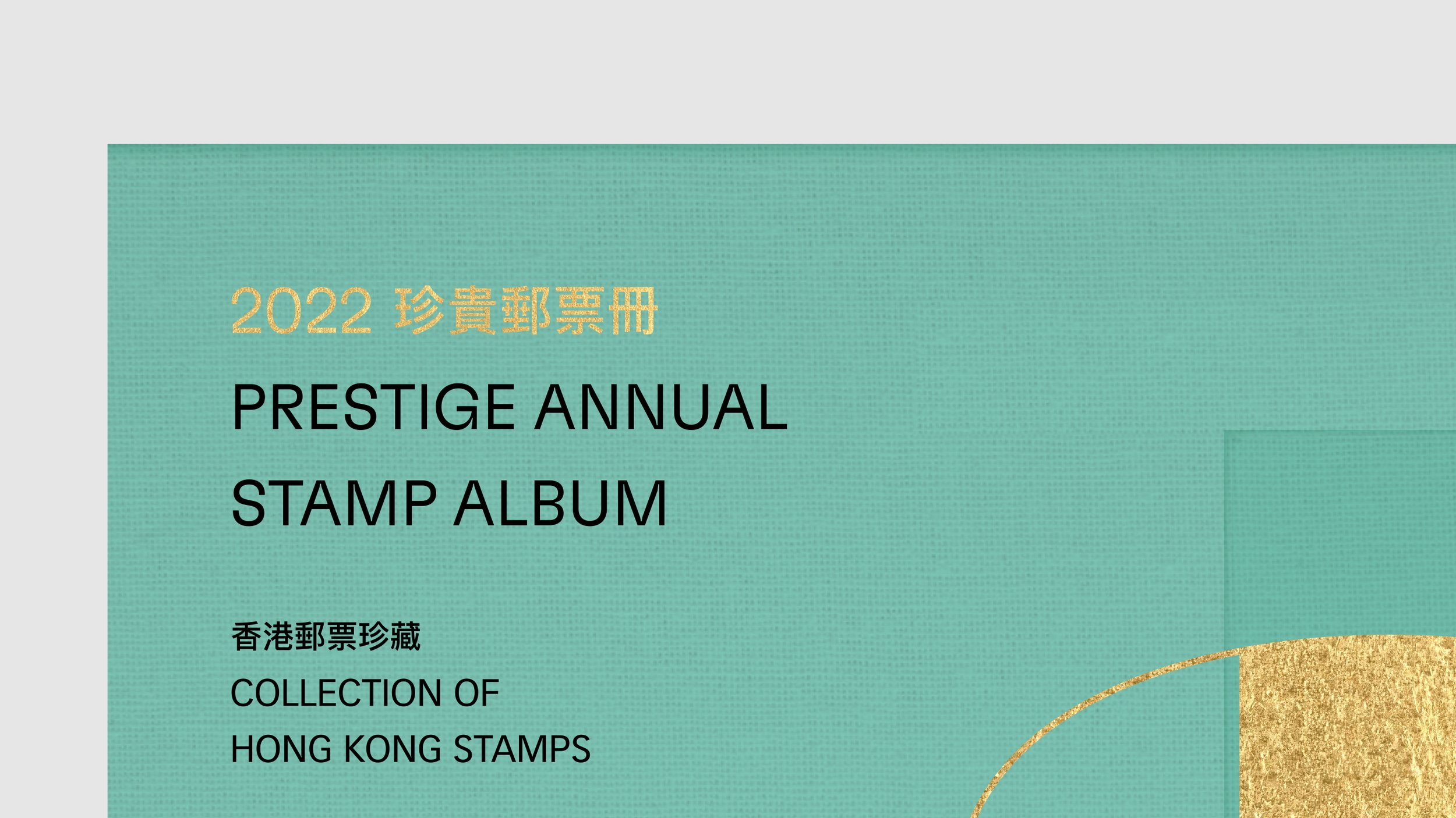
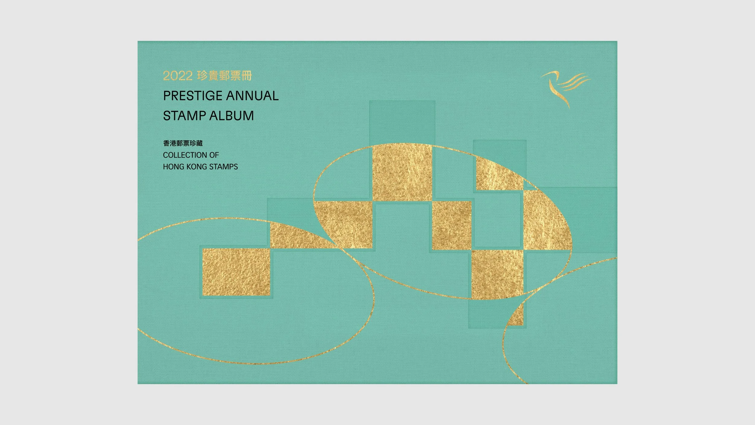
/ Demonstrating the printing techniques particularly for the album, like textured paper mounting, gold hot foil stamping and debossing
The positioning of the book design we set was aimed at appealing to philatelists. We made this proposition right after we had a preliminary progress meeting with HKP to assess and learn from other stamp albums from around the world. We realized that the true value of the annual stamp albums was how to wisely package the stamps with a coherent yet simple idea and high-quality bookmaking.

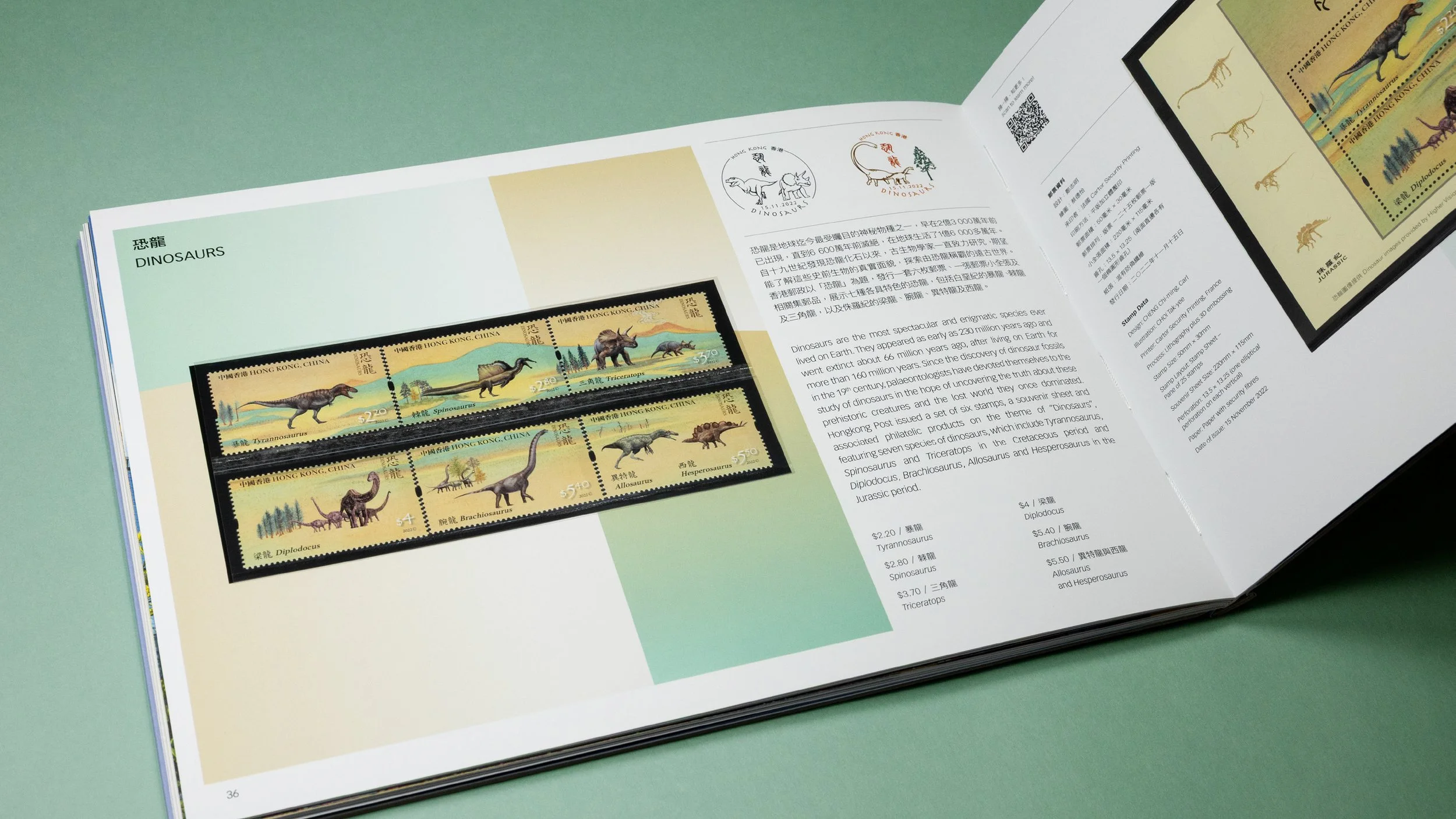
One of the stamp themes — “Dinosaurs” out of the 13 series fit well into the concept of space-time travelling. The dinosaur itself is already a striking hero image, together with other beloved stamp themes, they creating an incredible visual combination that perfectly unveiled the design idea of the album and pack. Nevertheless, this preliminary idea was not preferred and accepted by HKP. In fact, there was an unwritten agreement or rule that the annual stamp album shouldn’t highlight or promote any stamp theme regardless of differences in size or visual treatment. We then tweaked the design to adjust the focus on other design elements like the title and typography.
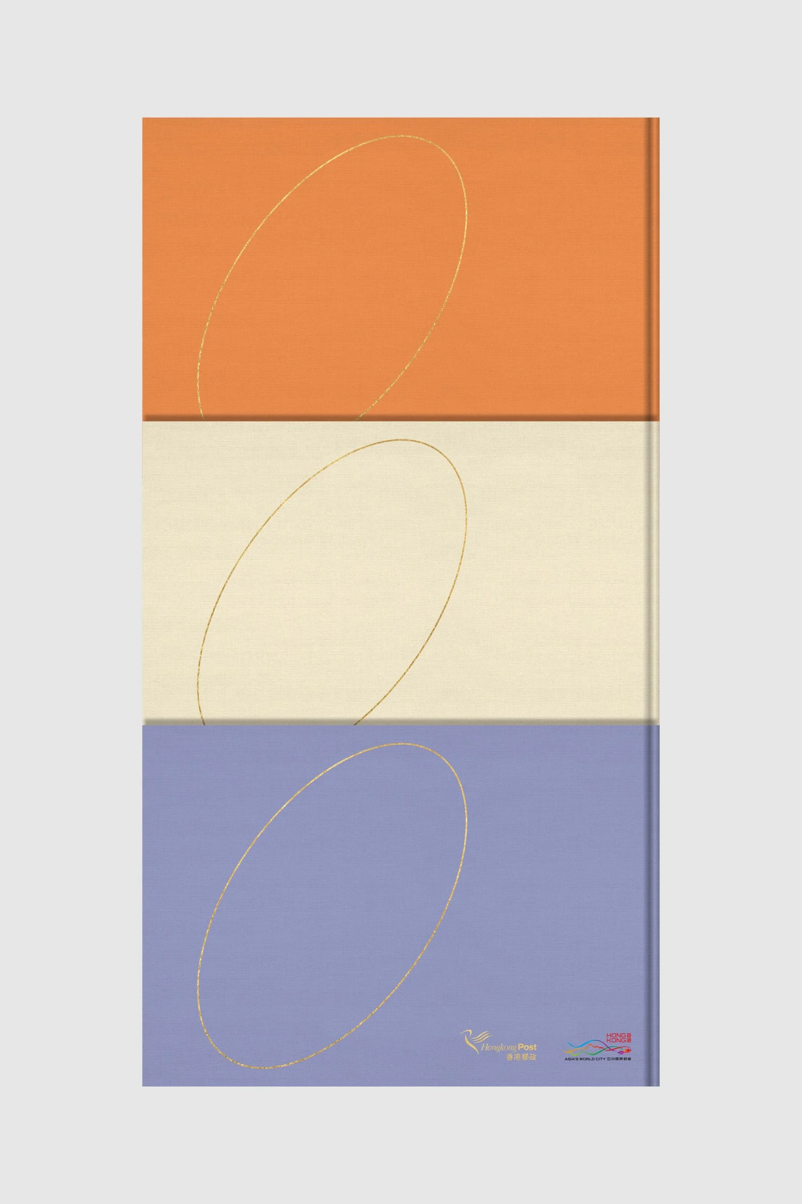
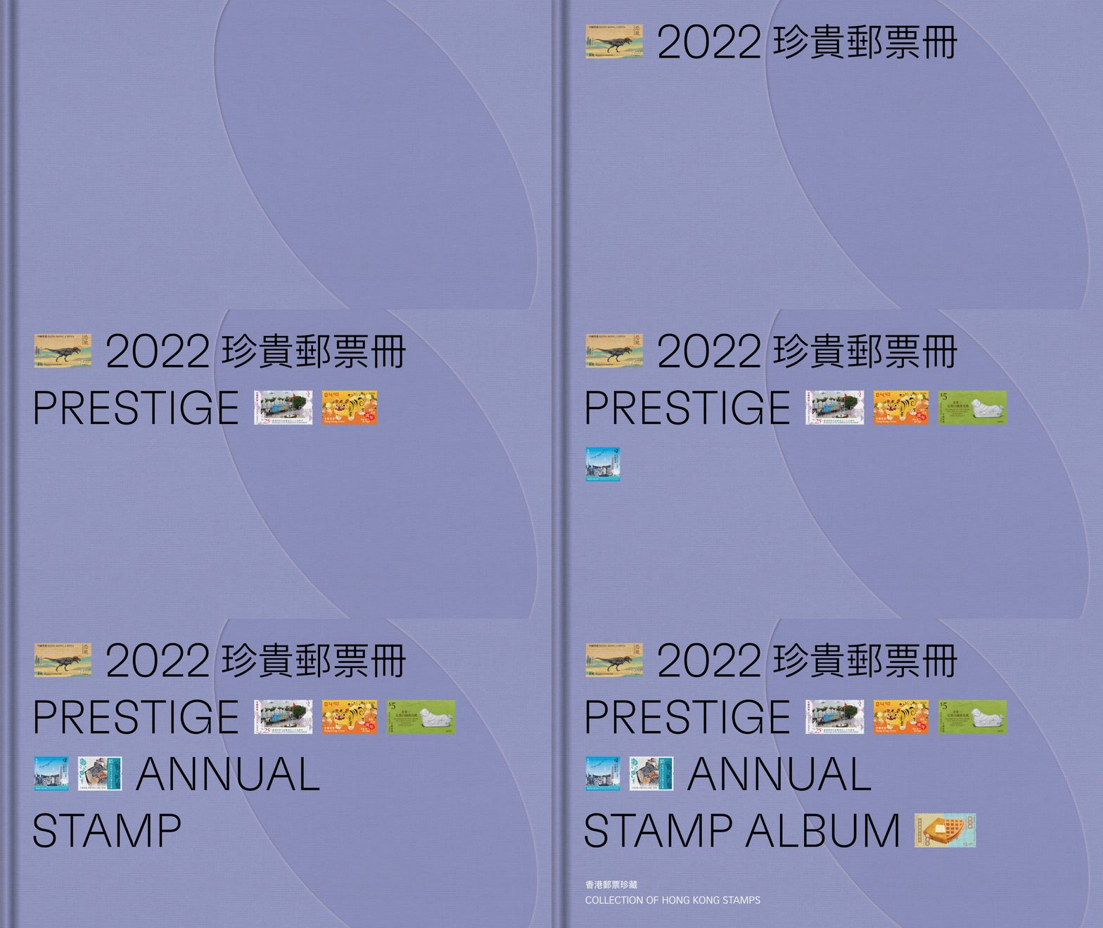
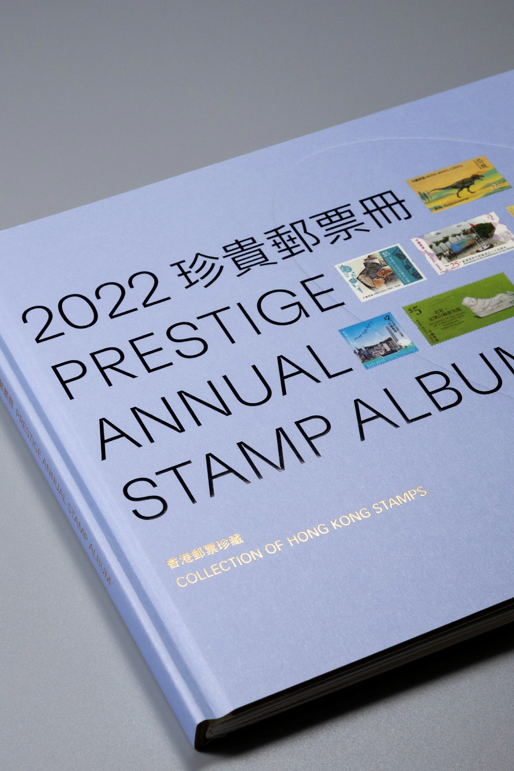
/ Light purple was selected for the stamp album eventually
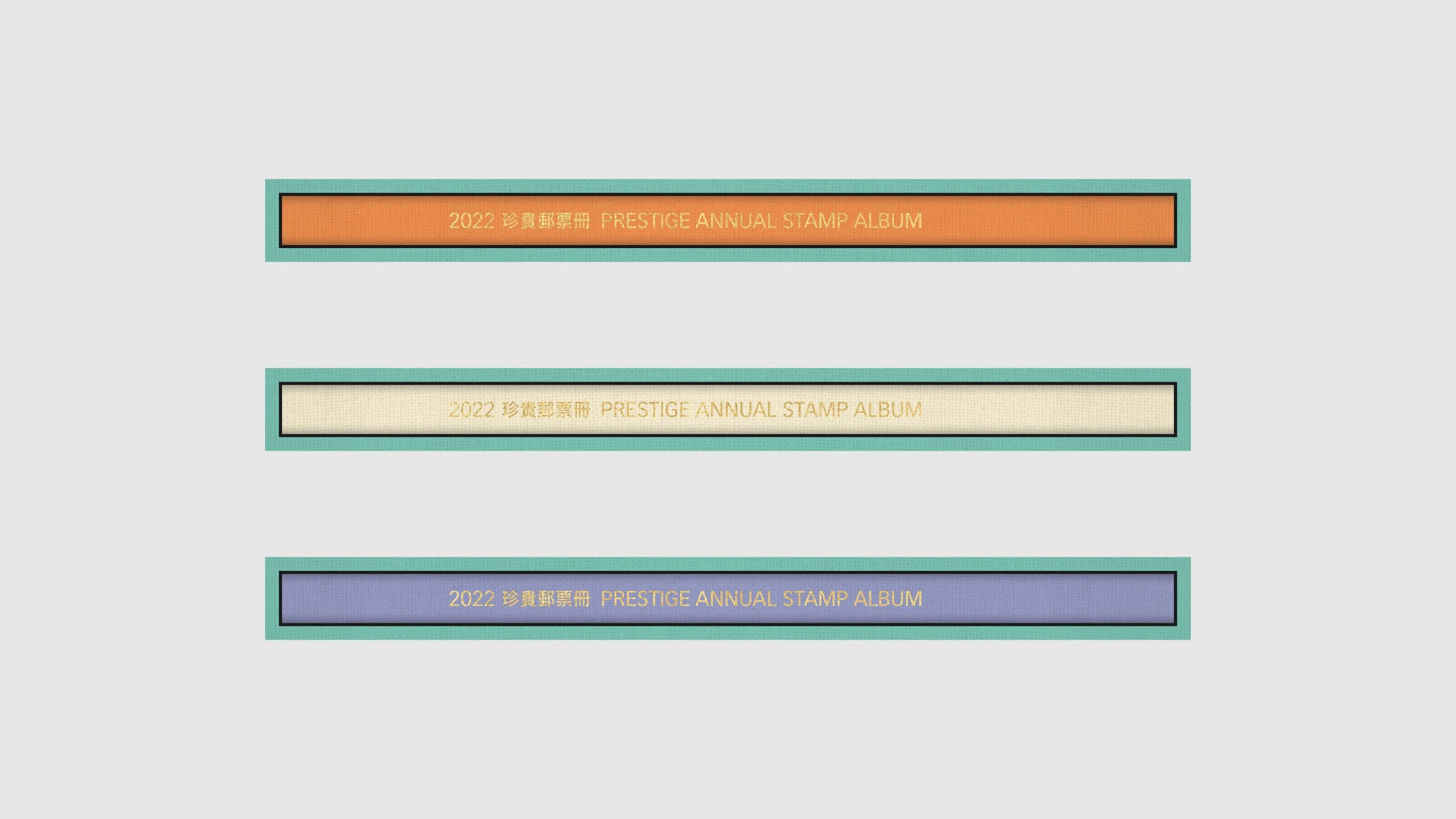
Indeed, the interrelationship between the ellipses and varied proportions of the rectangular stamps is surprisingly fascinating from a design perspective, which is more than a graphic interpretation but also a visual identity system if further developed. In the light of this new understanding of the concept, we eventually found a more holistic design solution for the annual stamp album with its deluxe edition and the annual stamp pack.

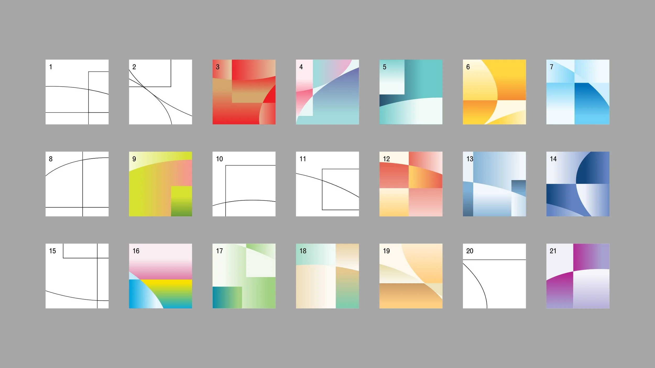
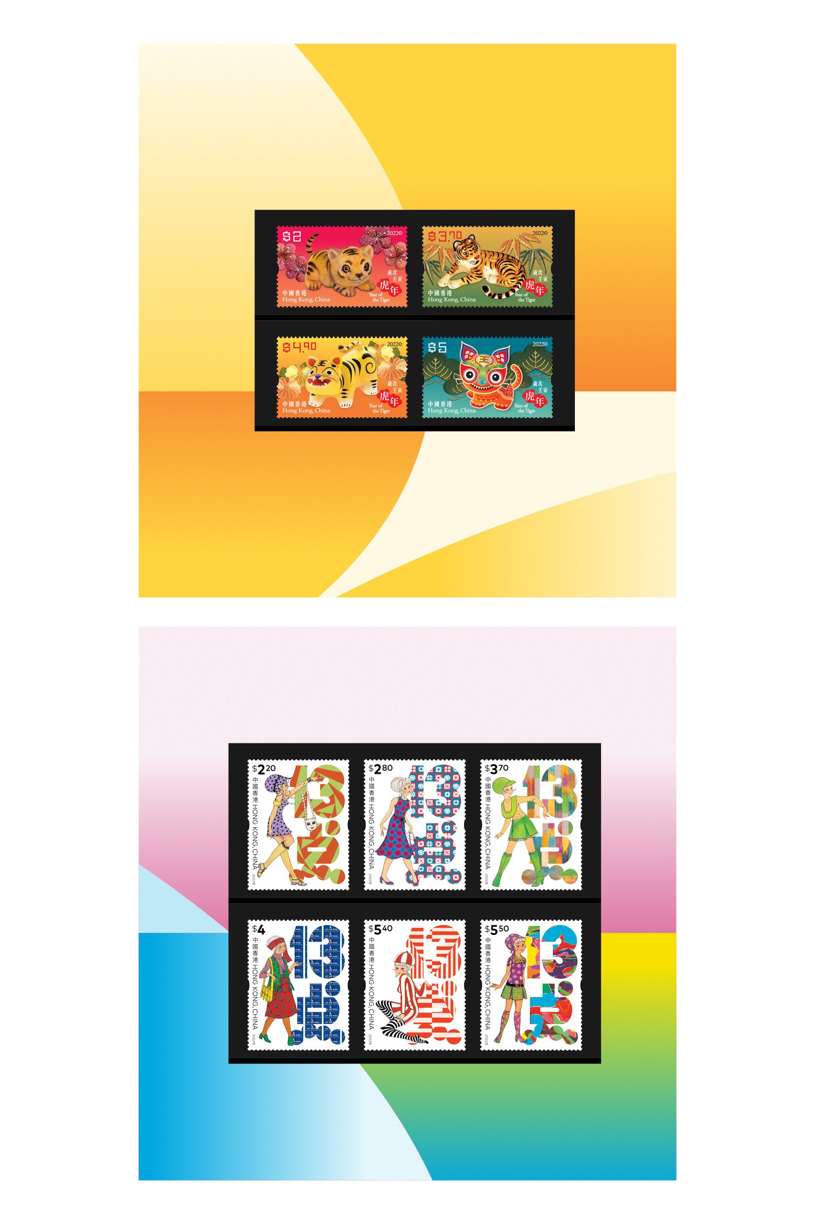
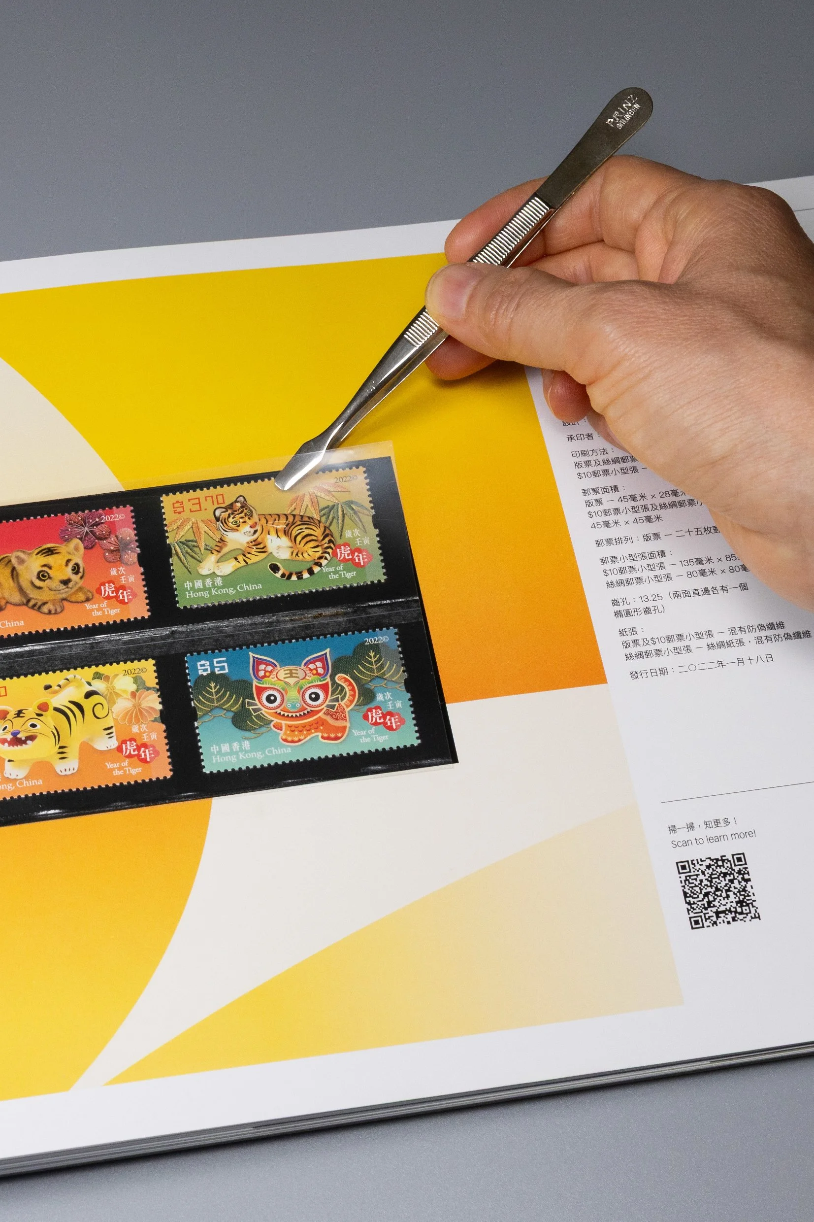
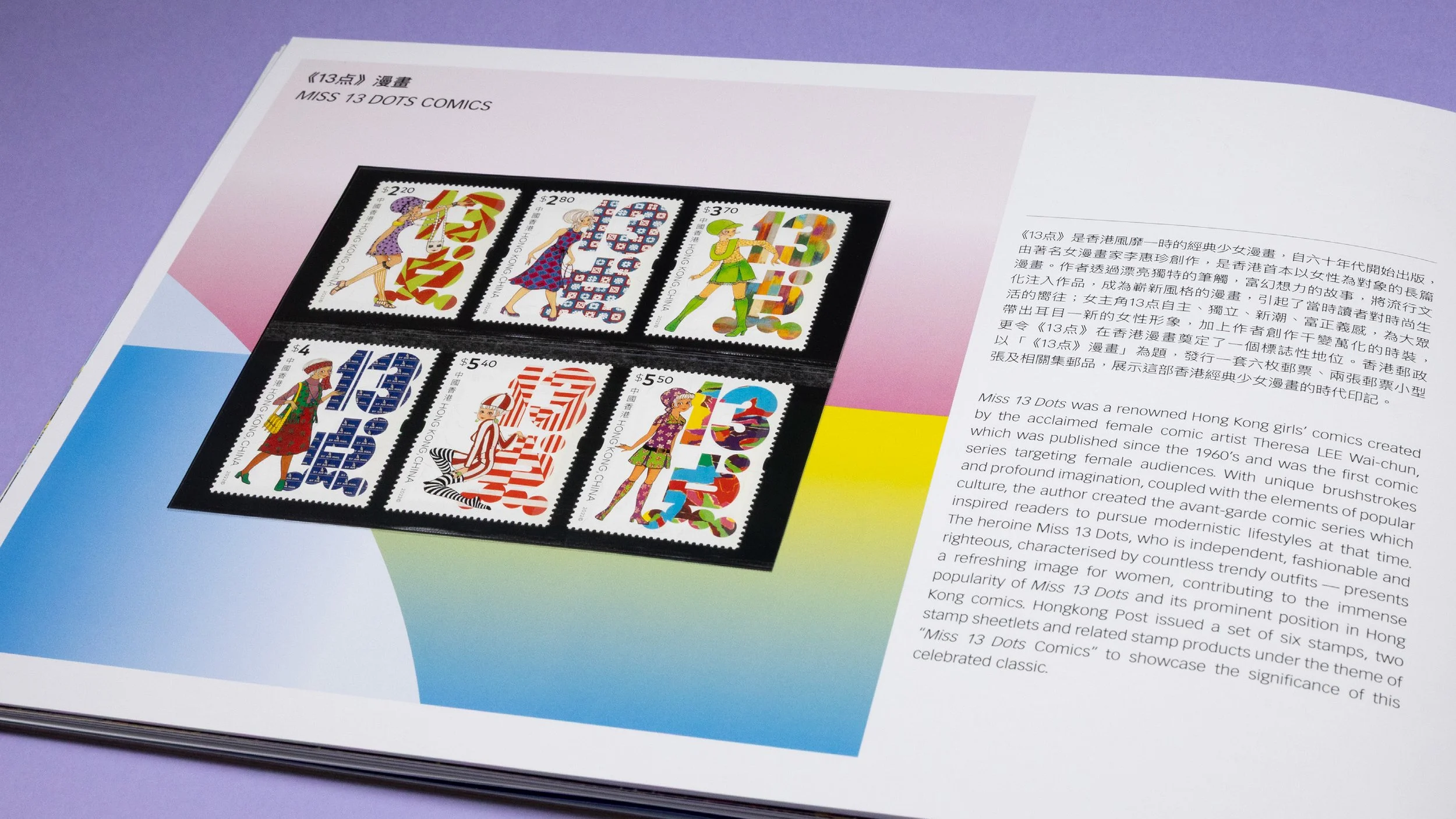
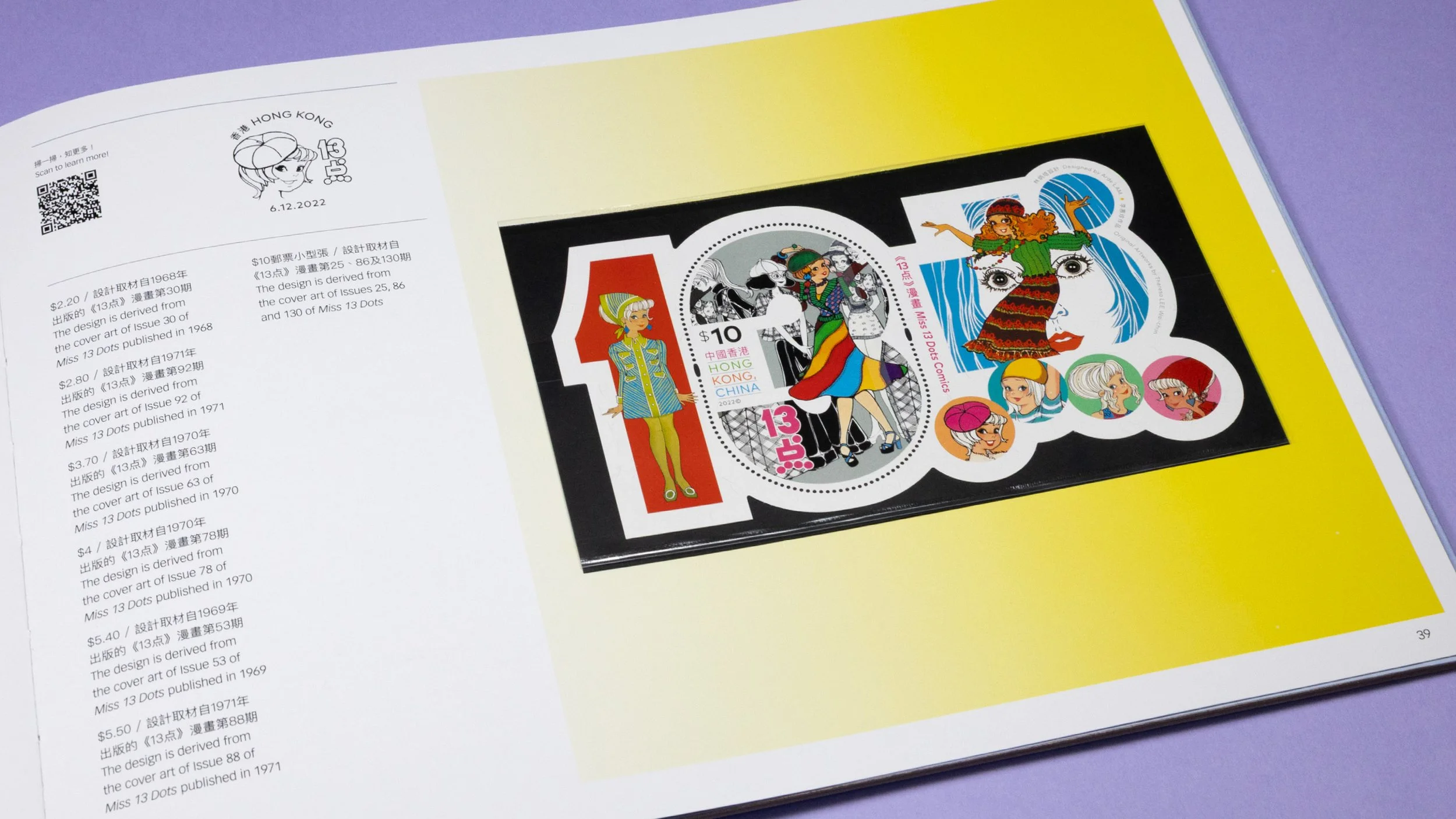
/ Varied cropping of the space-time travelling geometric forms for the usage of supporting graphics in presenting the stamps
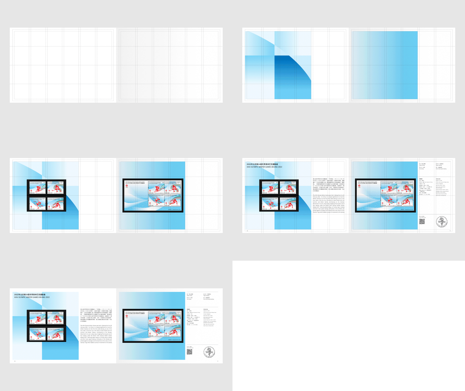
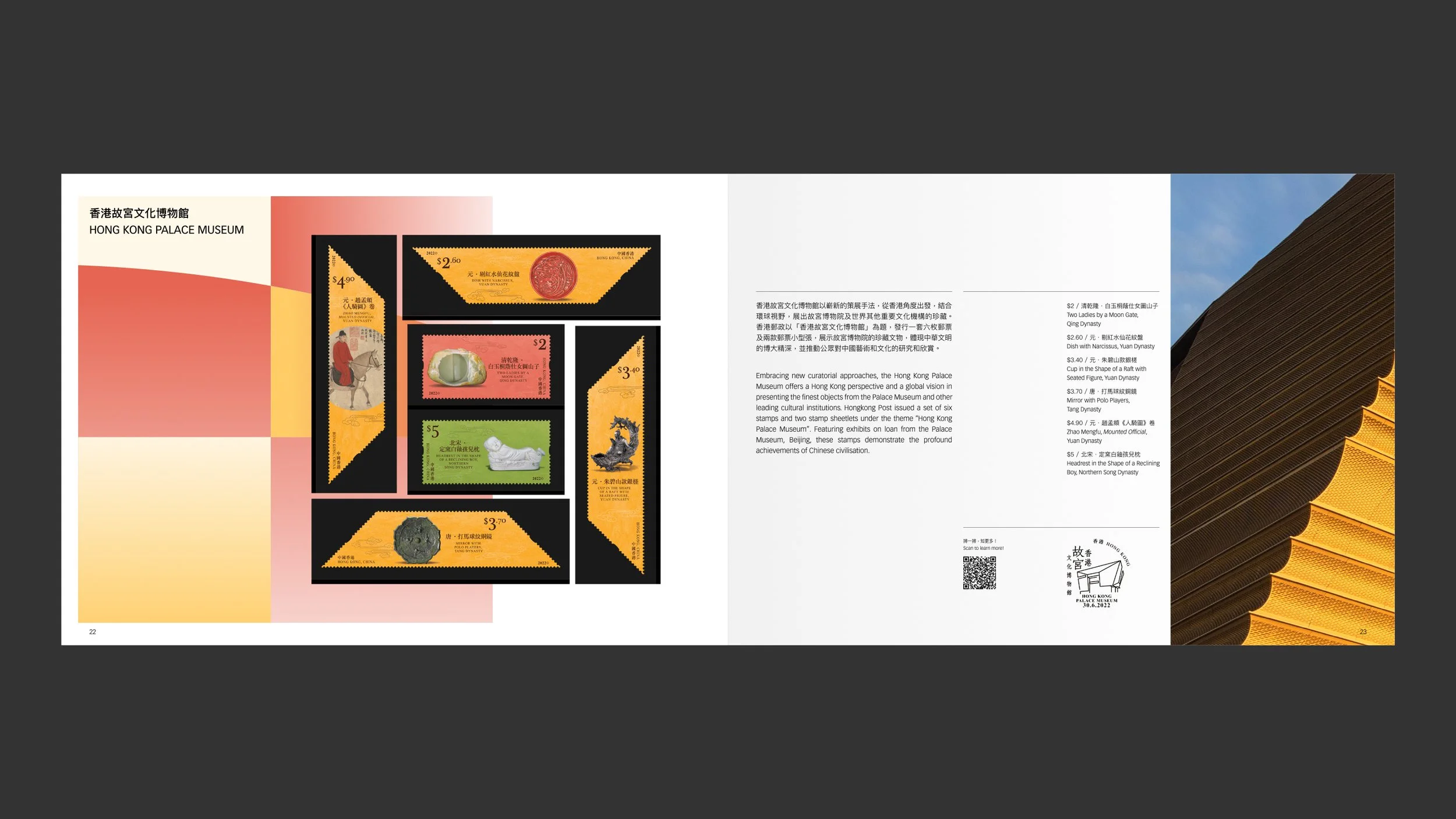
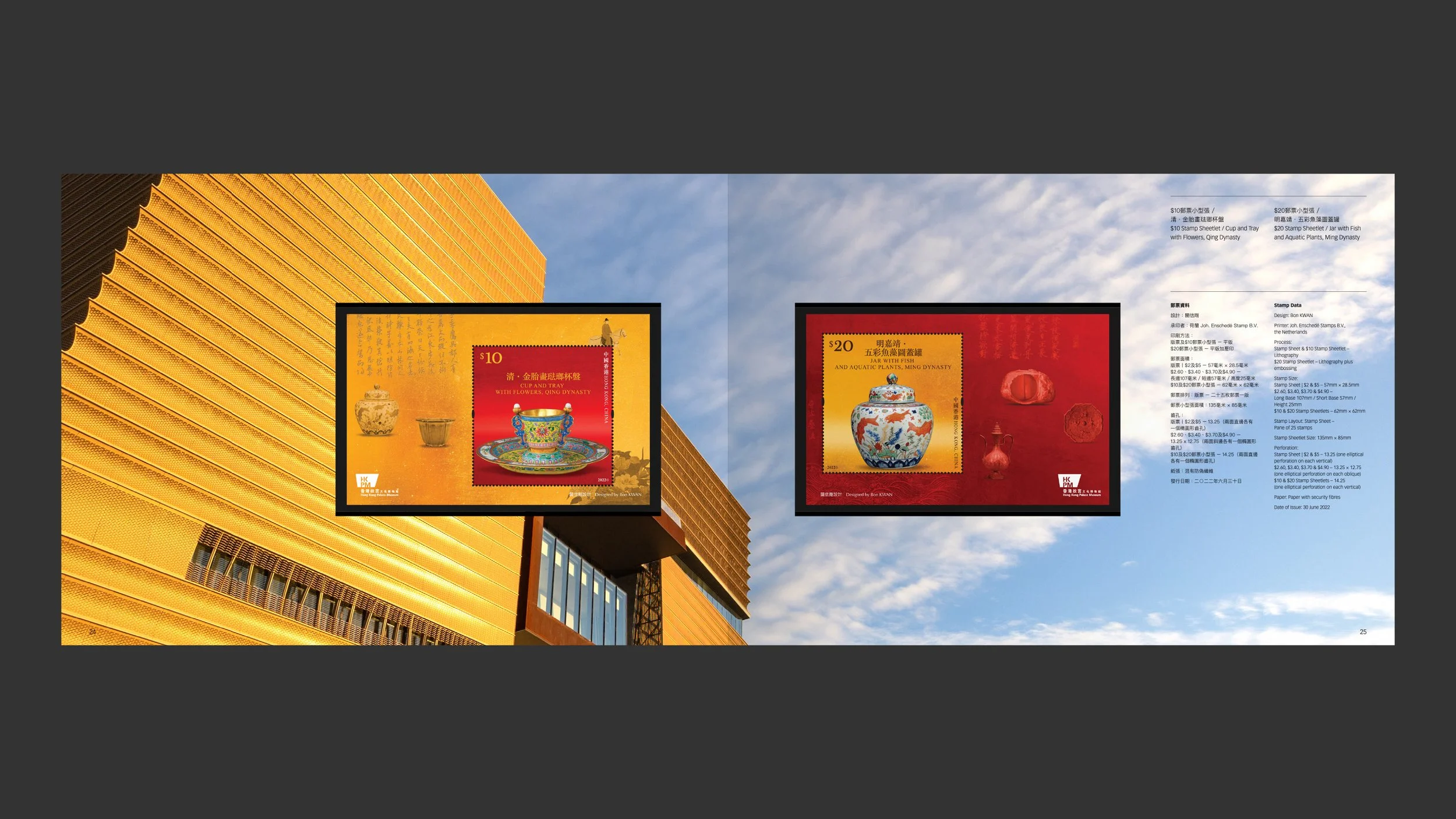
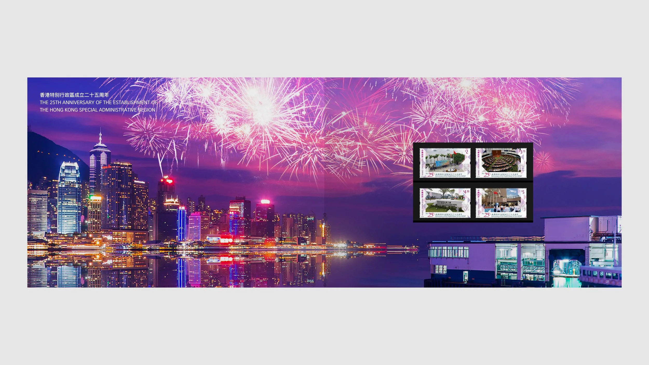
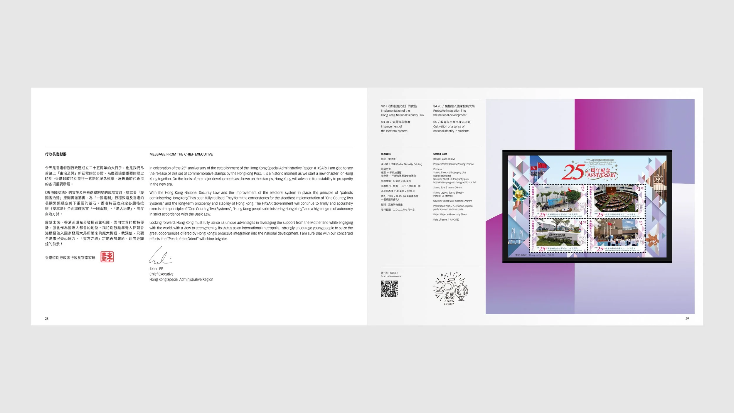
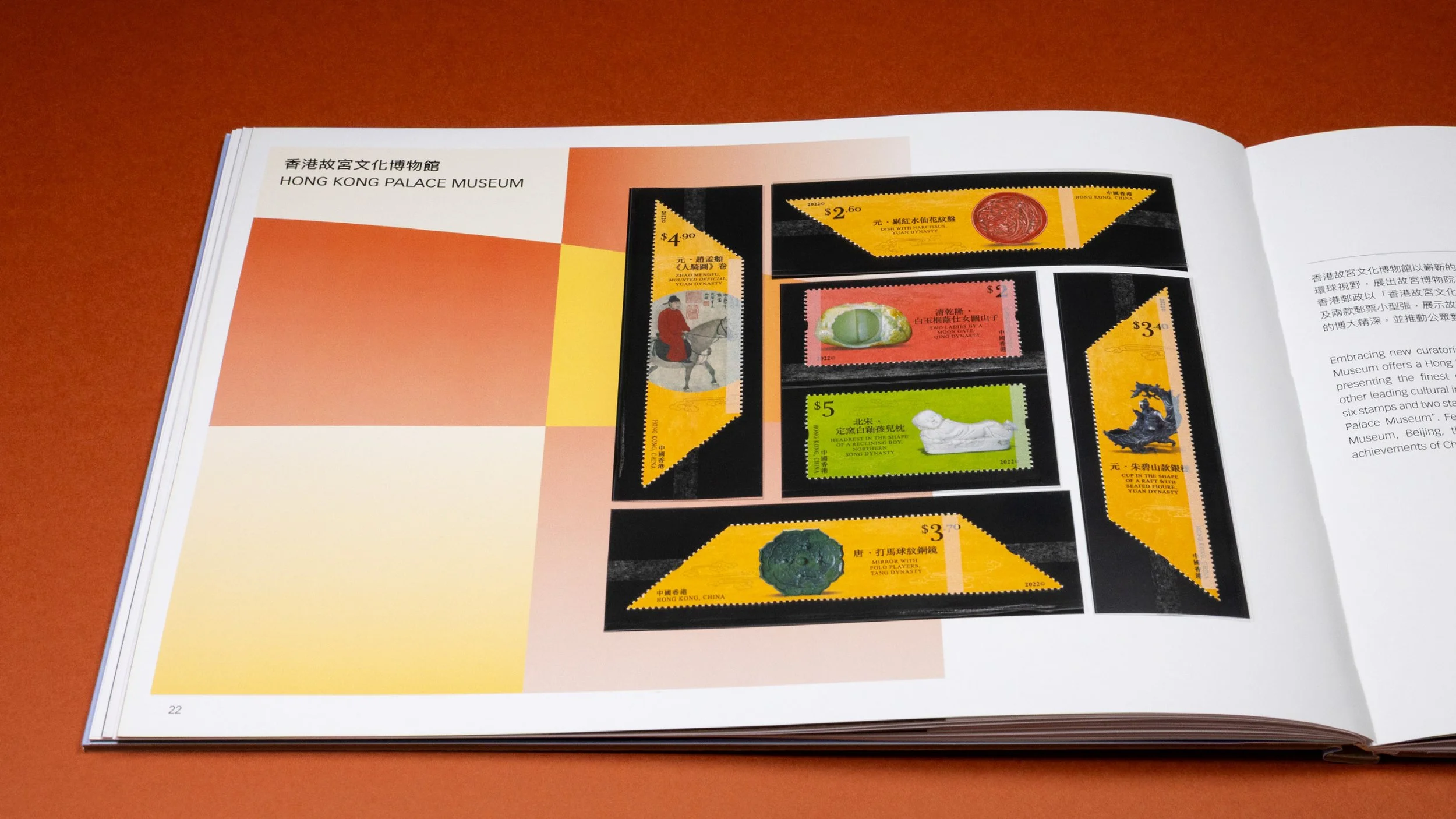
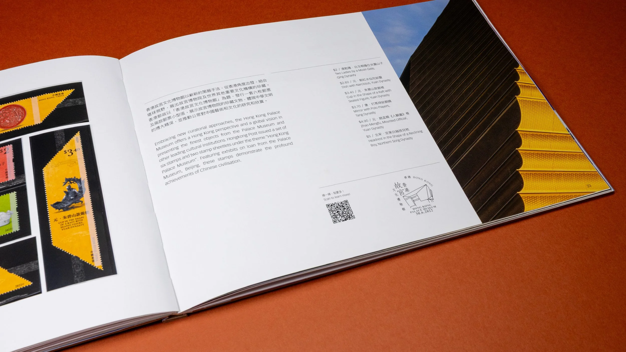
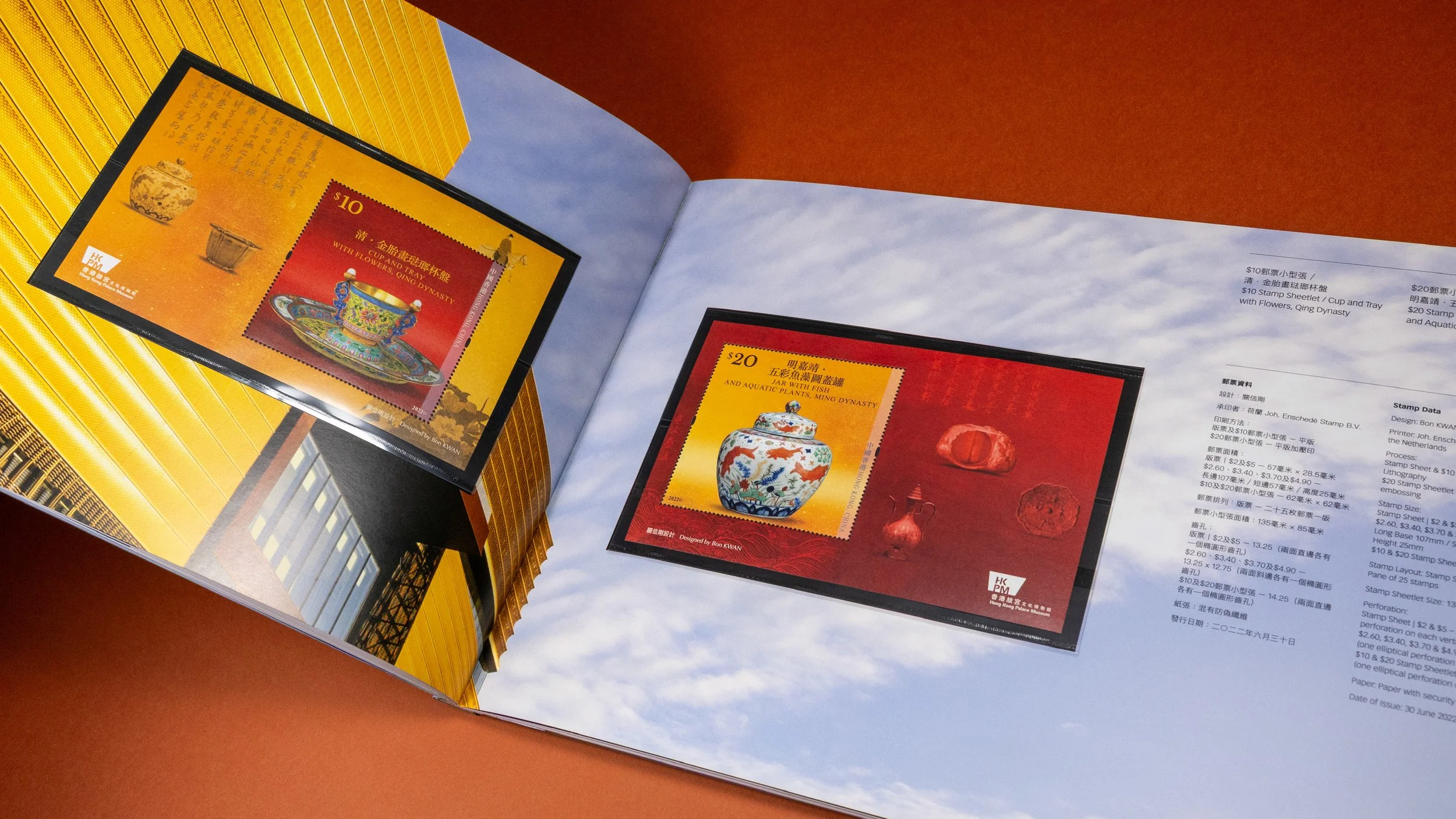
/ Utilizing the supportive hero images to enhance the particular stamp series in the album (as demonstrated above, “Hong Kong Palace Museum” and “The 25th Anniversary of the Establishment of the Hong Kong Special Administrative Region”)

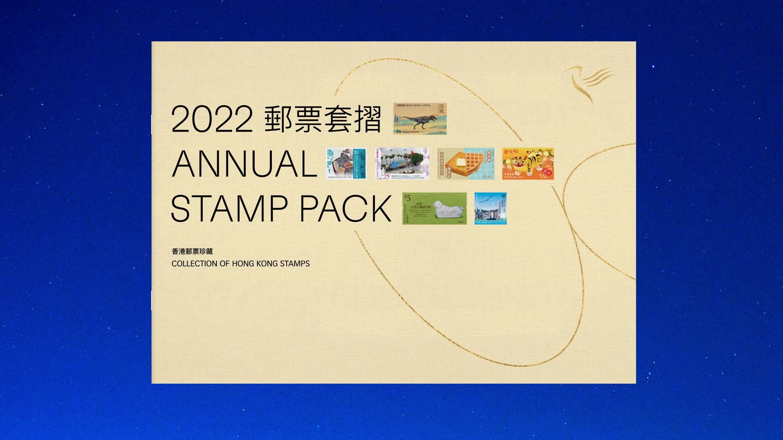
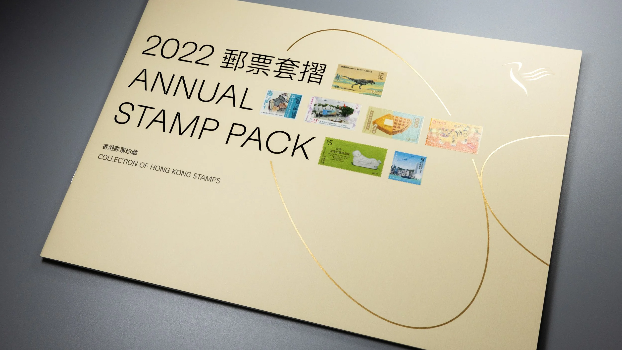
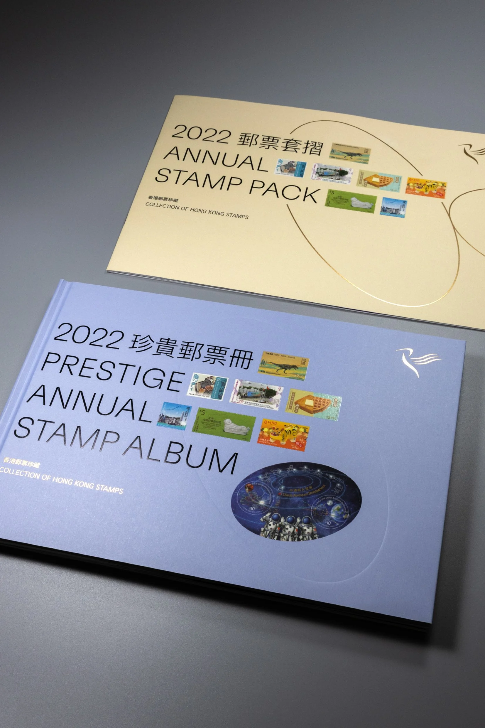
/ The stamp pack is a more concise yet essential version of the album



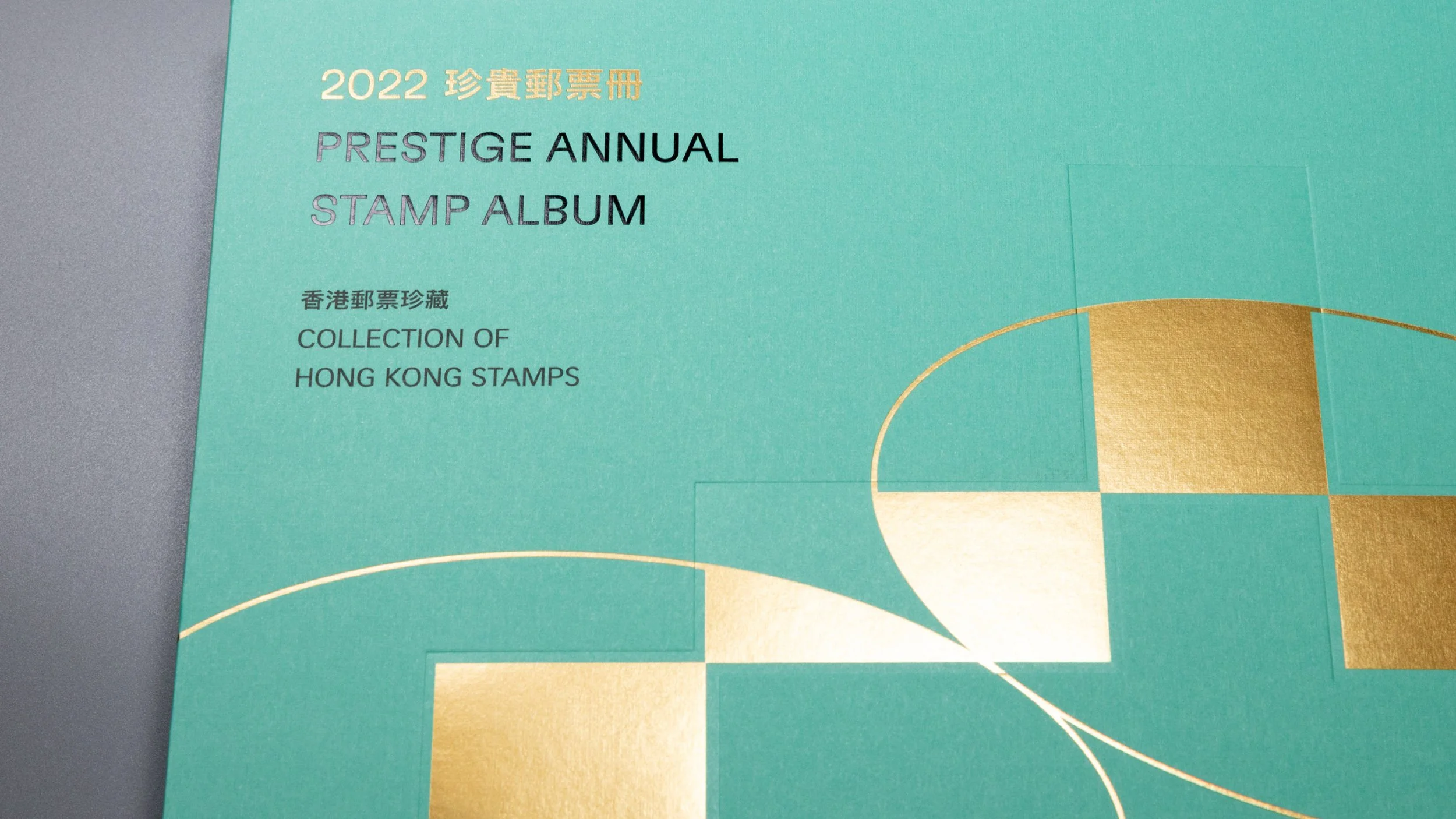
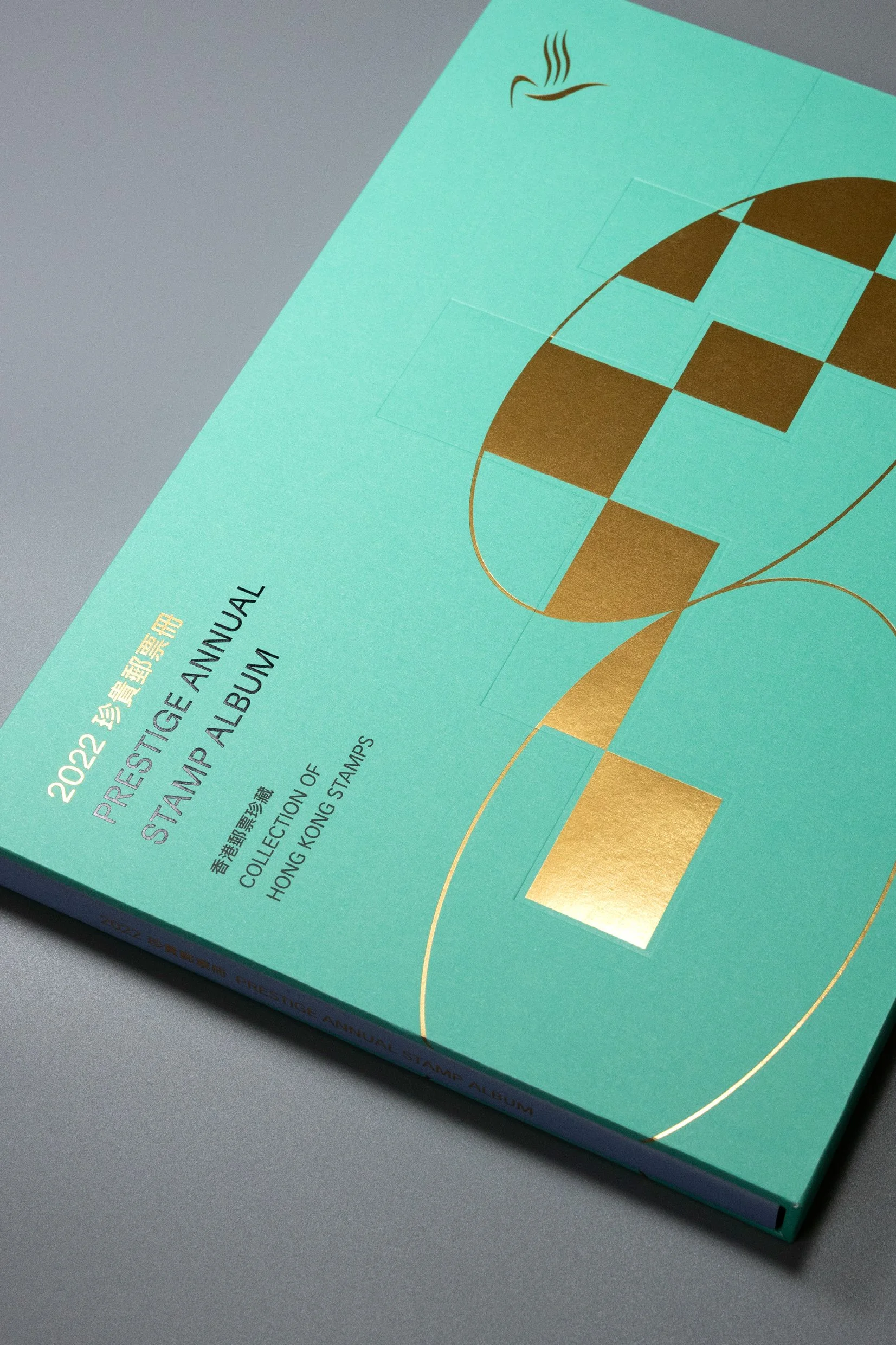
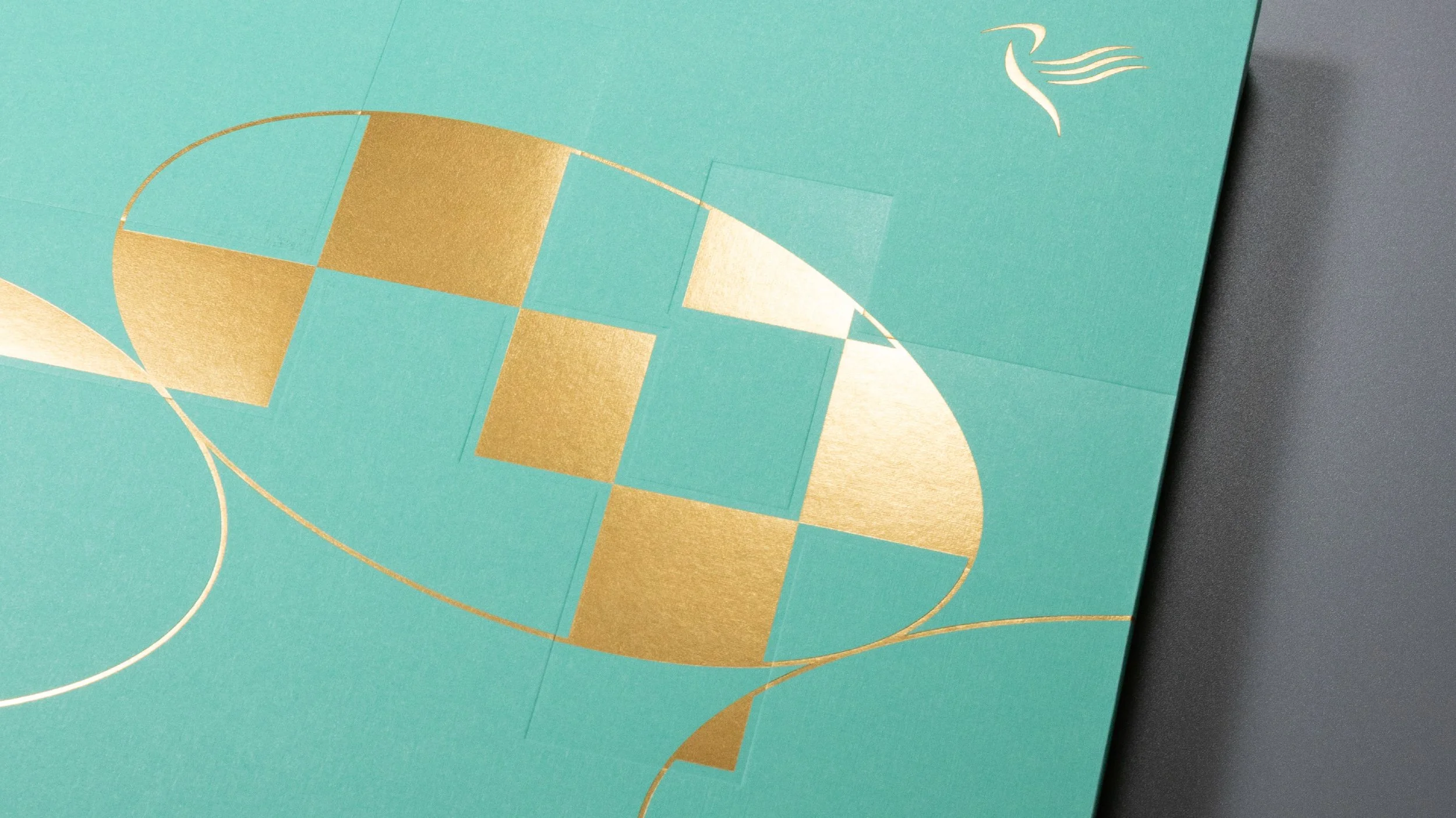
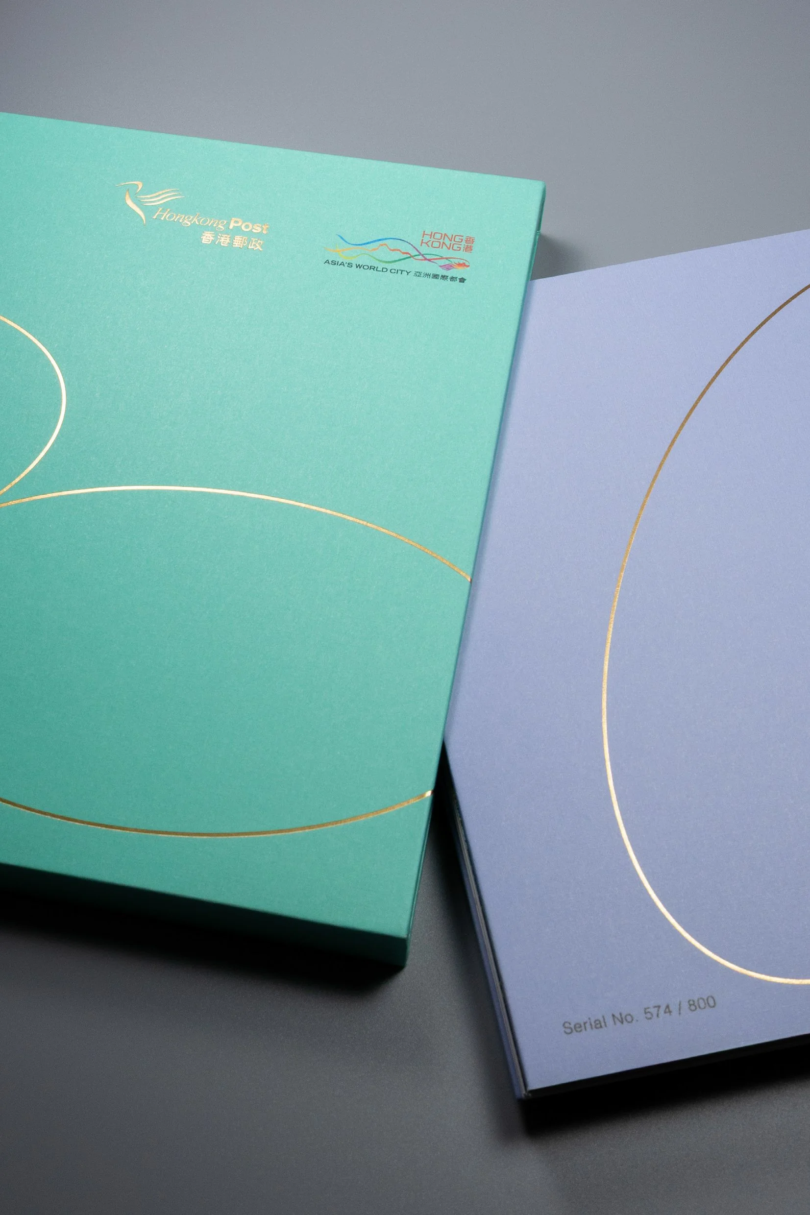
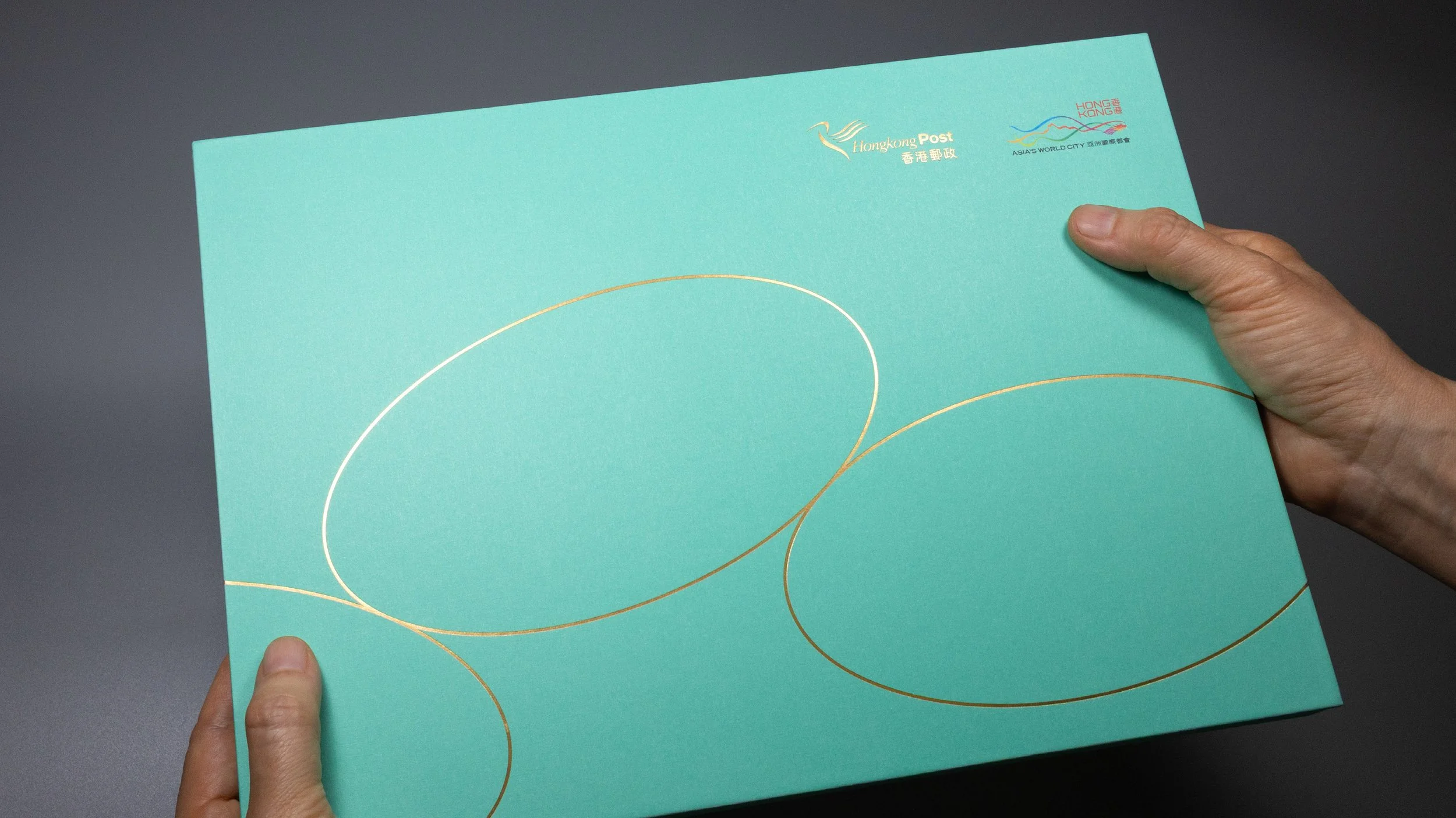
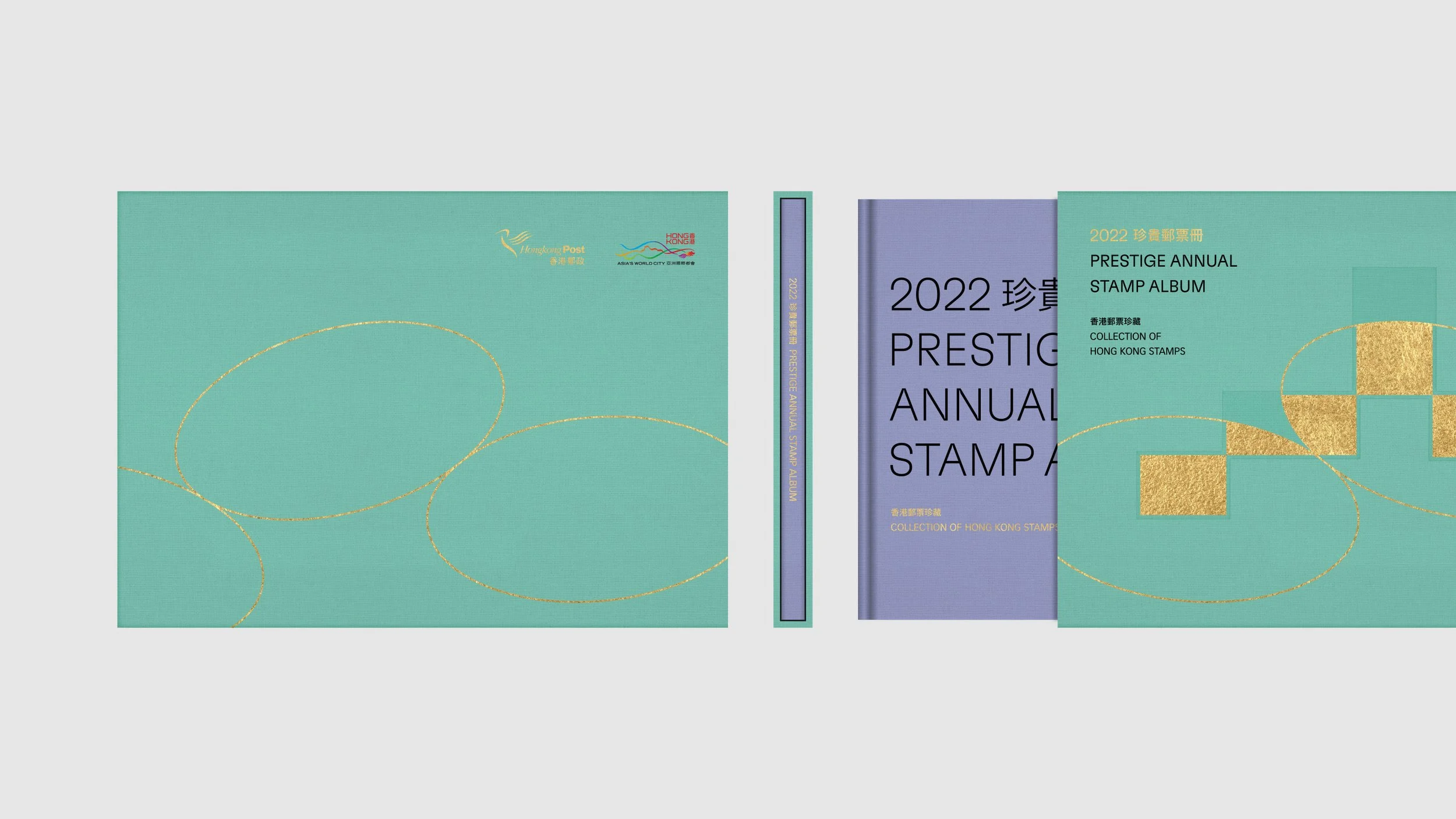
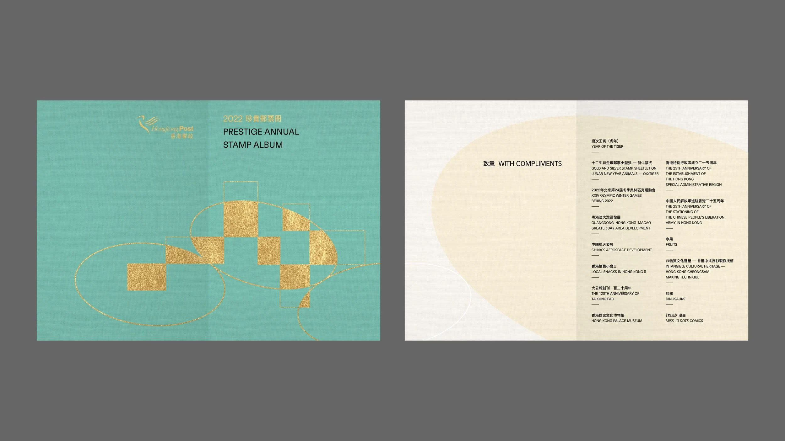
/ The actual published stamp album box set (limited deluxe edition) and the stamp pack
There are 8 selected stamps from 8 themes printed on the stamp album’s light purple hardcover, following the title lines, they are positioned directly after each line. All of these then cross through a large, slanted ellipse centered on the cover. Moreover, we designed an exquisite yet stylish thick textured turquoise cardboard case for the album’s deluxe edition.
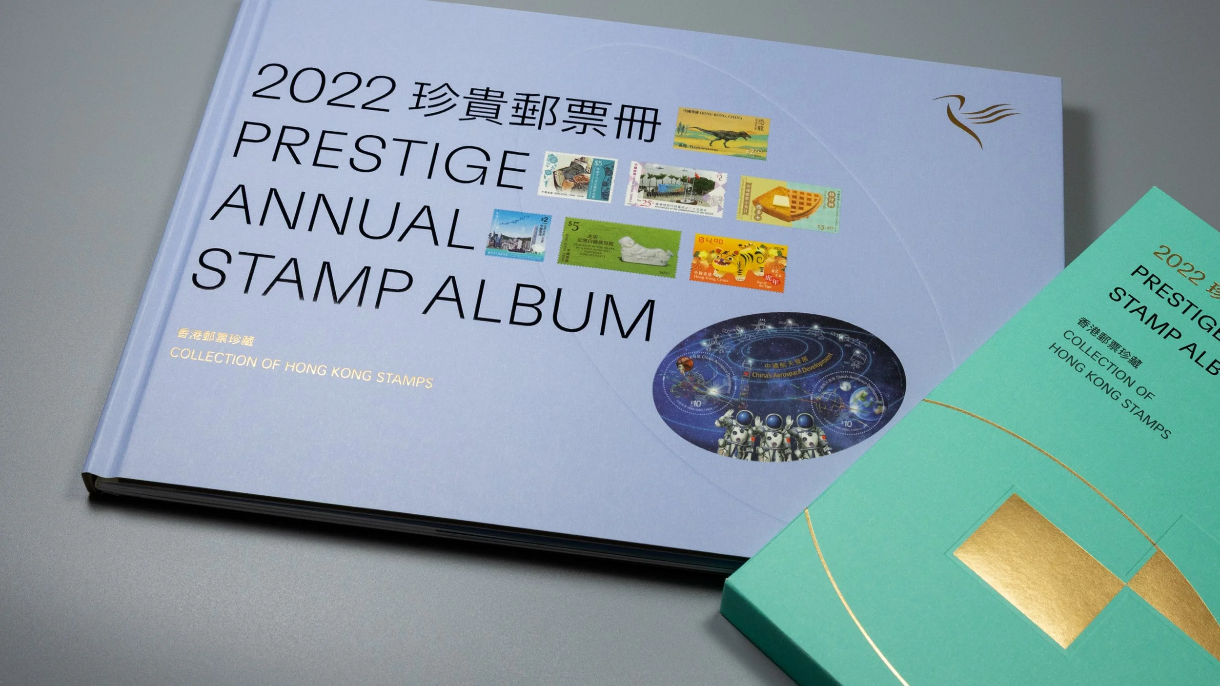
Actually, this pair of colours — mint green and light purple is the pastel version of HKP’s corporate colours — green and purple, which reinforces their brand identity. However, the light purple can be quite tricky to adopt sometimes, so we have also tried pumpkin and apricot, both of which are the ideal colour options for the album. In the end, we decided to leave apricot for the stamp pack, which features almost the same cover design as the album but just 7 stamps/themes on it, and uses textured card paper instead.
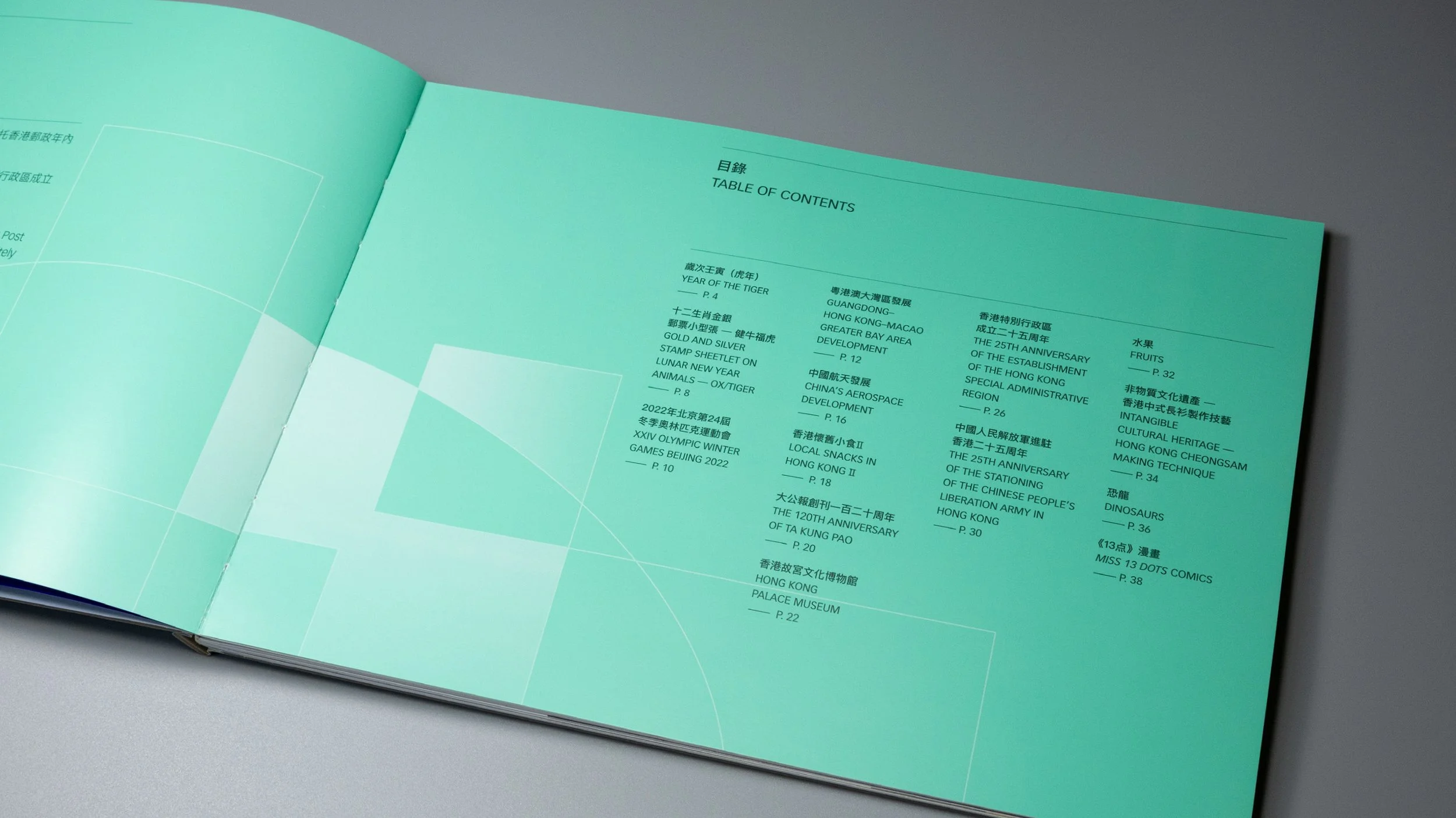
For the printing craftsmanship in these books, particularly for the album and its limited deluxe edition, spot varnishing/UV, gold hot foil stamping and debossing are utilized. Besides, Smyth-sewn binding we believe is the best and the most decent bookbinding technique for the album because it allows people to open the book wide and lay it flat in order to see the stamps and enjoy reading, as well as its durability.
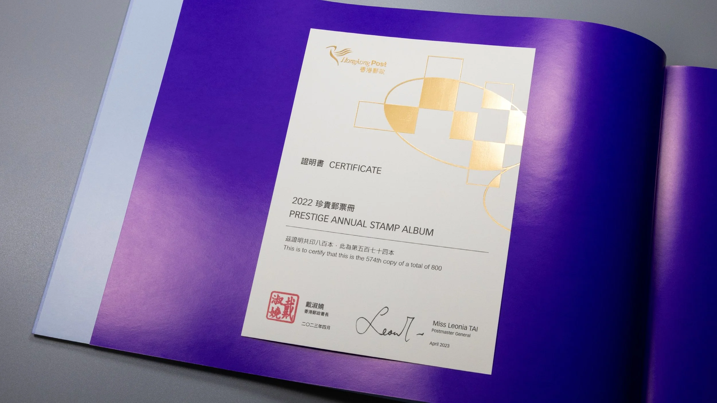
/ A deluxe edition of the album, limited to only 800 gift boxes, which feature the Postmaster General’s signature on a custom designed certificate that is similar to an elegant bookplate