Seeing the parameters of creativity
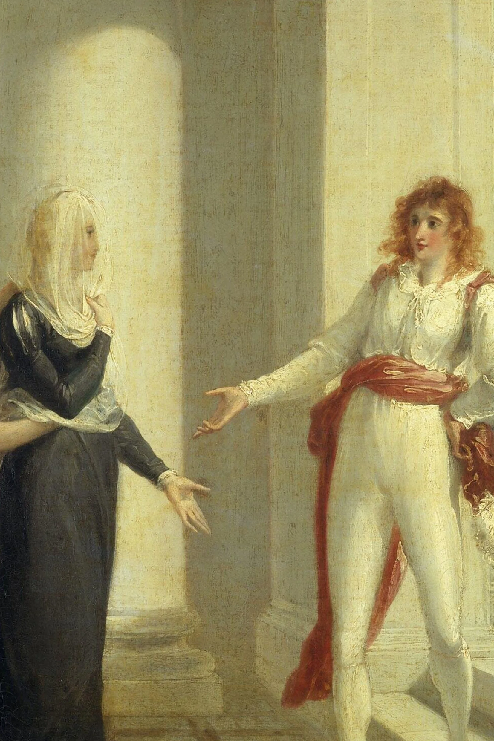
To appreciate the beauty of creativity is rather a kind of cognition or even an intelligent, in spite of how elusive and mysterious they can be. We don’t have Viola and Sebastian, sheerly not “What You Will” by Shakespeare either, here are the crucial episodes of our creative developments instead, which happened recently or finished years ago, as well as some significant projects that we have participated in the past, not to mention to take a peep at few on-going ones, they all are the unique chapters of our story.
We have been exploring the borders of creativity and testing its possible limitations, usually call it “trial and error”, or may be a better word — experimentation. In order to push things forward, we keep discovering the new and never stop questioning the old at the same time. However, such creative & exploratory practices are extremely easy to get stuck or frustrations but highly worthwhile to a certain extent. People tend to greet the accomplished or completed stories like the eleven projects we have shared in the Work section, which perfectly portrayed what we did and how we work.
Anyway, to know the unknown and knowing it afterward is the essential process to gain new inspiration in our case, which also the most intriguing part within the entire creative development. Get down to fundamentals is the key no matter what the project is, in fact, this is always a good way to unleash the latent power of creativity and reap new perspectives, which sometime let us have a chance to catch a glimpse of success, even though it is still an unknown.
Attempting miracles after all —— the Twelfth.
Branding simply put, imagine
A universe of projects
Here we time travel back and forth and thoroughly not in chronological structure. In fact, there is a resemblance among the stories that they are right in the midst of their journeys, some just got started and some almost reach the finale but struggling not to be off-track, few had just settled. In addition, some had entirely completed over a decade, which were before FA but the prequel of it, indeed we had greatly participated in those stories of yesteryear even though we were only part of them but can’t be ignored.
Project 34 ——
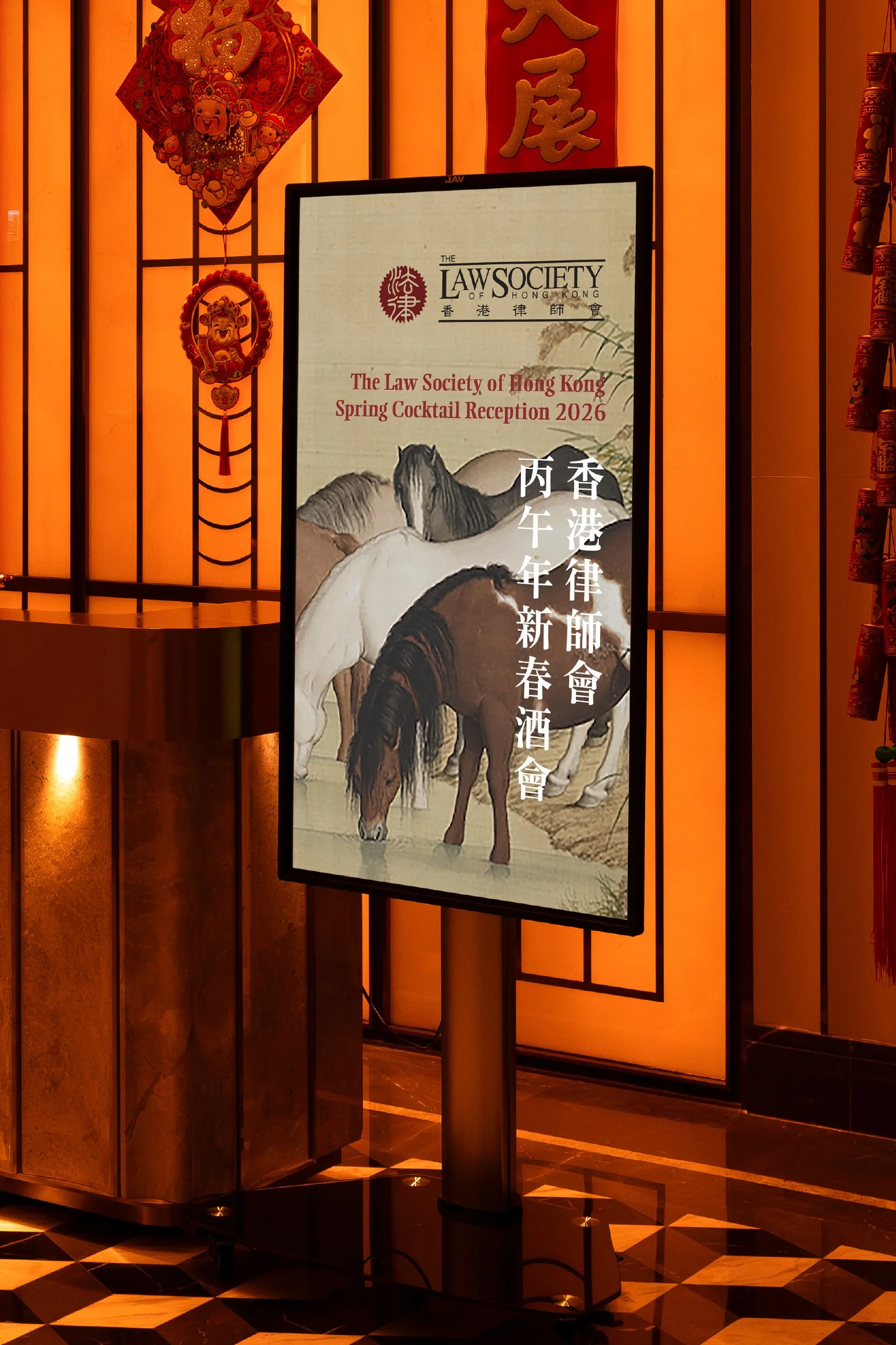
LSHK Spring Cocktail Reception 2026
(design proposal)
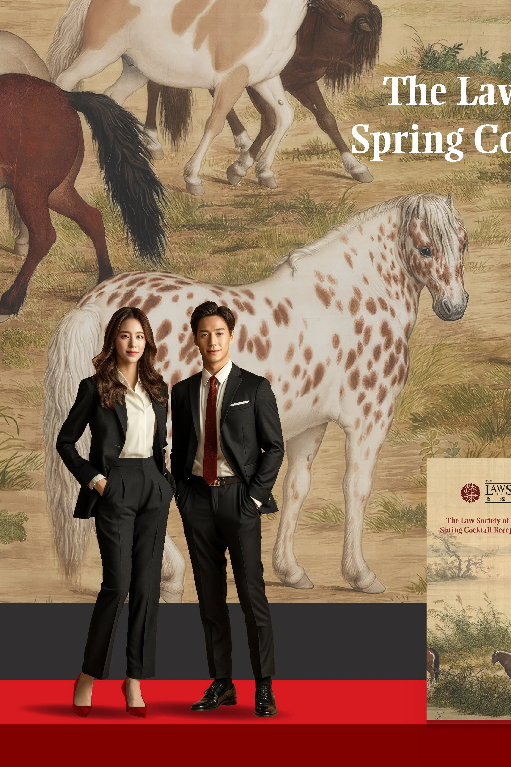
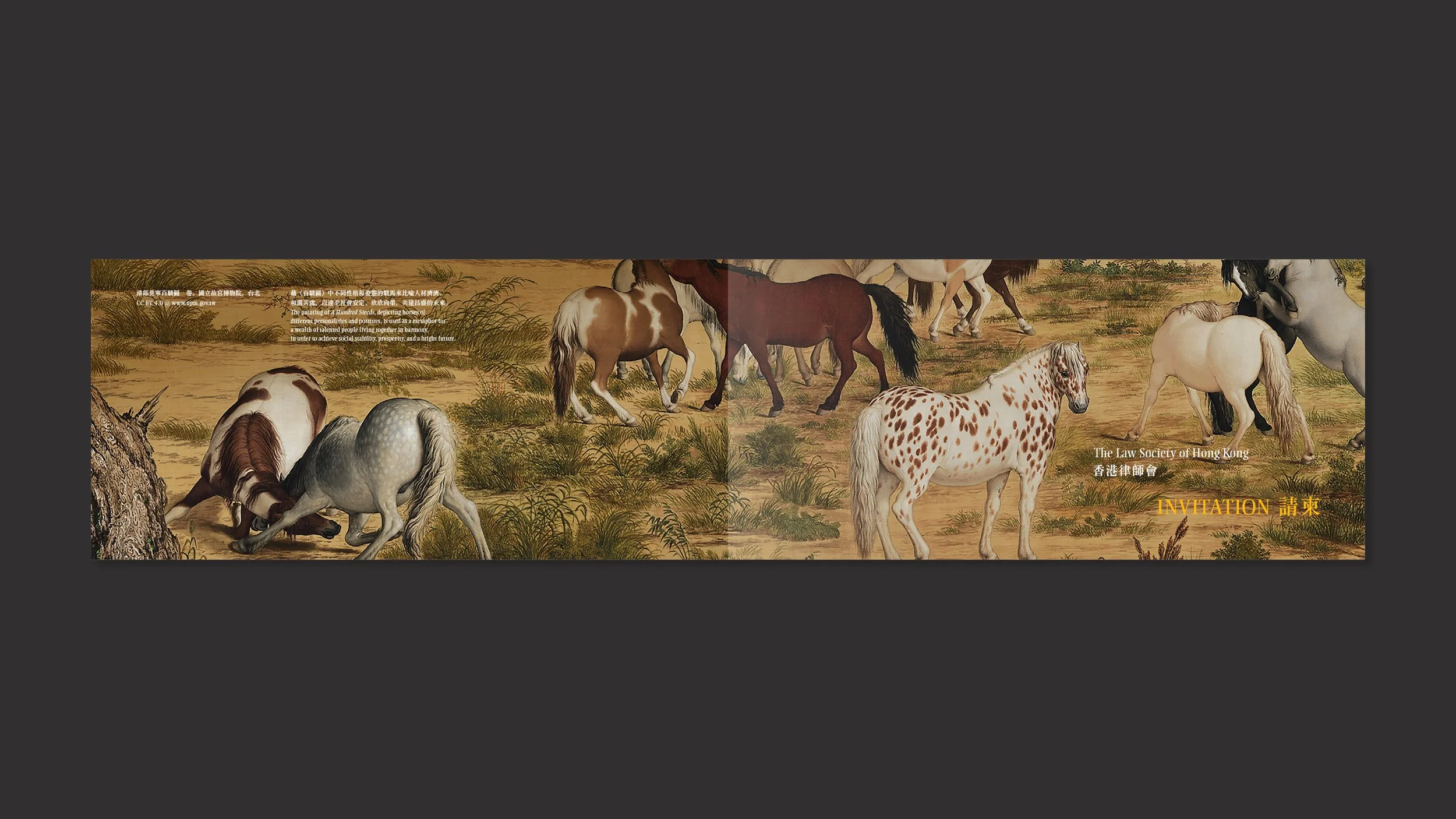
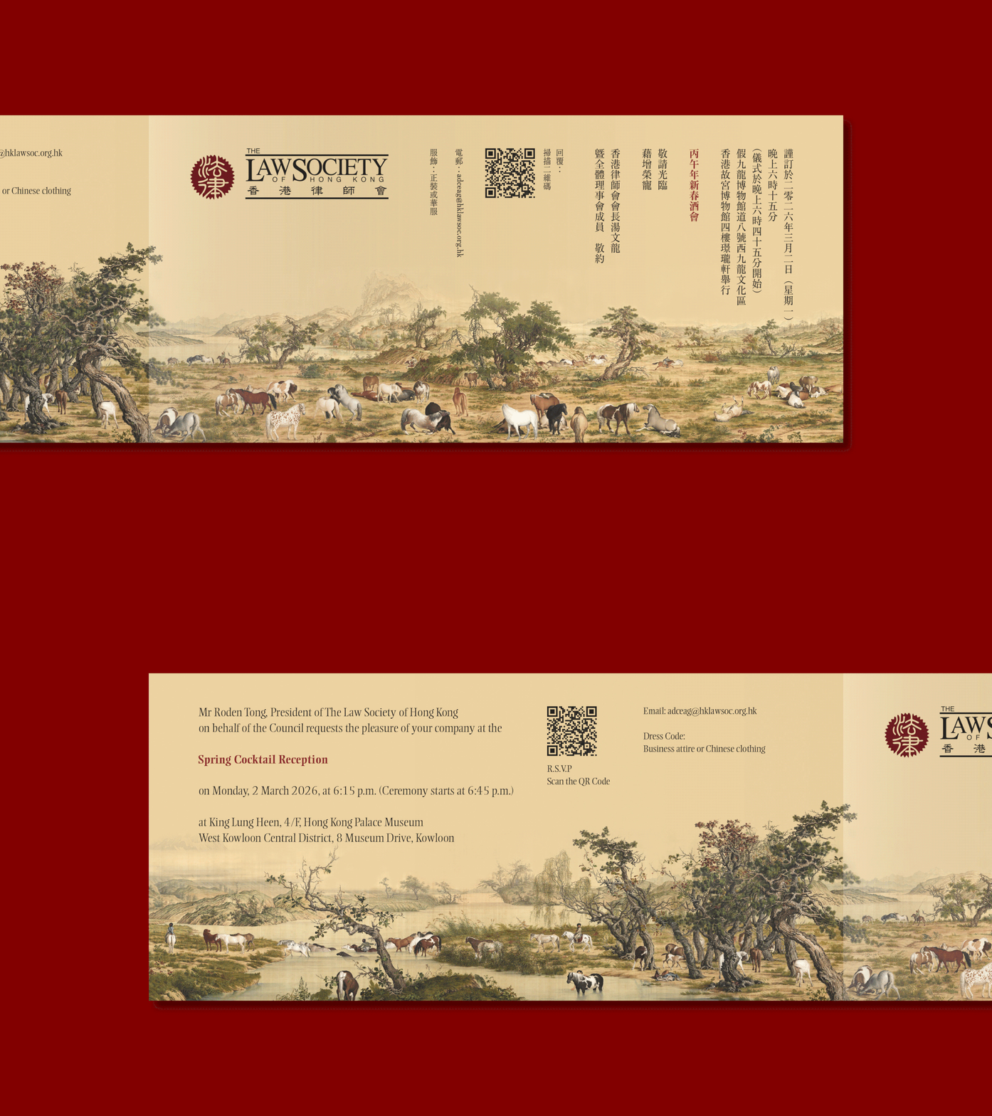
After considered the constraints of the project particularly little amount of time for design and production, we decided not to follow the creative process as last year that was hand drawn style, but to utilize one single hero image instead — A Hundred Steeds painting by Giuseppe Castiglione (1688 – 1766), an Italian painter who was the royal artist of Qing dynasty (Kangxi period).
It was a compelling yet simple idea to best match the event that perfectly coherent with the theme — the Year of the Horse, which also rather unique and memorable among some similar spring cocktails during the Chinese New Year.
Unfortunately, the concept was only the design proposal for LSHK, didn’t go through in the end, but we still carried on to help them to accomplish the design and production of the event as per their preferred one.
Project 19 ——
HKMU Logo Design Competition
(proposed concept)
One of the good ways to contribute our profession and expertise to our society we thought is to participate in few meaningful yet significant design competitions, like the one we have partaken in 2021 — The University Logo Design Competition, which was hosted by The Open University of Hong Kong (OUHK).
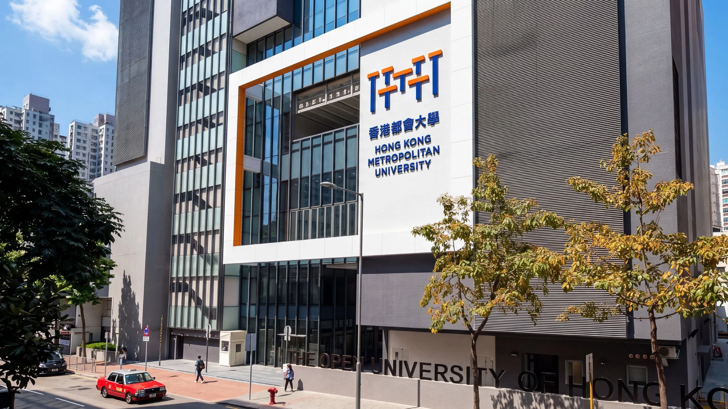
There is a particular design concept we have reviewed recently and still believe that it was a most impeccable and compelling idea for OUHK’s new identity of the university — Hong Kong Metropolitan University (HKMU).
This concept is inspired by the primary target audience of OUHK — students, especially working professionals studying part-time. The new era requires more than just individuals with single expertise to drive social development and progress. Future talents, in addition to their professional fields, will proactively explore other knowledge areas, broadening their knowledge base horizontally to complement the depth of their professional knowledge, thus contributing more comprehensively and proactively to the society. They are the “T”-shaped talents needed for our tomorrows.
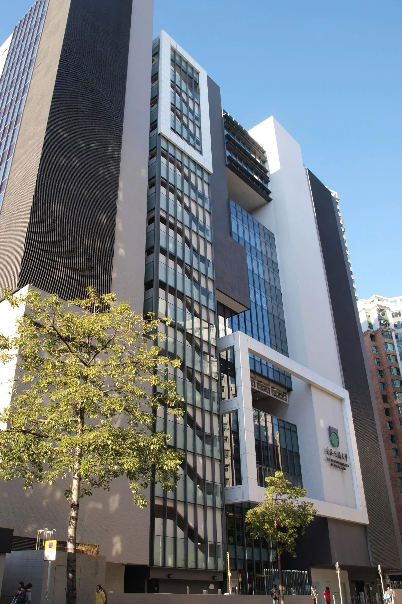
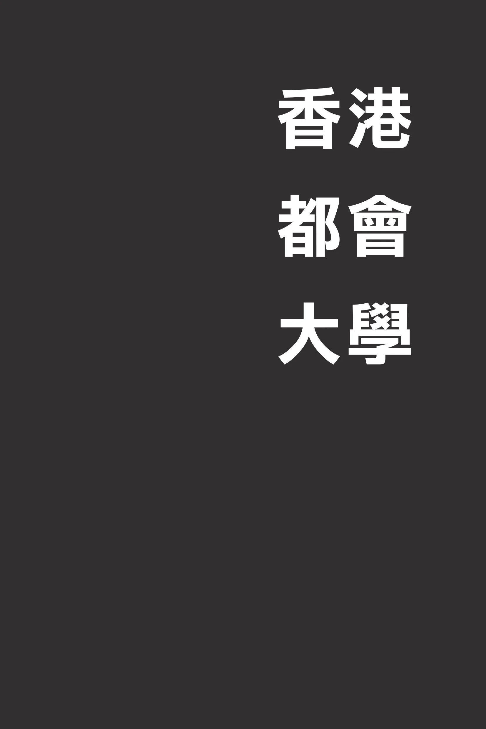
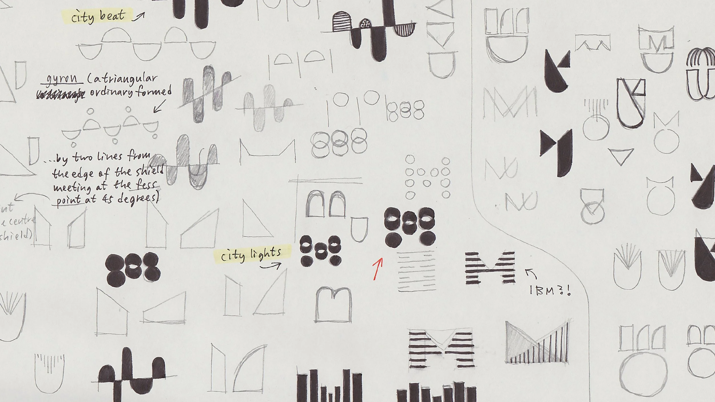
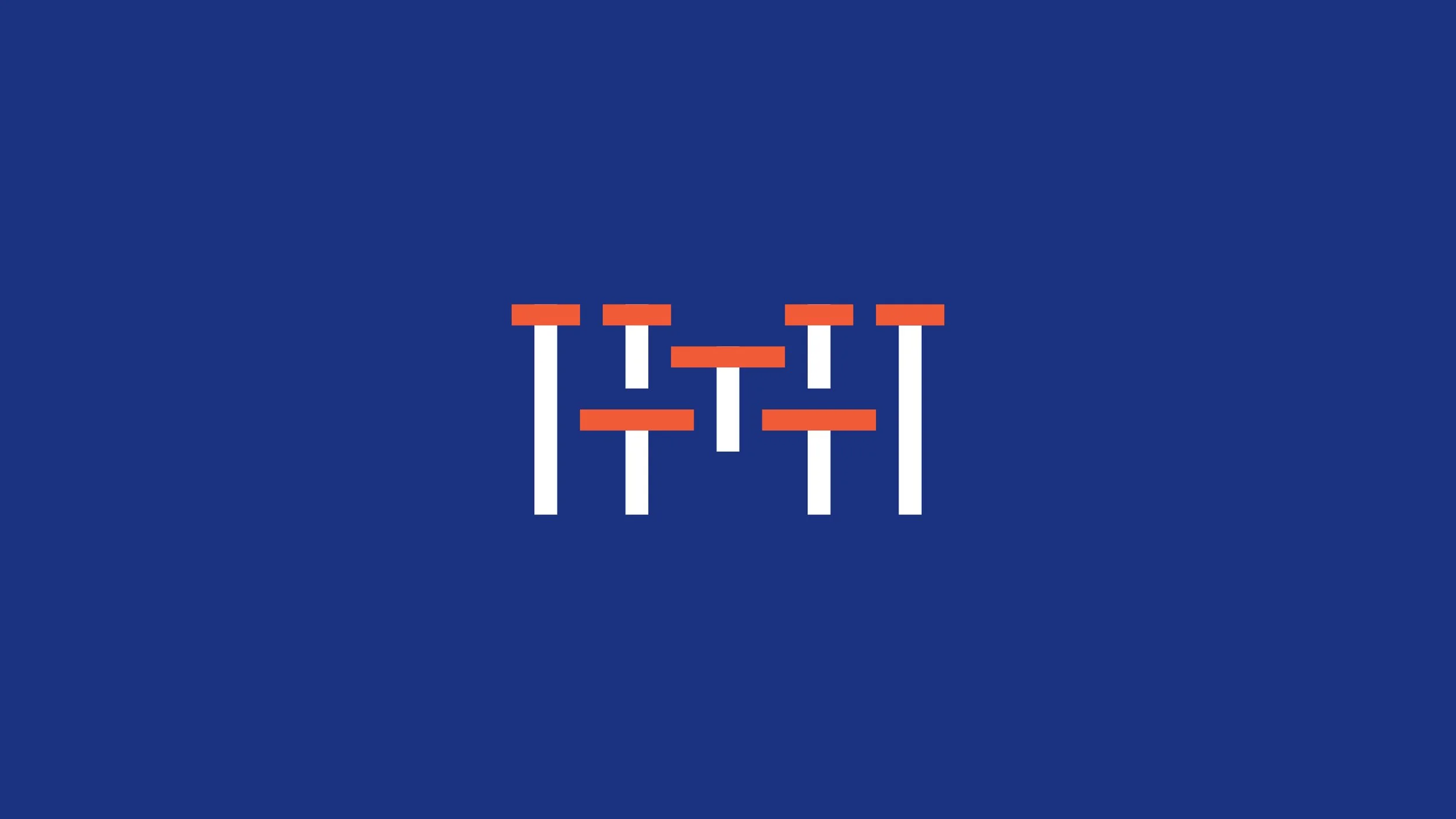
The logo focuses on bringing together “T”-shaped talents, accurately reflecting the inclusivity of Hong Kong Metropolitan University and its founding principles and characteristics as a comprehensive university. The icon is composed of “T”s with varying proportions of horizontal and vertical strokes, forming a capital “M” to represent METROPOLITAN in the new name of Hong Kong Metropolitan University, from which the “T” also derives.
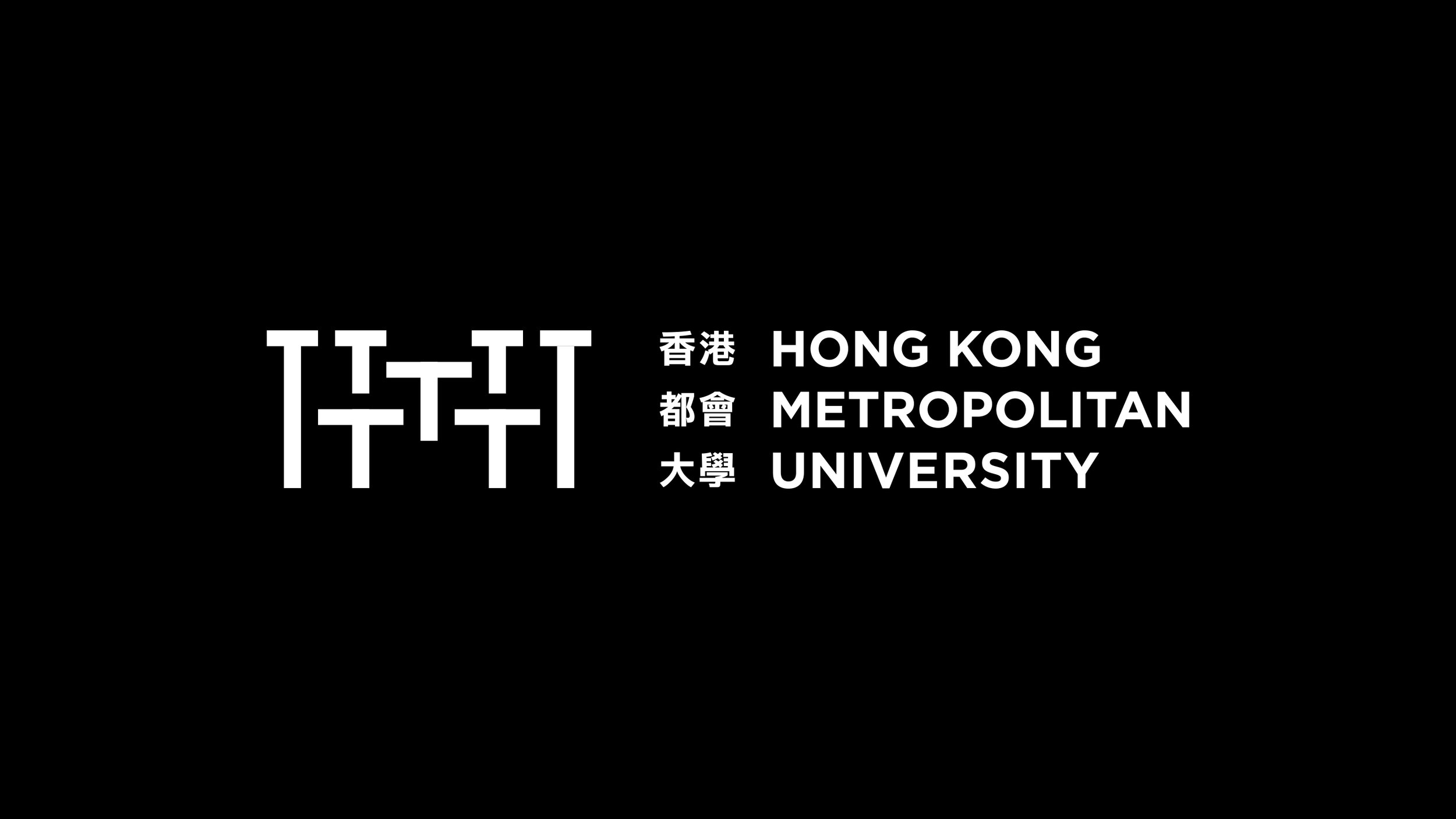
The horizontal strokes of the “T” not only symbolize the breadth of knowledge of talents but also express the meaning of cross-connection and collaborative exchange, highlighted by orange-red, reflecting the striking contrasts found throughout the metropolis. When the logo is presented in a reversed colour version, the design becomes more prominent, and the concept is more pronounced.
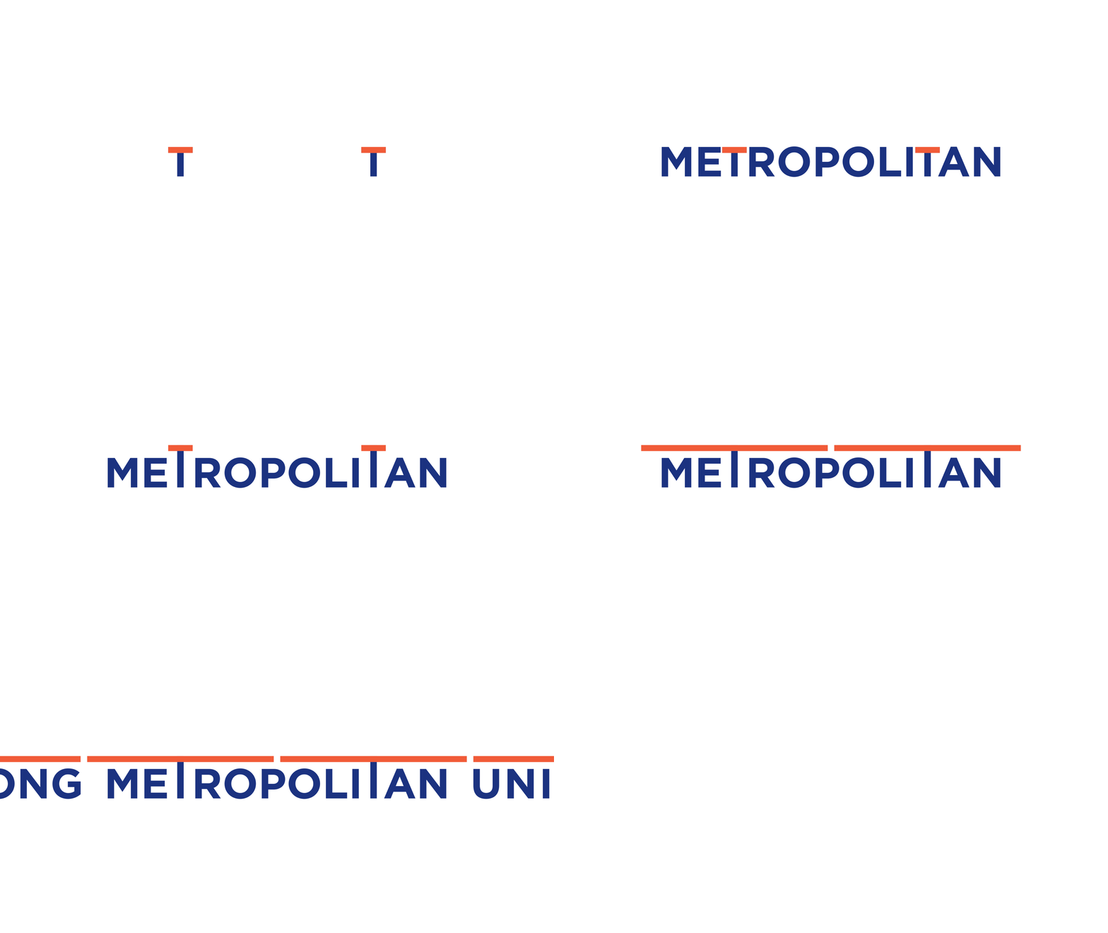
Hong Kong Metropolitan University actively explores future development directions, pioneering academic reforms for local universities and connecting society, industry, and talent. This logo design also aims to enhance the meaning of “Connection”. Therefore, in some cases, when the icon and the university name are presented separately, the specially designed wordmark can be used to express this. The two “T”s in METROPOLITAN are a design feature; they are higher than the other letters and extend their horizontal strokes, fully demonstrating the concept of connection.
When the entire university name is presented, the concept of connection is particularly evident. Today’s society is highly interconnected, especially our modern knowledge-based society. The future development of our society will require more diverse “T”-shaped talents. We believed that Hong Kong Metropolitan University can play an important bridging role in this process, facing the highly challenging developments of the future together with the society and realizing the university’s original ideals.
Project 27 ——
SUZU 2020 | Oku–Noto Triennale
Station by the Sea
Residence & Exhibition Programme
(art proposal)
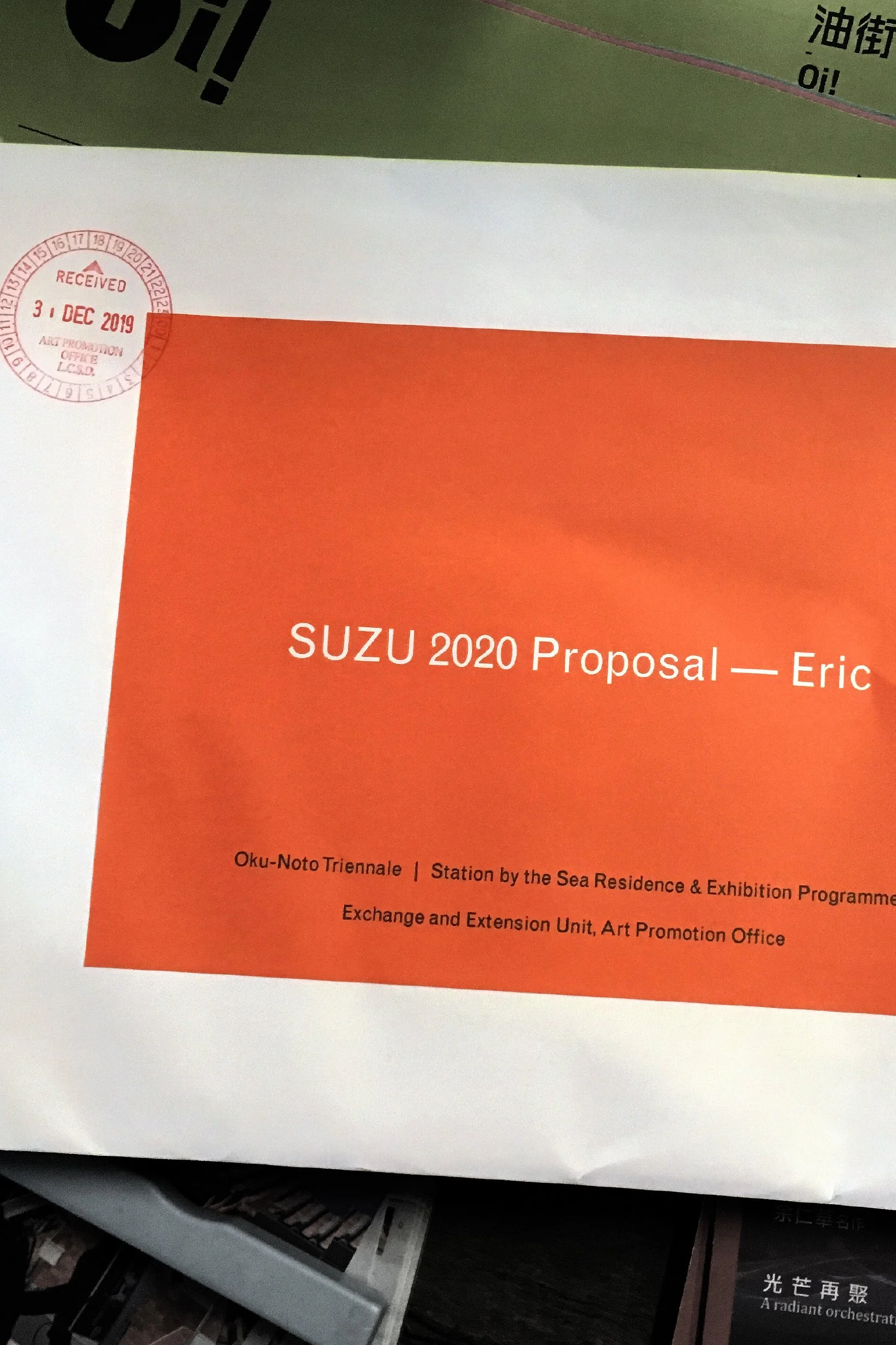
To celebrate the progression and close of 2019, we participated in an unusual project, which we had never done before, felt so excited but at the same time a bit hesitant about it. This was completely by chance that we got the information and materials from Art Promotion Office (APO), it seemed rather interesting and blew our minds right away, and we thought it would be a lot of fun to take part in.
The programme set in the city of Suzu that located in the Noto Peninsula on the northern coast of Japan. Much like Naoshima, such remote northern forgotten city Suzu nowadays would like to reconnect with the world and people by art with its distinctive natural surrounding and innate rich culture.

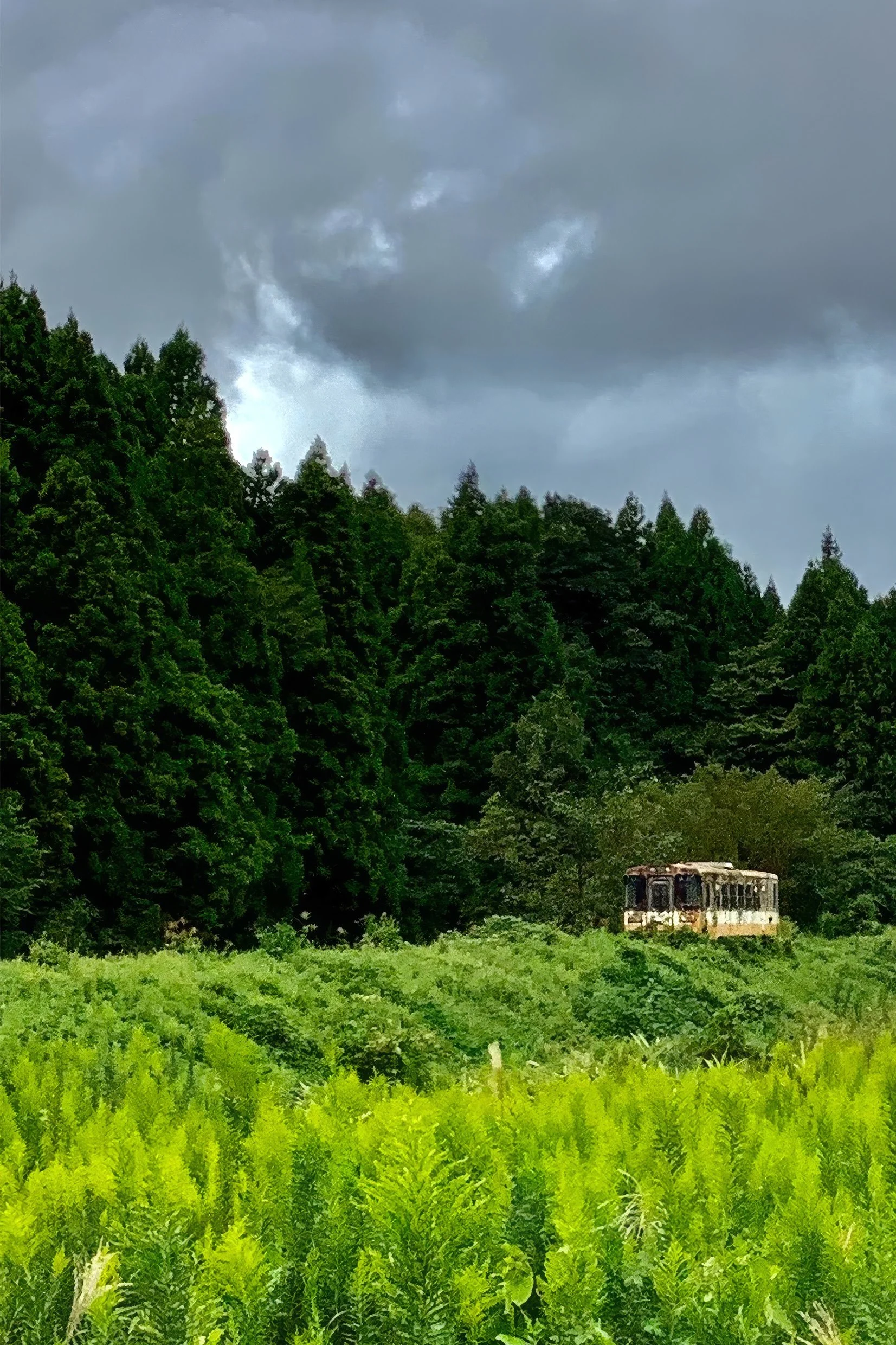
The concept
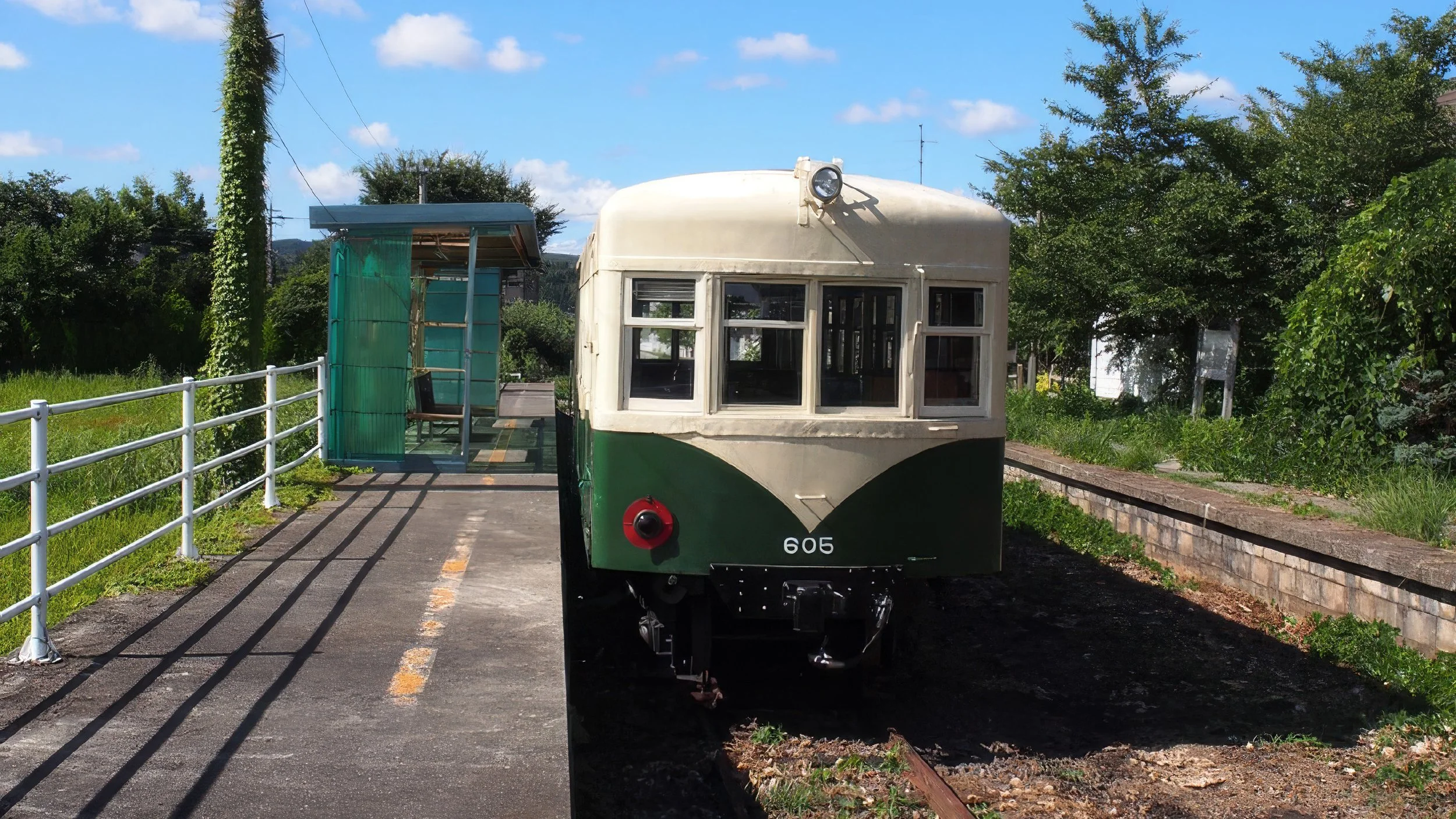
This phenomenon left us a perception that Suzu has struggled alone on people overlooked or disregarded since many years ago the Noto Railway Line was abandoned. Suzu was fighting for its future, and this was also a battle against the torrent of times. In spite of the winning was near impossible, defending what Suzu treasured most, and gaining more recognition from the outside world seemed feasible and rather important.
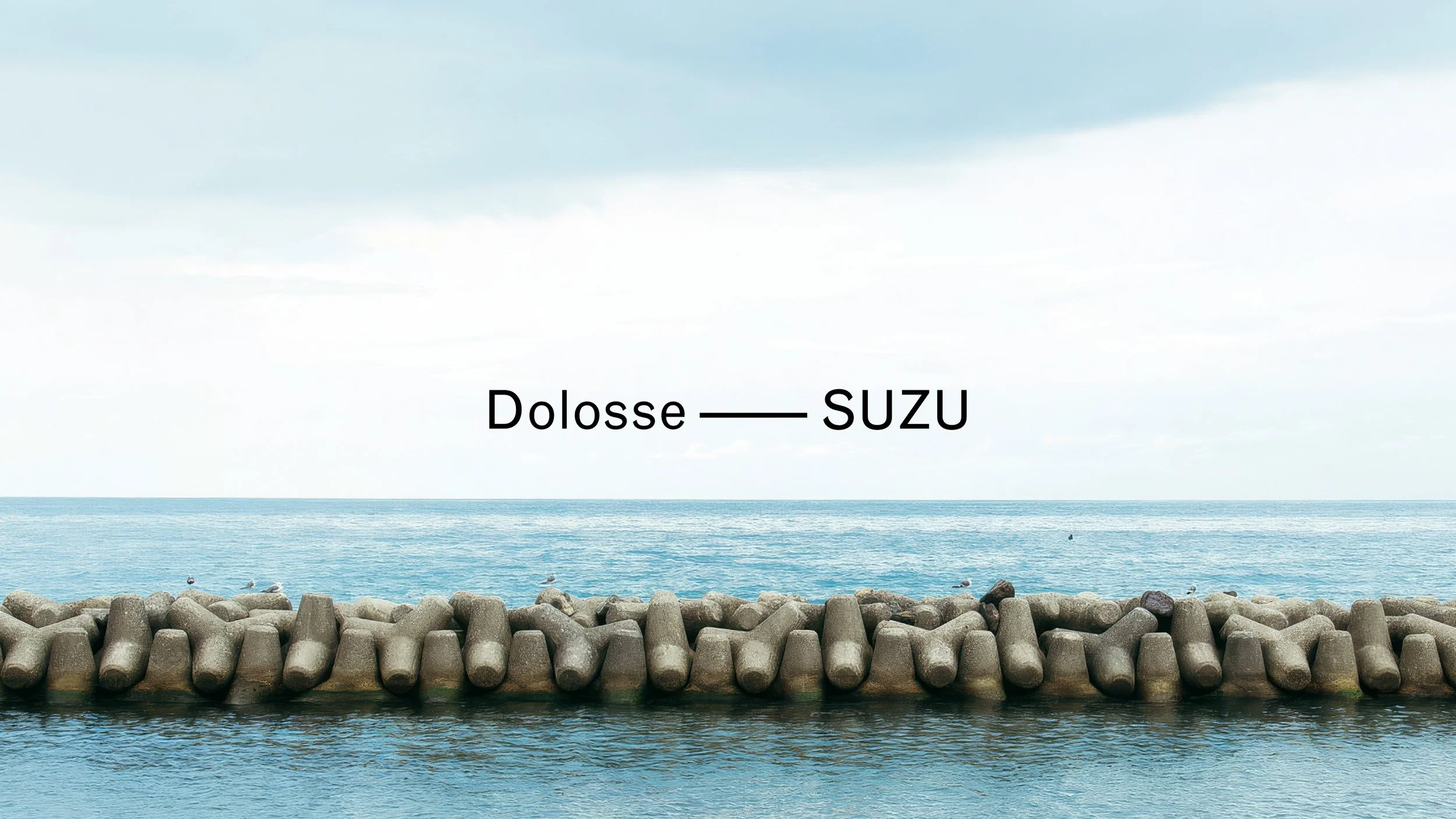
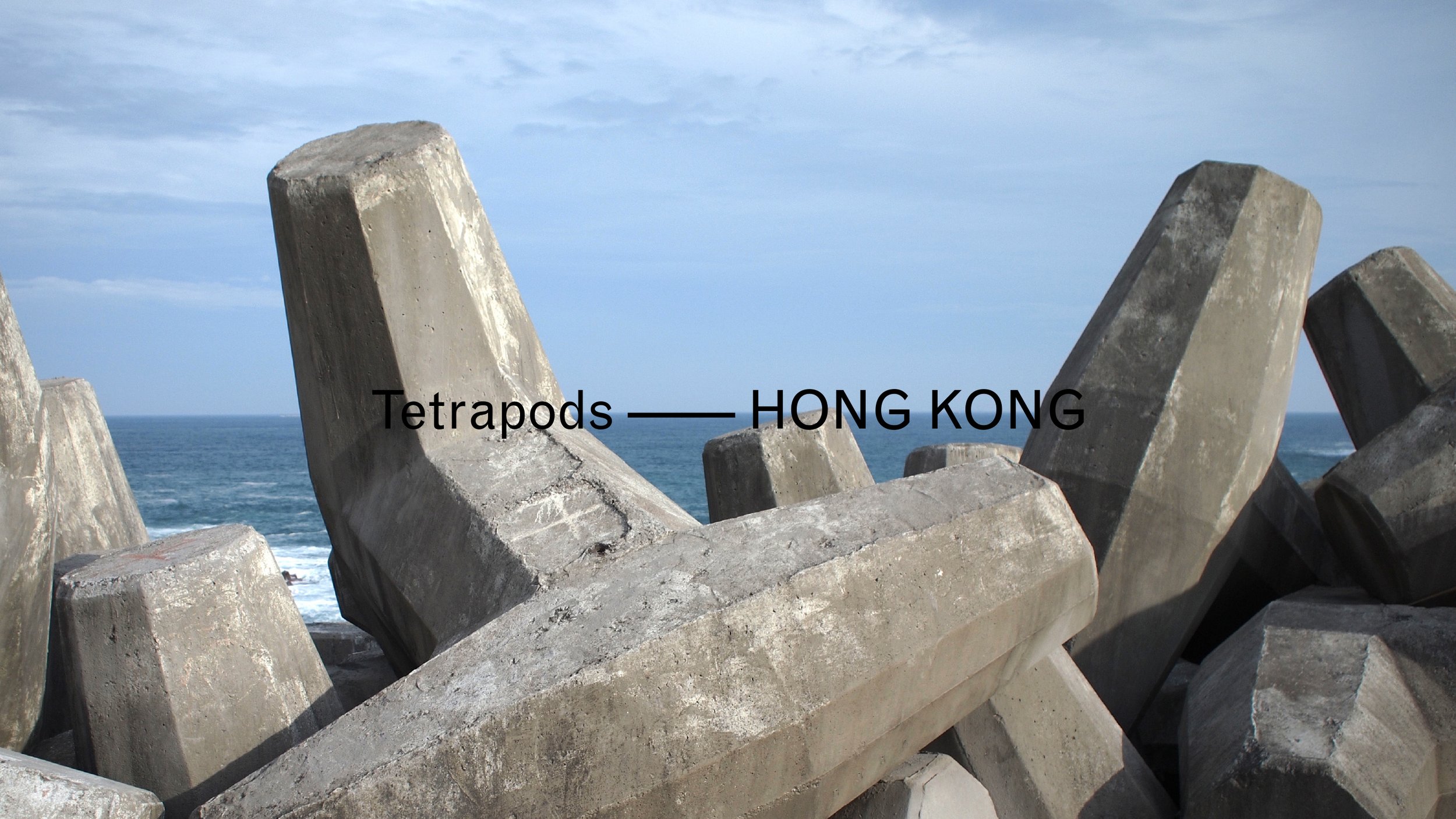
Heading to this direction, defending Suzu against the torrent of times eventually became a lead thought of our concept for the project. Finding the linkage between Suzu and Hong Kong was a starting point, one of our local hiking experiences rang a bell, it was High Island Reservoir in Sai Kung. The giant tetrapods (wave blocks) over there were so unreal to us, not only about their size and scale, but because of their perfect combination of art and science.
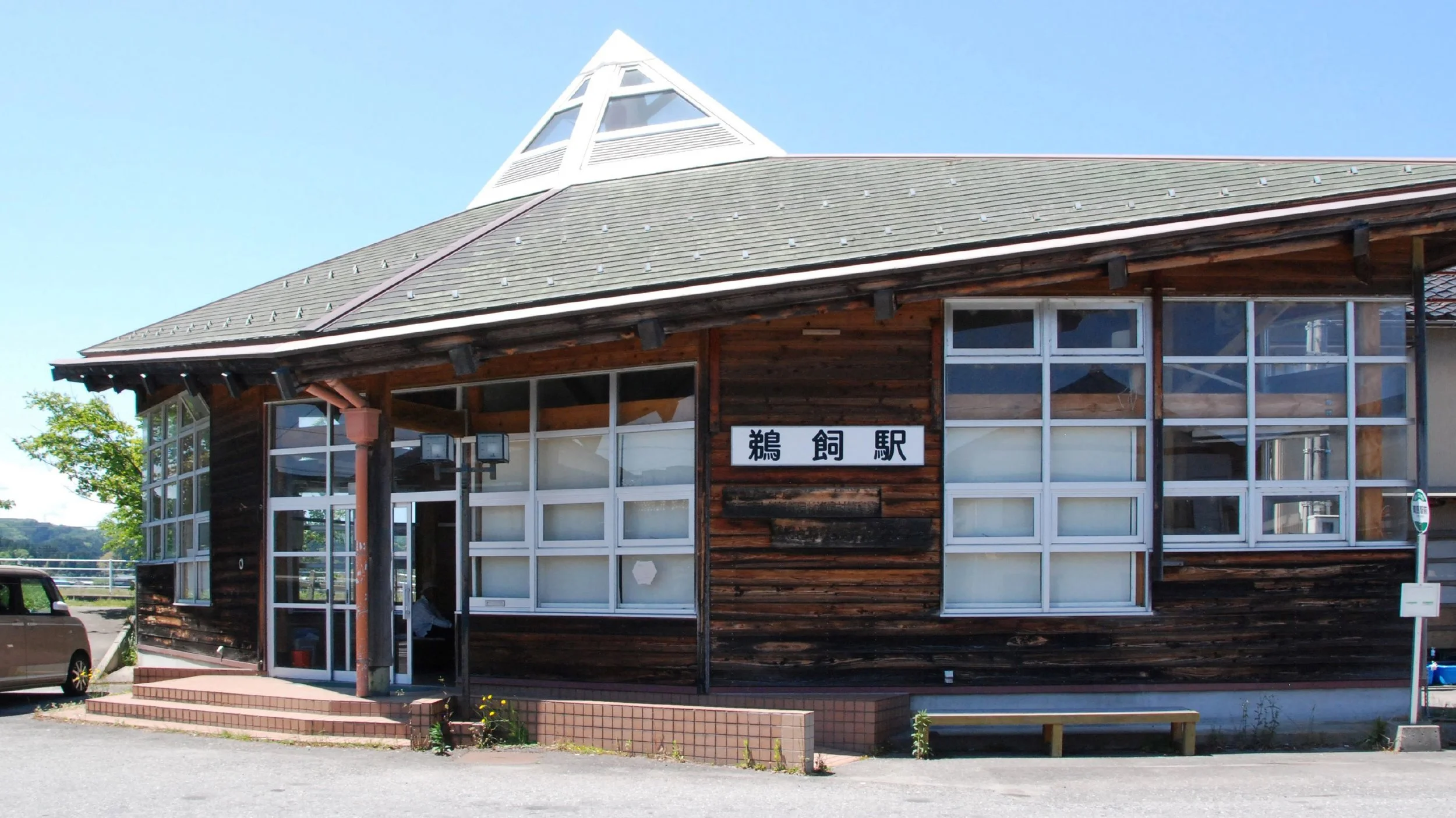
Today we can find there are many different kinds of wave blocks around the world, Suzu also has its own dolosse. Nevertheless, what if we change the context and the scenario where they are used, which could be a totally new realization of their existence. It was indeed a radical concept, changing the connotation of a tetrapod from Hong Kong, from defending to inviting. To invite people to rethink their purpose and to make them feel baffled when they see the tetrapod at an abandoned railway station.
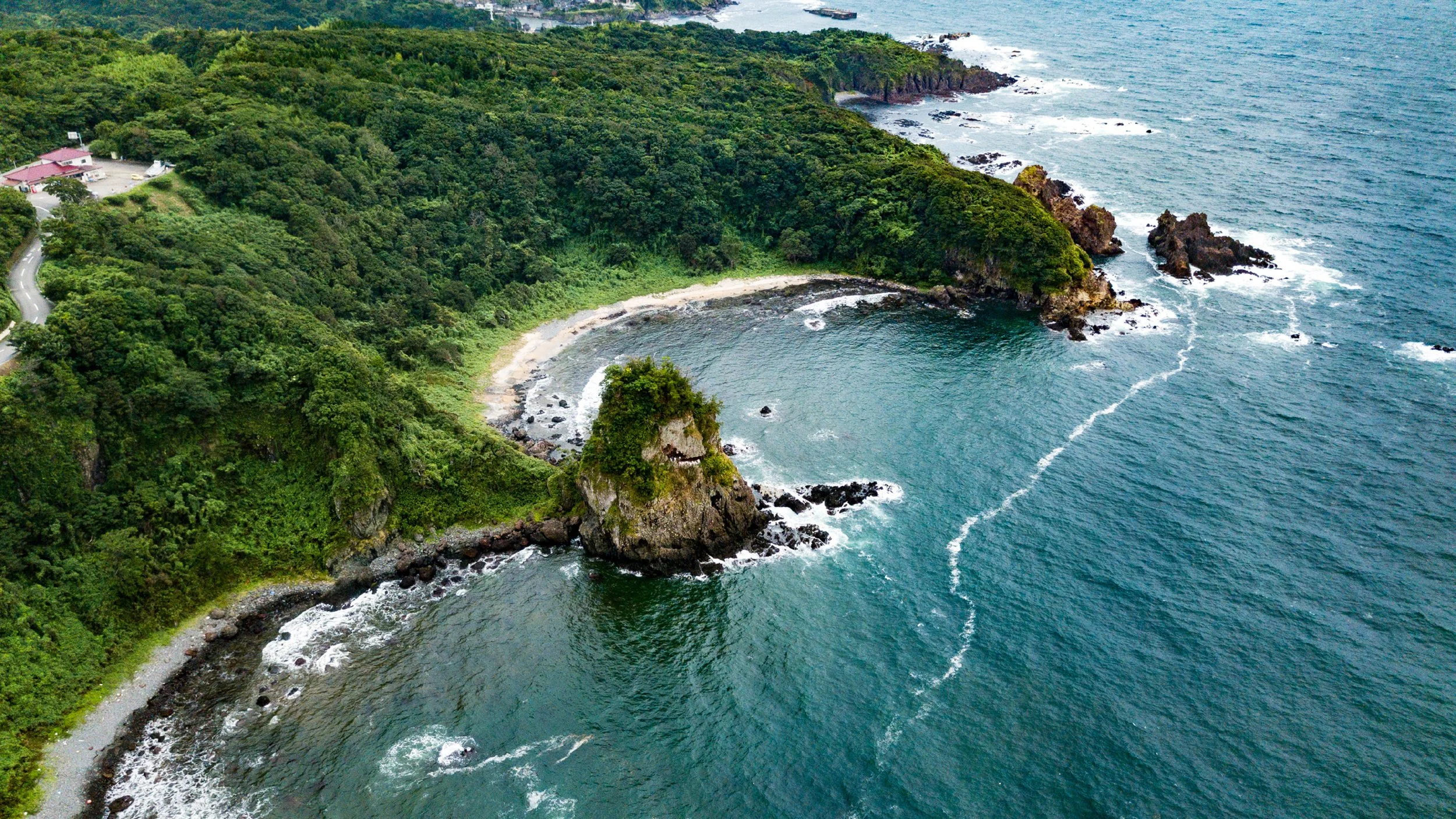
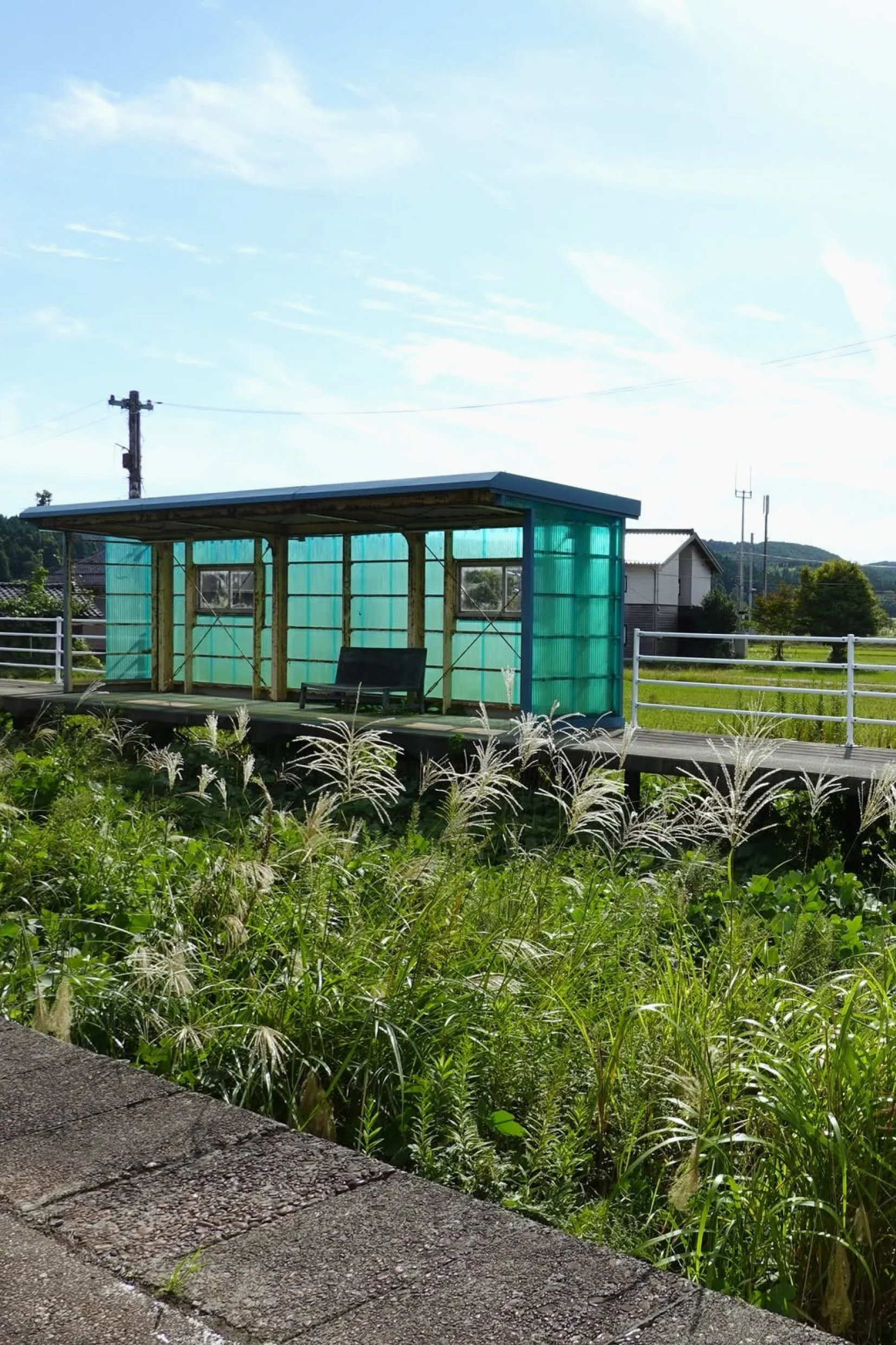
The setting
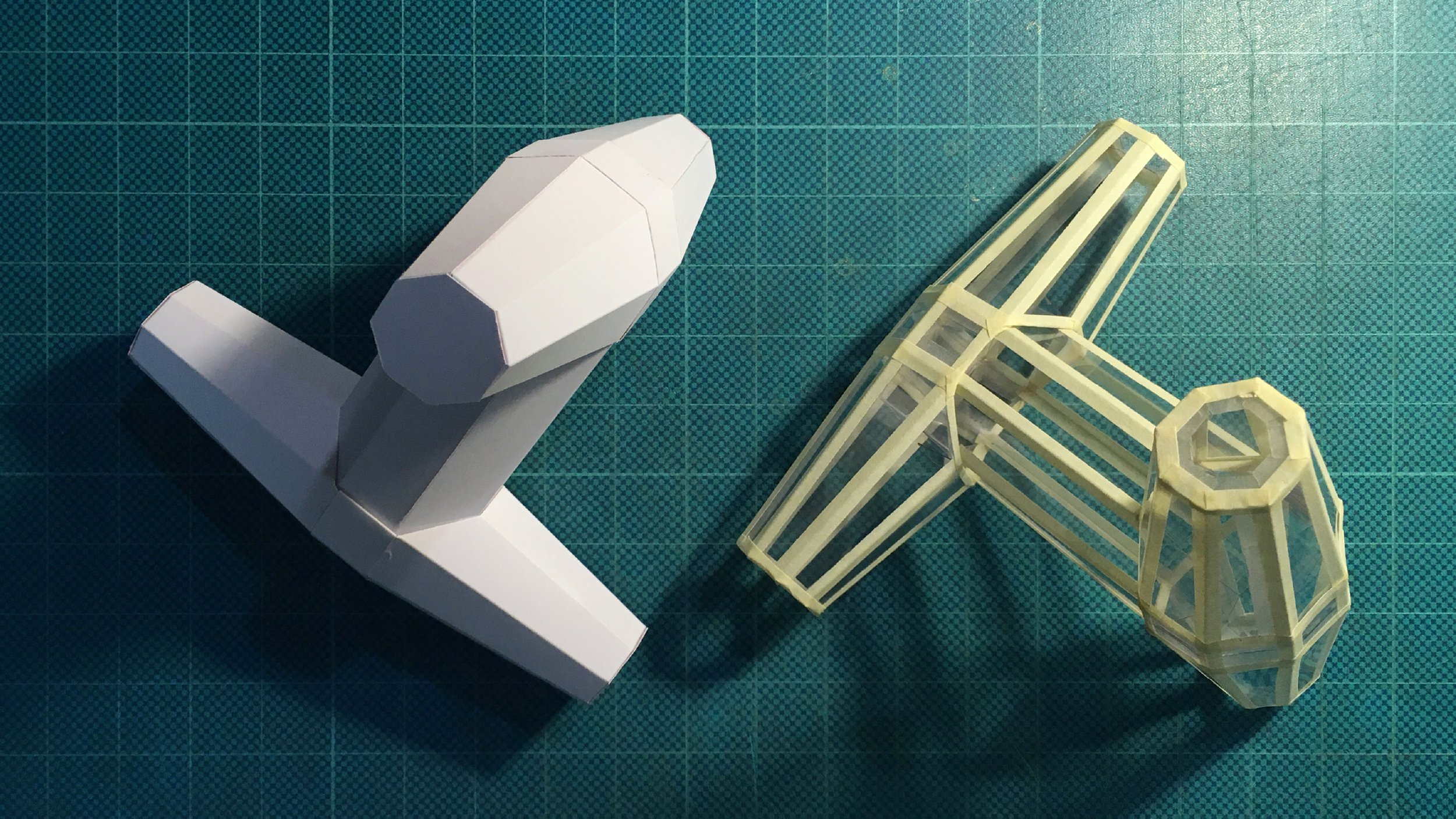
The actual height of the tetrapod is about 4 meters, and made of concrete. However, this is an awakening journey from the reality to a dream — Suzu Dream. Therefore, a totally new interpretation of the tetrapod is crucial, to make it in a way less familiar and atypical can arouse people’s curiosity, in order to reconnect Suzu with them.
Our tetrapod is no longer hard and solid as it used to be, its new skeleton is made of bamboo from Noto lantern (Kiriko toro) industry. In fact, this is a giant bamboo tetrapod assembled using traditional bamboo scaffolding techniques from Hong Kong. The tetrapod visually rises from the weeds in Location 1 (former Ukai Station) in the daytime. However, it becomes very obvious at night like a star, the skeleton will be illuminated by hidden built-in fluorescent tubes or LED pipe lights.
For Location 2 (former Suzu Station) we turned the other tetrapod to a symbol of revitalization, a tetrapod covered by mirrors, which is also an avatar of both resistance and reflection, as this idea functions as two sides of the same coin within the circumstances of Suzu at that time, preparing for its next phase. Such a giant mirrored tetrapod created an extraordinary visual experience and an instant impact on the locals, not to mention the visitors from around the world.
A vision
Reimagining the new relationship between humanity, nature and the civilization in the Suzu’s context can be a movement to rebuild its unique personality. Suzu is located on the fringes of Japan, it is already unconventional, to obtain a new vision for its future development is not only a dream but really an action.
Fighting against the torrent of times is a metaphor for what Suzu is facing, accompanied by a symbolic art expression — Suzu Tetrapod, we believe its people have been answering that calling ever since.
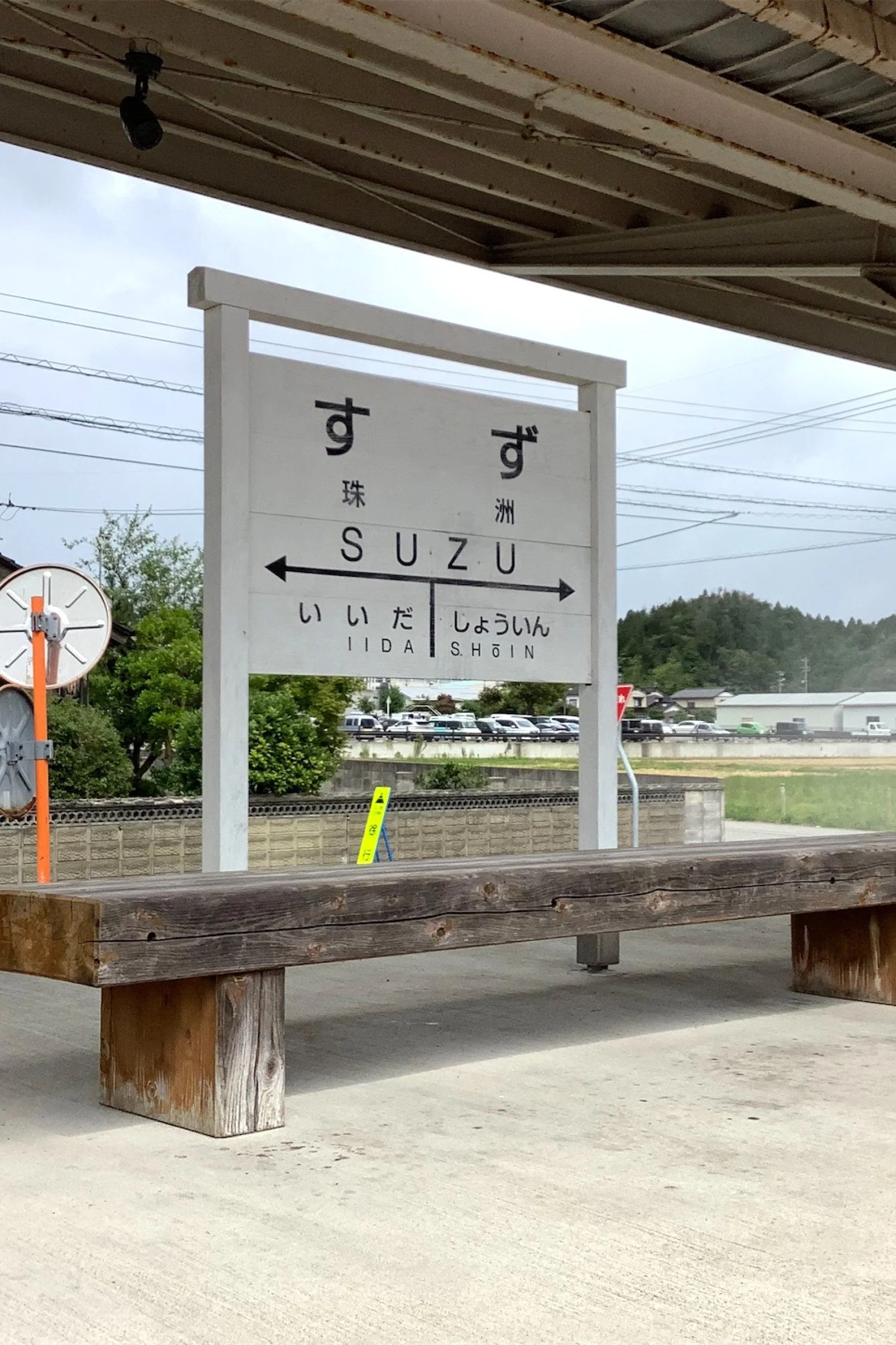
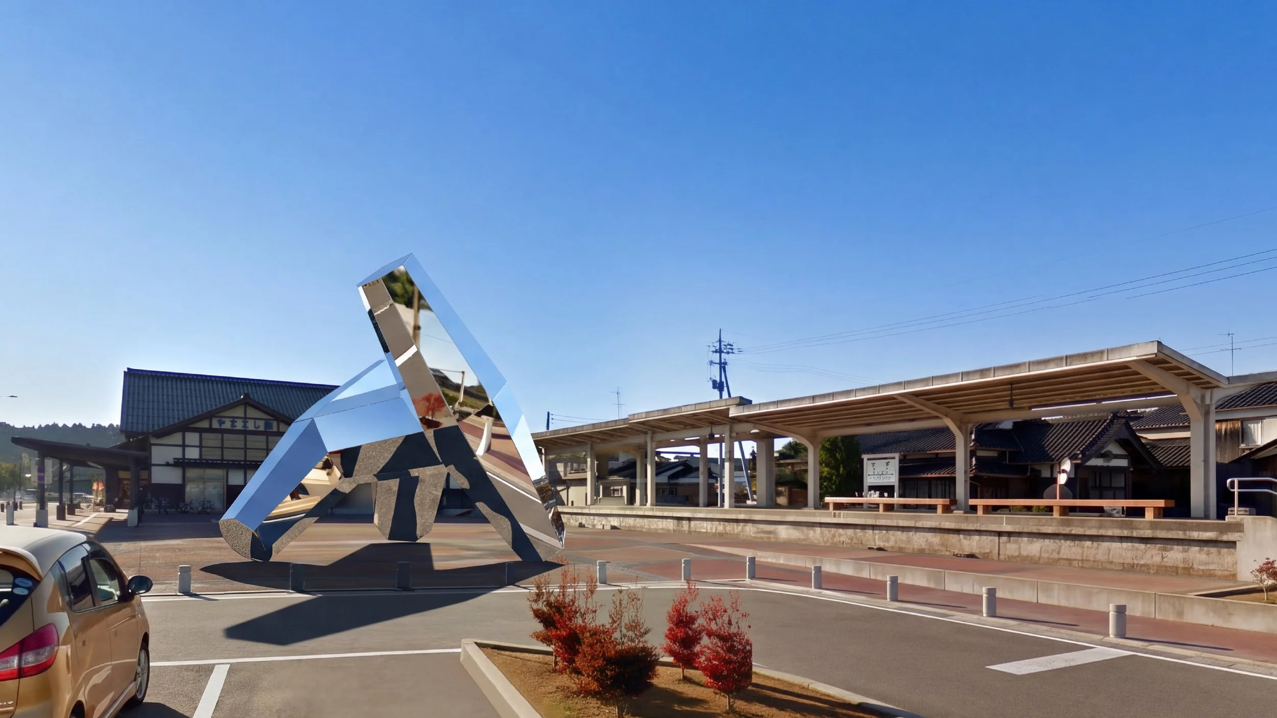
Project 13 ——
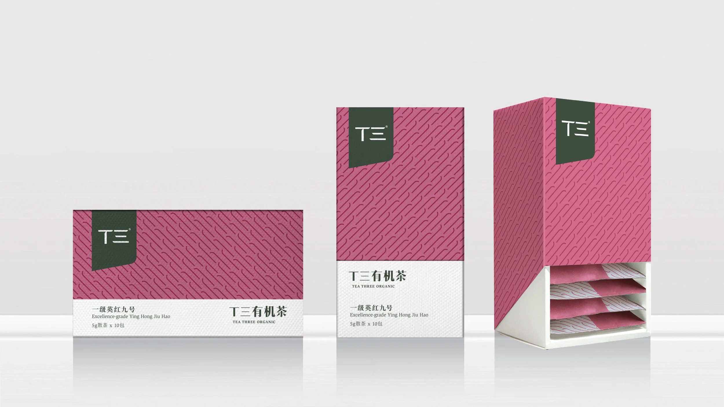
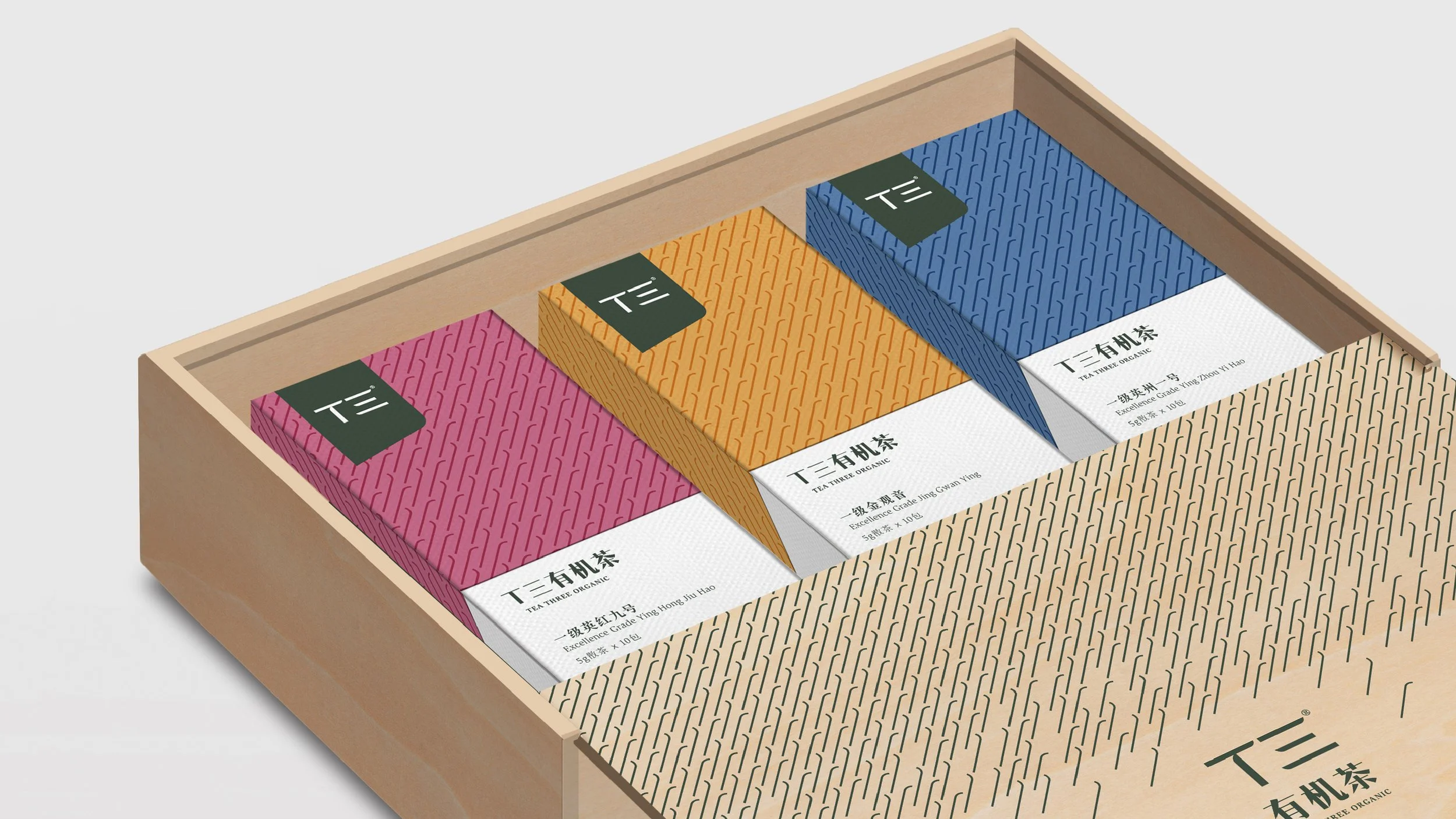
Tea Three Organic | T3
(branding proposal)
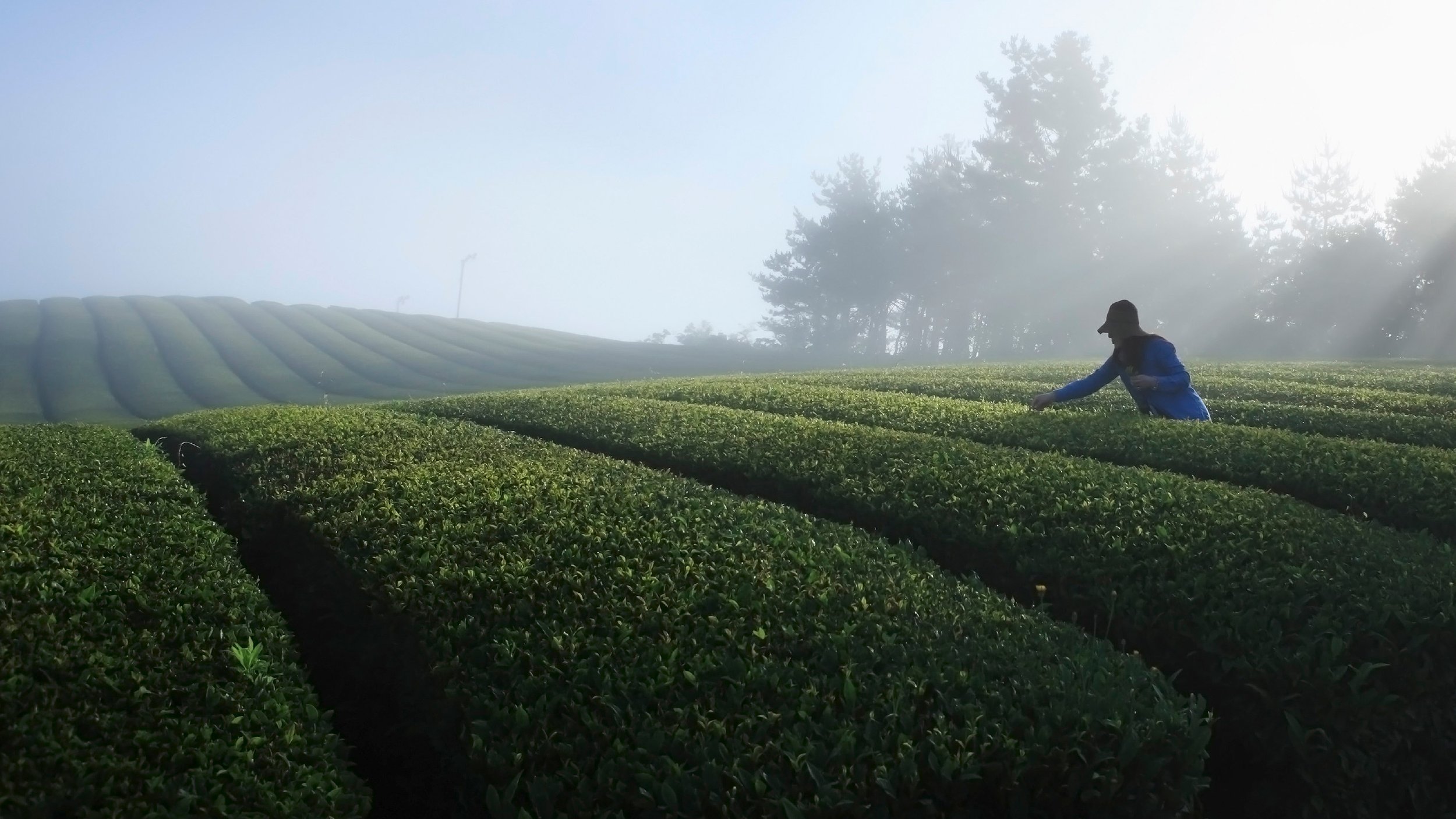
Takson from Guangzhou which had a grand ambition to further expand its business, and would like to see what if it broadens its territory to plantation, not only focus on its family-held property business, the time was back to the summer of 2012. After several phases of market investigations and foundational work for the possibility of its new plantation business, the team had a primary insight and consensus to kick-start, they were full of confidence and strongly believed that their uniqueness could successfully lead them into an already super crowded tea market, in China.
Change is always much faster than planning, let alone branding strategy, particularly in the Chinese market, regardless of the sector. When the team came to us in the fall of 2015, it just seemed that they were launching another initiative, a market-led “me-too” direction which was fairly comprehensive but totally losing their uniqueness. Their hero product could have made them very special in the traditional Chinese tea market but they didn’t see it, because there was a lack of established caffeine-free tea categories or even brands at that time. They need to wake up from this market illusion, no excuse to be lazy and get back on their track, regain the realization of why they started such business.

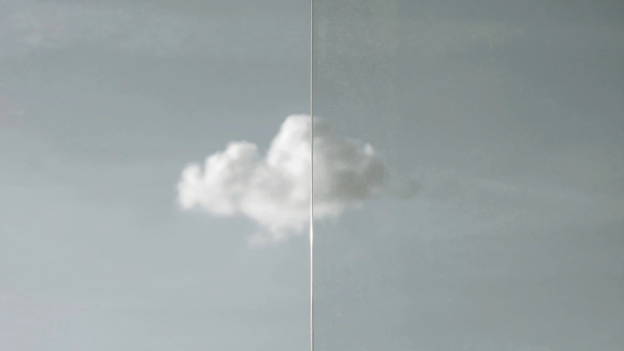
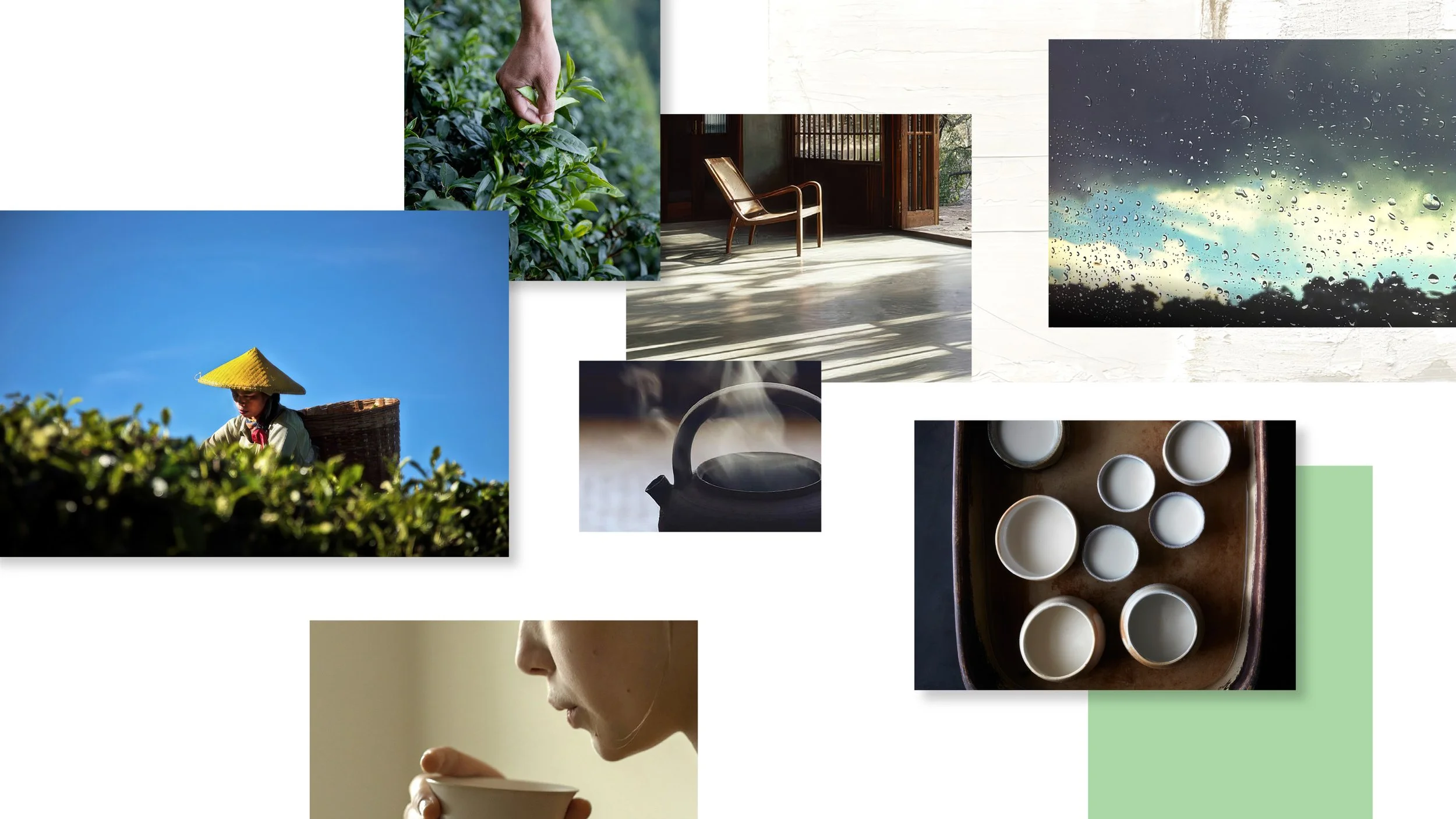
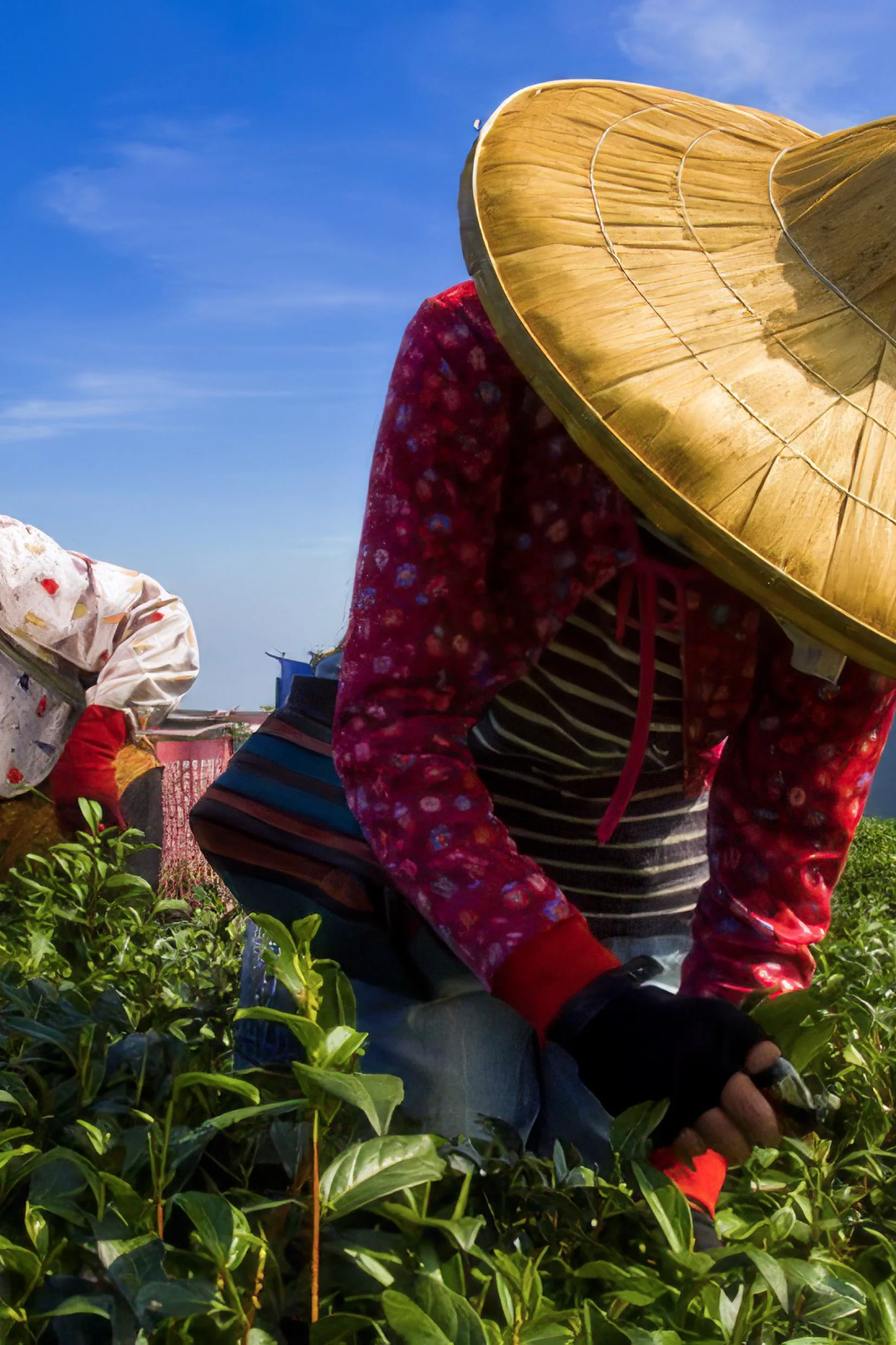
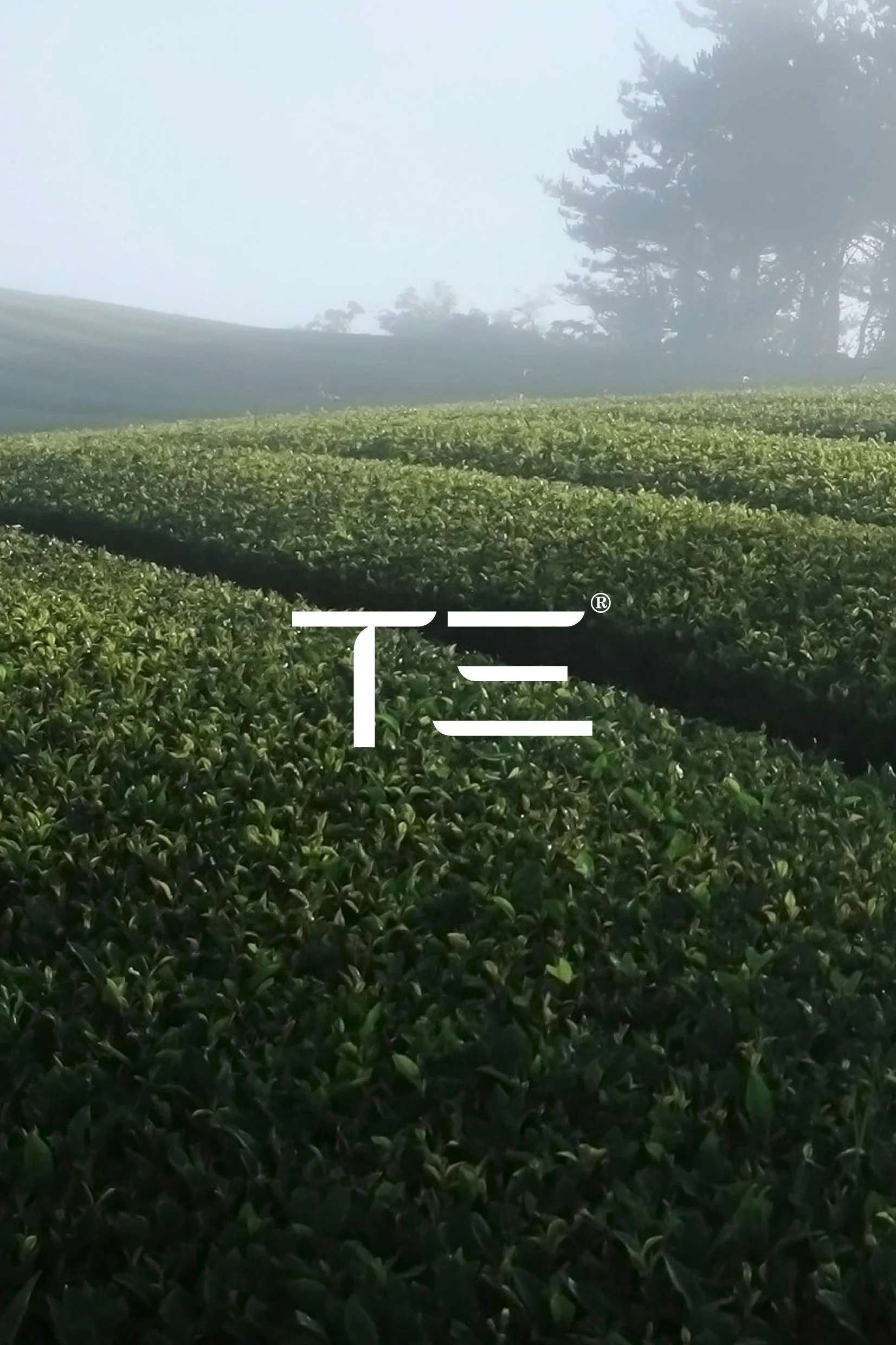
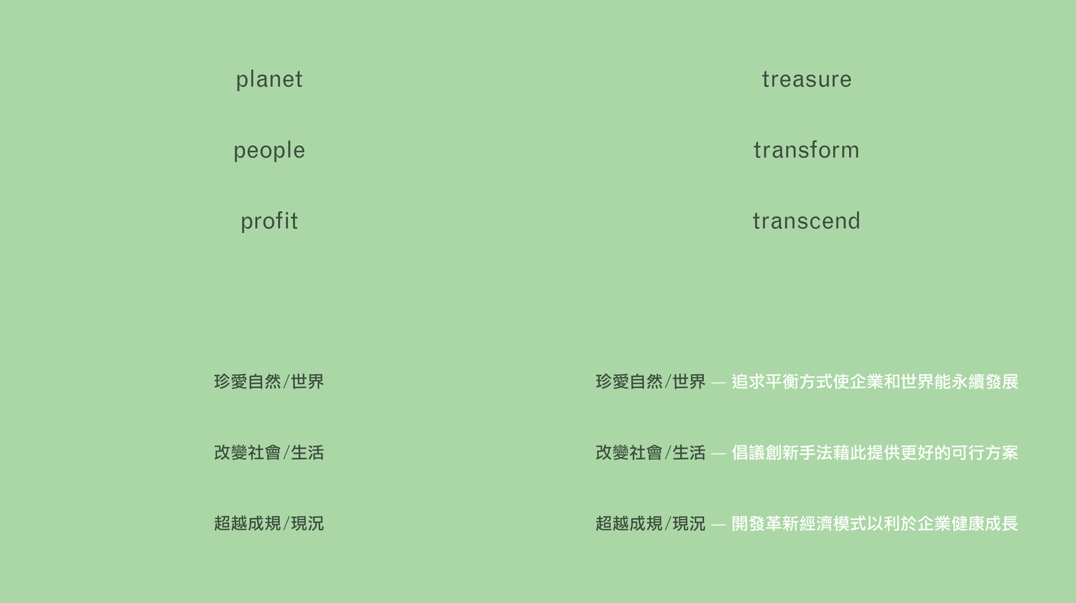
We helped Takson to tell its unusual tea story over the course of 20 months, the focus was certainly on brand building, but through Takson’s tea — its rather unique product, a caffeine-free tea — CoCo Tea, together with its famous local black tea (Ying Hong Jiu Hao). All of this ultimately became a new business strategy, which was also a new tea brand — Tea Three Organic (T3), adopting a much more exquisite, elegant yet genuine brand image to reenter the tea market.
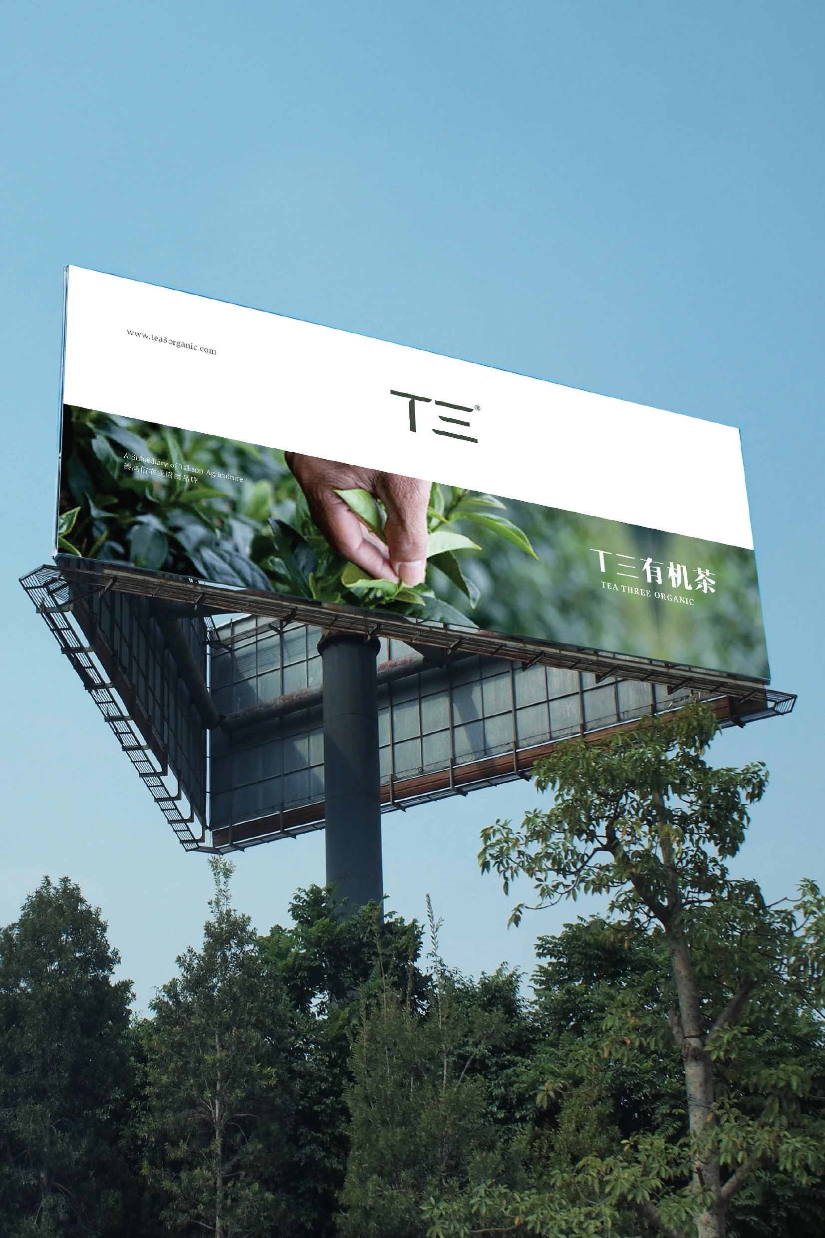
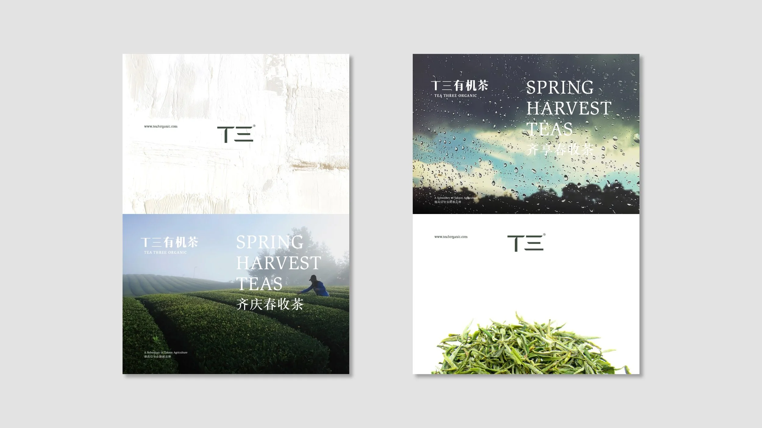
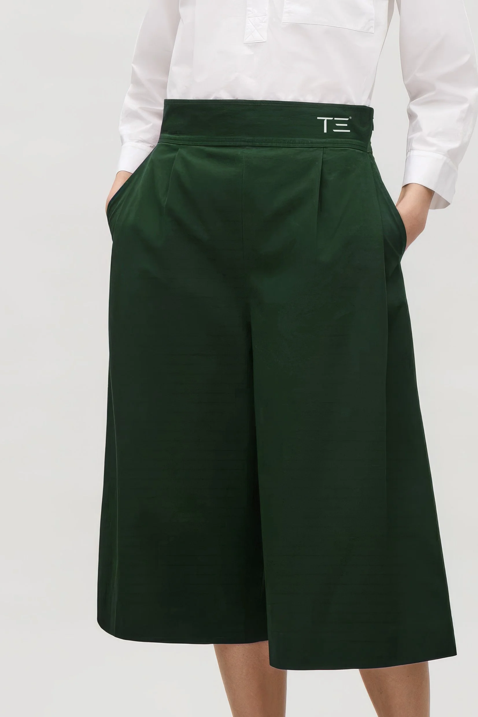
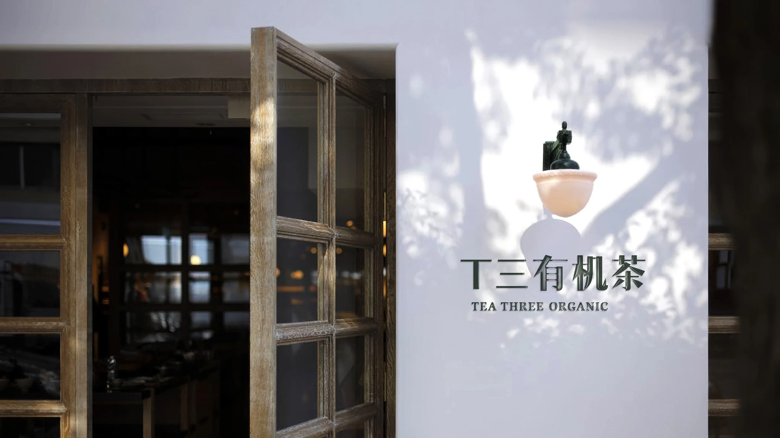
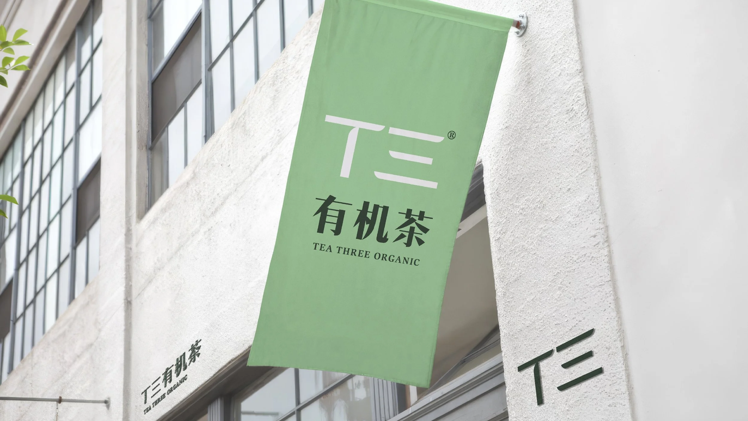
Unfortunately, the core business/branding team have kept changing, as well as the believe in T3’s brand purpose and vision of their leaders due to the unbelievable China’s gift-giving culture, which is huge, an enormous business opportunity. So, we ended up shifting our branding strategy a bit in order to align with their perspective, we fine-tuned some major packaging designs and suggested recategorizing the product combination, these were our final touches on the project. However, the brand development journey of Tea Three Organic carried on without us, in spite of the fact that we could not lend a hand during the last few phases, T3 was undoubtedly one of our significant and memorable projects.