THEi
Stretching beyond vocational training to true professional
Brand Concept
Brand Identity and Visual System
Brand Guideline

Design partners ——
Debora and TK
2012 was a significant milestone on VTC’s brand development journey, as they had escalated the vocational training to a higher level, offering degree programmes by established a totally brand new tertiary institute, Technological and Higher Education Institute of Hong Kong, THEi.
/ THEi’s brand positioning focusing more on the students or learners as individuals
It was actually part of VTC’s far-reaching master plan since they were founded in 1982. After 30 years, they had already gained tremendous experiences, and most importantly earned great reputations within the community. They had got ready to put their thoughtful plans into practice at that time, as VTC levelled up to integrate their offerings with a more comprehensive solution to vocational training.
/ Visual inspiration (initial concept stage), design exploration, and the selected logo (brand identity)
THEi actually is not only a new alternative of tertiary education in Hong Kong, but indeed a theory-practice well balanced vocational training institute, working closely with the industries and the marketplaces in order to manifest their unique brand purpose.
/ Tsing Yi campus
Innovative, impactful and individual are the quintessence of THEi, this trio literally reflected their brand personality, and also inspired the design of their brand identity, that is the bespoke THEi logotype. And besides, the lowercase letter “i” is a core branding design element, it turned out to be a strong, bold and agile brand visual system.
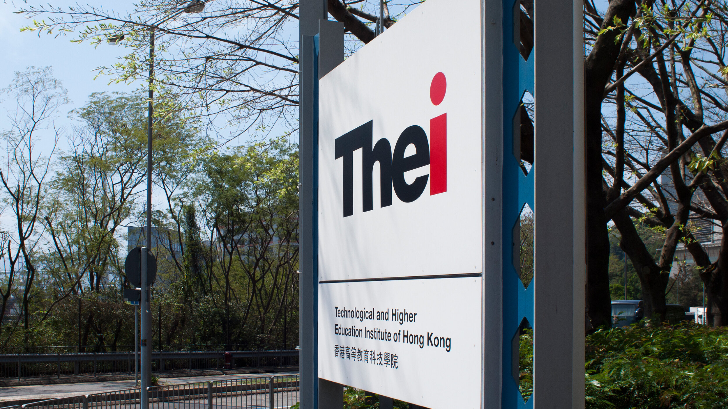
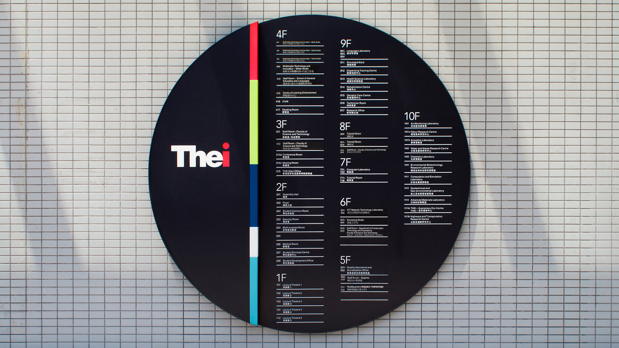
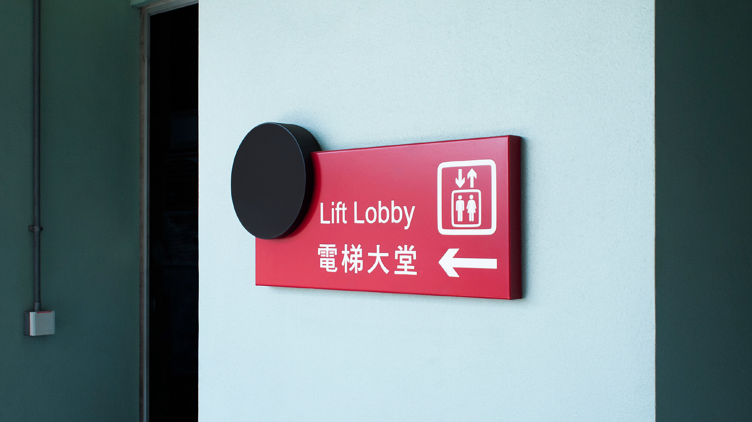
/ A series of campus signs made use of the brand visual system to design and develop
/ Touchscreen kiosk
/ A vast array of design applications has been fully utilized the brand visual system
/ Some visuals shown here are for design reference only, the image rights belong to the corresponding sources


