MaBelle
Turning into a happy diamond brand
Brand Concept and Narrative
Brand Identity and Visual System
Brand Experience Design
Brand Guideline
Jewellery Case Design
Packaging
Project lead ——
Enterprise IG (Hong Kong)
MaBelle was founded in 1993 in Hong Kong, they came through two decades of the trailblazing development of diamond retailer, and then in 2003, they repositioned their business strategy and simultaneously turned their branding direction, to put the customers at the very centre of everything they were doing. In a sense, selling diamonds were no longer their core business ever since.

/ Existing logotype and icon (the monogram, which composed of a capital letter “M” and a small letter “b”)


Instead of trying hard to be a number one diamond brand, MaBelle would rather be a different one, they were keen to transform the business in line with the highest need of the customers — happiness.


/ New brand positioning of MaBelle and their currently wide using advertising slogan


As such, the brand refresh was carried out to tell a new story of MaBelle and unfold the significant change they were undergoing. In spite of the current marketing message “Ma Belle is Diamond” had reflected their brand attitude ostensibly, however, it did not create any additional or meaningful value to the brand, not to mention the fact that diamond is not only MaBelle.
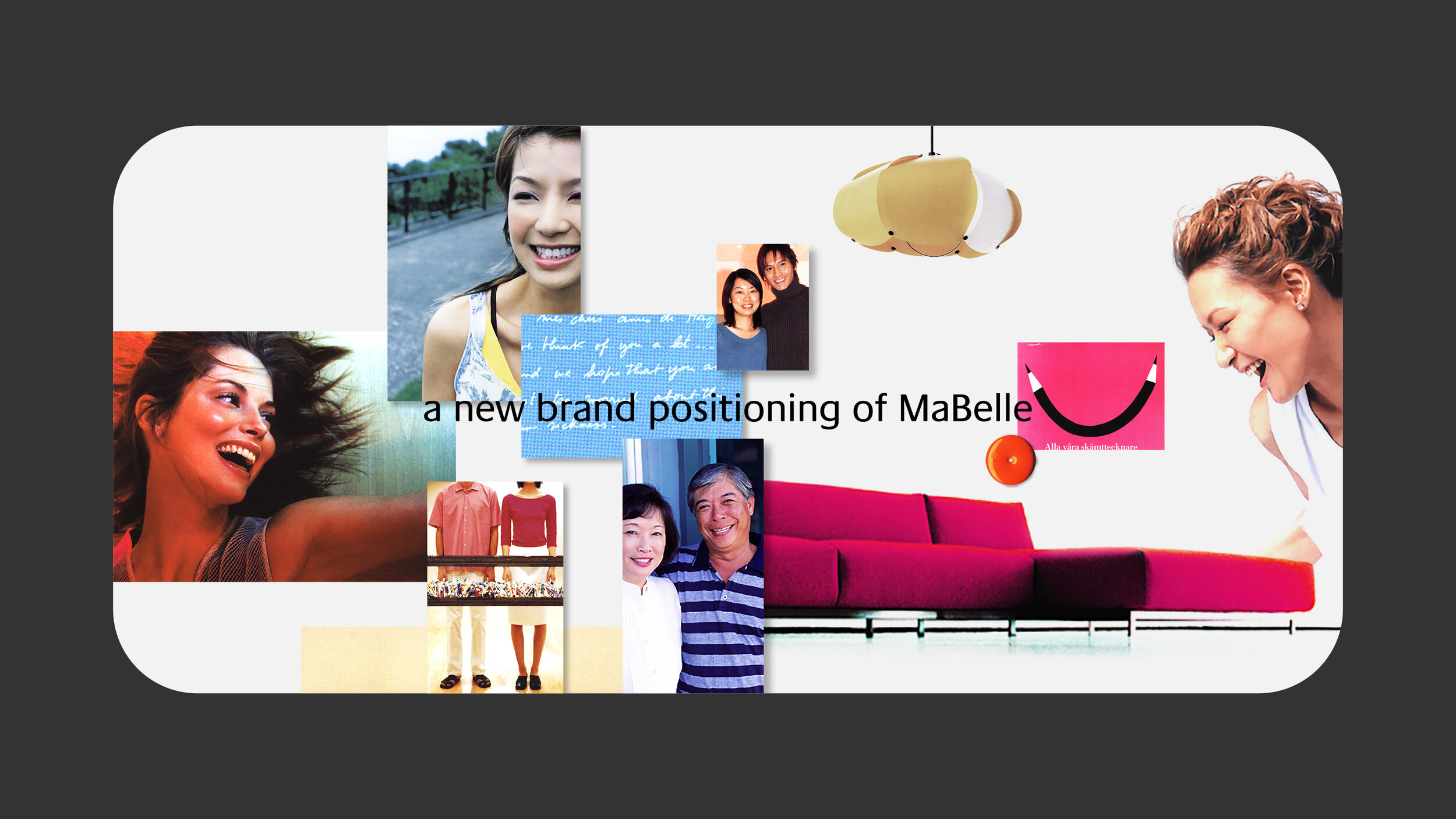
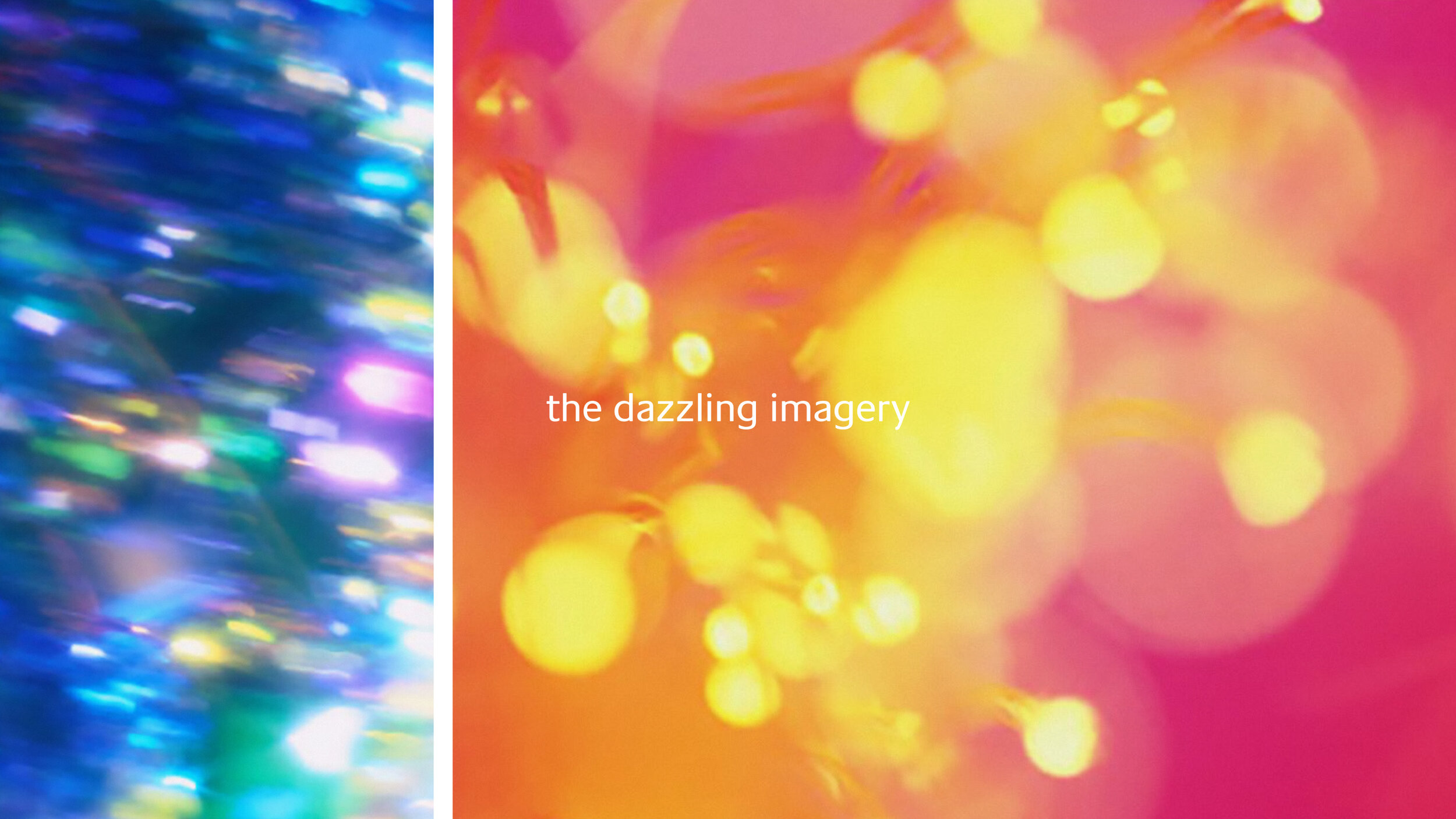
/ Visual inspiration of MaBelle’s new brand positioning (concept development stage)

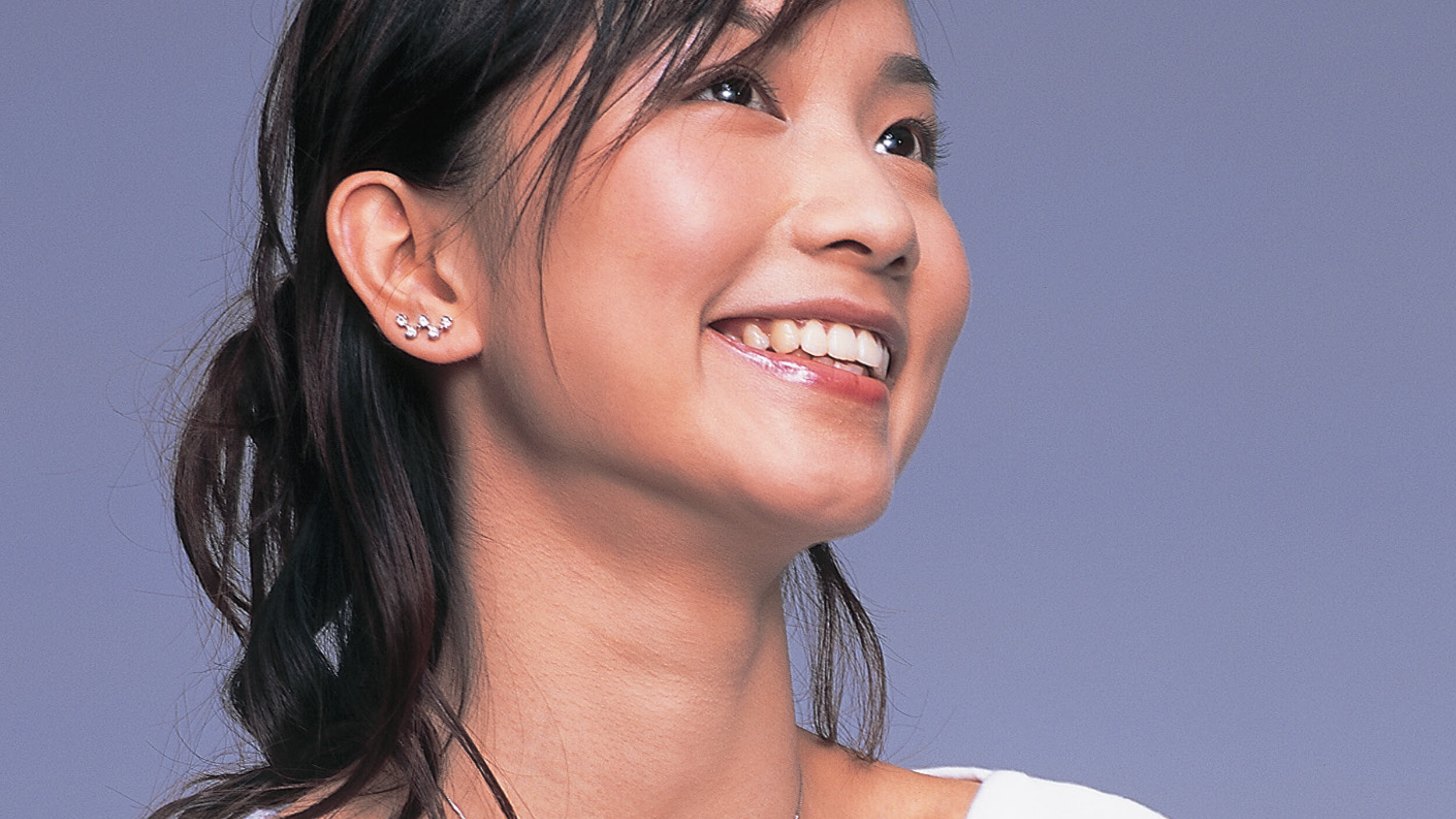
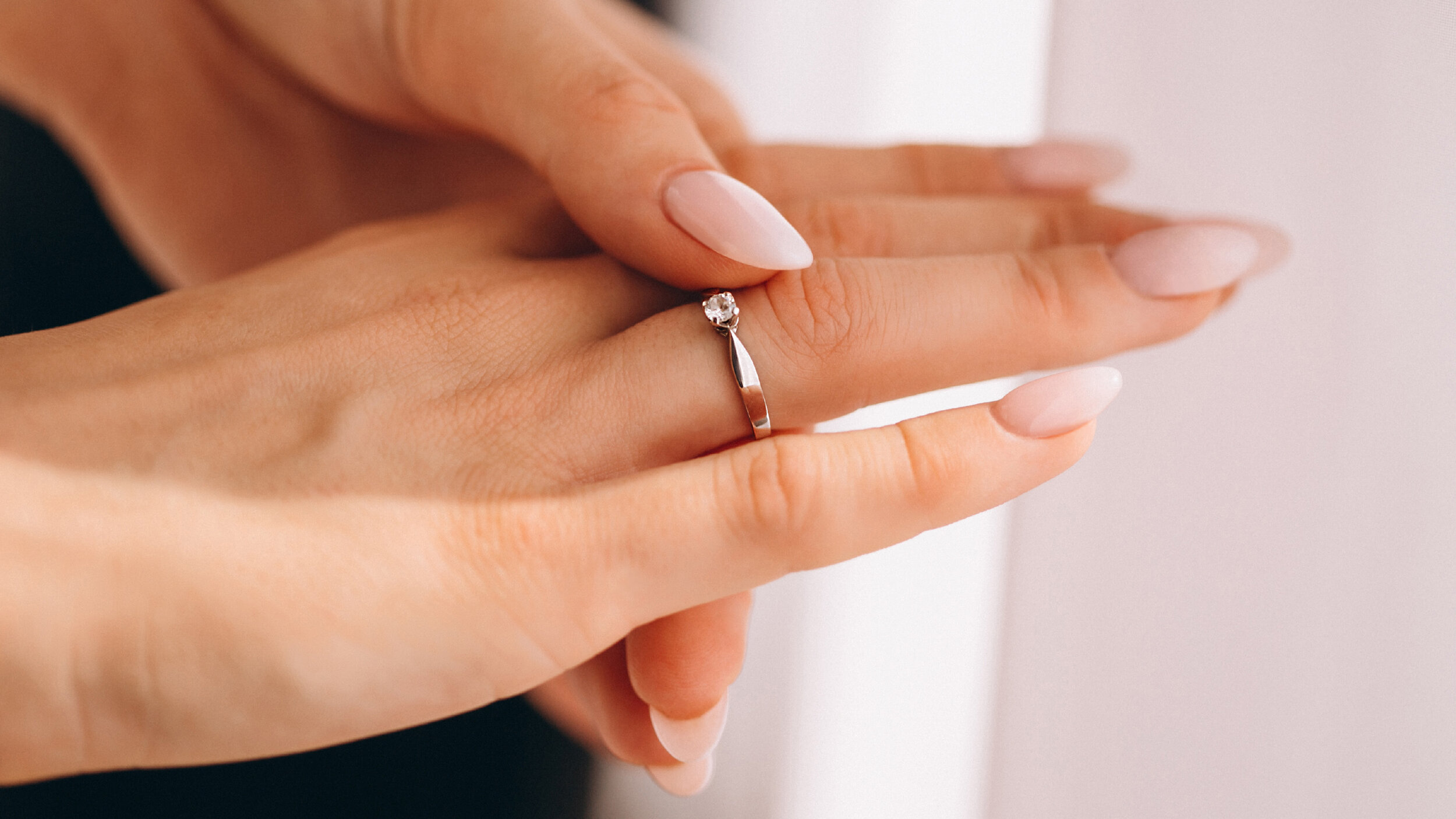
To circumvent the overcrowded jewellery market, MaBelle was consciously crafting a cohesive brand experience, and they aimed to stand apart from a sea of uniform diamond brands by creating a moment of simple happiness to the customers.

Based on a new brand positioning — Happy Diamond, we created a complete set of brand identity accompanied by some major design applications in order to bring to life an idea of the brand experience design whilst portraying MaBelle’s new brand personality, which is also a promise in a way that is authentic, differentiated and relevant to the customers.

/ Creating MaBelle’s new English and Chinese logotypes (custom-designed wordmarks)


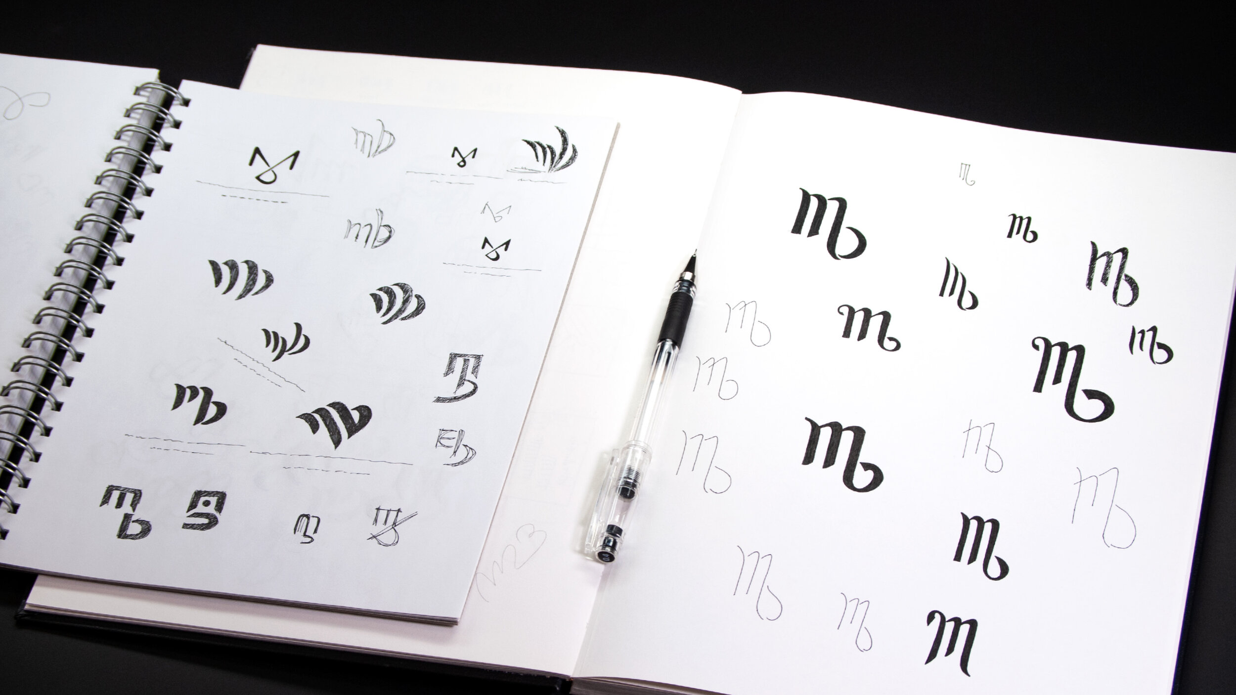

/ Design exploration of new MaBelle’s icon (focused on their initials “M/m” and “B/b”)


/ Primary colours of MaBelle’s new brand identity and visual system


/ Variants of MaBelle’s new brand identity


/ Sparkling patterns of the brand visual system (5 colours)


The refreshed brand image helps MaBelle’s transition from a diamond retailer focused on merchandise to one focused on people.
/ Complementary graphics elements of the brand visual system (especially used for lack of talent)


/ Demonstrating the freshened ambience of MaBelle’s new retail environment


/ Prototyping the custom-designed jewellery cases and a series of their outer sleeves


From a future-proof point of view, this is indeed an authentic brand purpose which makes MaBelle a real difference diamond brand among the industry. Now, “MaBelle is diamond” is not just a brand tagline but also a brand vision which they truly believed in.

/ Usage guideline of MaBelle’s new brand identity and visual system